Customer Stories
See how Adobe customers are building great experiences with Creative Cloud Pro for teams.
Build brand awareness and trust with guidelines that cover everything from brand voice to typography.

Artwork by Markaworks.
People personify brands. Just as we’re more inclined to trust friends with stable, consistent personalities, we’re more likely to trust brands that always look and feel the same. That’s why the world’s most recognizable brands develop and enforce strict brand guidelines.
A thorough brand book outlining these guidelines makes it easy for anyone in an organization to effectively represent the brand. With a solid knowledge of brand elements and brand voice, designers, copywriters, and developers can all work with the same building blocks.
A brand style guide is the rulebook for everything you create, from what fonts to use to how logo treatments work with different color schemes. Whether you’re creating a business card, crafting a tweet, or developing an entire ad campaign, a style guide ensures your work is consistent with brand identity guidelines — both visually and in tone of voice.
You want customers to recognize your brand no matter where they see it — on their phone, on TV, or on a billboard. The best brands use common visual elements and styles to increase brand recognition. A brand style guide is an essential tool to ensure your company produces consistent, cohesive work — especially if you work with creative partners like freelancers or a marketing agency.
Before the style guide addresses logo, typography, and brand colors, it should establish the brand identity. This provides a broad foundation of rules for how to present the brand at every point of contact.
What are the company’s core values? What sets this brand apart from its competitors?

What makes the company name memorable and important? The tagline should be the first thing you want people to know — a quick expression of value, in the brand’s voice.
If the brand were a person, would it speak informally with contractions, slang, and humor? Or would it be more buttoned-up and serious? Does it refer to itself with the royal “we” or does it use the third person? Would it use active voice to inspire urgency or passive voice to project neutrality? Each guideline should reflect an understanding of the intended audience and the purpose of the communication.
Describe the buyer personas that make up your customers, prospects, and referrals. Personas may have nicknames, like “Vanlife Vanessa” or “Homebody Horace,” and they should represent customers with different needs and interests who respond to different appeals. The better your designers and writers know the brand’s audience, the better they’ll communicate with them.


A brand’s first impression is often visual, so it’s important to codify the details of its graphic design elements. A brand style guide should contain rules on how and when creatives can use the assets in the brand kit.
Specify a full logo — the logo image locked up with the company name — for use wherever space allows. Provide a secondary logo for use in situations when the full one is unnecessary or will not fit. Be specific about the proportions and alignment of its design and text elements, down to the pixel, so the brand presents a consistent face to the world. You might also include a list of design do’s and don’ts and specify which logo treatments to avoid because they don’t fit with the brand identity. A tool like Adobe Illustrator is a great option for logo creation.
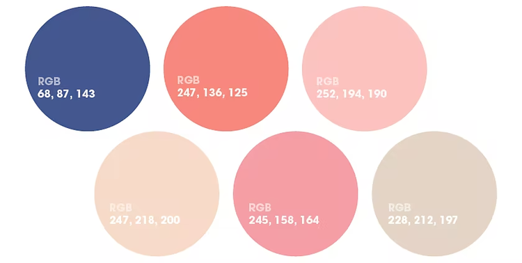
Establish primary and secondary colors. Specify the hex code for each color, so whether a designer is using CMYK color codes for the brand’s printed material or RGB for the website, they can replicate the exact shades every time.
Note the two or three typefaces the brand uses. Explain the use cases for each font as well as the desired size, spacing, and weight. Whatever font family represents the brand, it’s important that designers use it consistently. Be sure to include web styles, so developers know how to create uniform pages.
Define the brand’s photographic style. Is it candid or posed? Professional or casual? Is it a purple-haired young woman at a music festival? An elderly couple walking on the beach? Refer back to your buyer personas to define the types of photos that will appeal to each.

From social media icons to mobile app buttons, the details matter. Iconography should be both easy to understand and consistent with the brand’s other design elements. Icons should work with logos and typography to create a unified look across all communications.

You can find templates for your brand’s rule book via a resource like Adobe Stock. And find inspiration on Behance with examples like these:
You can increase the efficiency of your creative team and ensure brand consistency with practical branding guidelines. Tools like Adobe Photoshop, Illustrator, and InDesign as part of Adobe Creative Cloud Pro for teams can be used to compile these rules in sharp, user-friendly style guides. This will give designers and writers a handy reference tool to help them speak with the same creative voice, and your customers will identify and trust your brand more readily when they see consistent, on-brand creative output.

See how Adobe customers are building great experiences with Creative Cloud Pro for teams.

Browse the latest guidelines on effective design, marketing, and more.
All plans include the Admin Console for easy license management, 24/7 tech support, unlimited job postings on Adobe Talent, and 1TB of storage.
US$23.99/moper license
Annual, billed monthly
Your choice of one Adobe creative app such as Photoshop, Illustrator, lnDesign, or Acrobat Pro.*
US$99.99/moper license
Annual, billed monthly
Get 20+ Adobe creative apps including Photoshop, Illustrator, InDesign, Adobe Express, XD and more.

