Try these tutorials with Adobe Express
Create web pages, social media graphics, and videos.
Understanding the personal impact of color and how to design with this in mind.
Color is more than an aesthetic choice– it can be a powerful tool for communication, even when subtle or unconscious. In this course, brand strategist, designer, and instructor Nicte Cuevas teaches us how color can be used to evoke emotion, influence our decisions, and shape our world.
We’ll start with the function of emotion in design:
Can you think of an instance you bought a product because the brand made you feel something? Could color have been a factor?
Popular brands have successfully used color to elevate themselves to a place of ubiquity and to become memorable.
No matter what the content you’re creating is, you can apply the power of color to design an experience. Design is a powerful tool to help us to convey meaning, to inform, educate, and to create impact.
Weaving emotion into everything we design ensures a lasting impression and can make our work stand out. Design allows you to connect to your why and helps you bring to life the feeling you want to evoke in your audience.
Next, we’ll look at the physiological and emotional impact of color.
Color does more than just grab attention, it plays a key role in psychological, physiological, and cultural perception. Specific colors can elicit physical reactions and shift moods.
Context and messaging associated with color are critical. Cultural associations are deeply important but often overlooked. Along with the choice of what color(s) to use in your design or brand, think about how those colors make people feel. What emotions, moods, words, and cultures do certain colors feel associated with and why?
Considering these thoughts while you make your choices will ensure the colors you choose will resonate with your audience and make for a more inclusive and impactful experience.
Keep watching for part three where we’ll discuss collecting inspiration.
Nicte’s tips for implementing color into your designs? Look for color inspiration everywhere. Go outside, let your eyes wander at the grocery store, find beauty everywhere.
She recommends recording and organizing your inspiration in its own location, so you can reference the resource later. A pro tip of hers is to use a note to link your findings to the emotion and experience of seeing them. Presence is crucial while gathering this information so consider how you feel, the sensory experiences that you have, and anything that influences the moment– and write it down.
Our brains are wired to seek information. To think about how can color communicate without needing to spell out a message we’ll do an exercise looking at how color relates to emotion, connection, and audience. You can also try this exercise on a brand you admire thinking about how they use color.
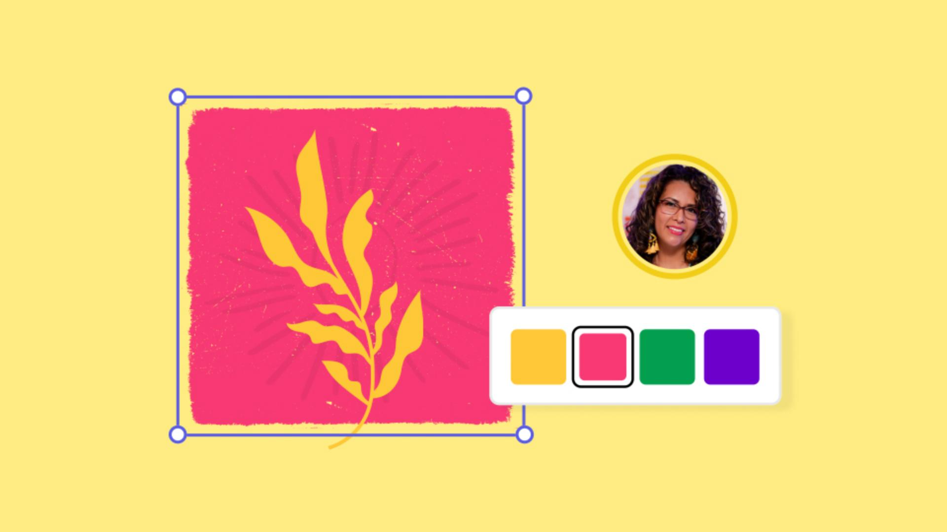
Now, let’s take what we’ve learned about ourselves–and our brand–and apply it by building a color storyboard in Adobe Express. As you add the colors, include the emotion each one evokes.
Remember that, while you may use specific colors for specific functions, they should remain consistent with your brand colors and overall brand experience.
As you’re choosing colors Nicte recommends leveraging tools within Adobe Express like the color designer add-on and checking your colors with the color blindness simulator for accessibility purposes.
Strategic selection of color can significantly influence brand impact. By thoughtfully leveraging color, you can influence how your audience experiences your brand.
Remember:
Color shapes the way we experience and interact with brands.
Finding inspiration offline in moments of attentive presence helps us focus on the emotional experiences we have with color.
You can build a color storyboard in Adobe Express to apply emotional experiences to specific functions and expressions of your brand.