Try these tutorials with Adobe Express
Create web pages, social media graphics, and videos.
A look at the basics of photo editing and stock image curation.

Photos are a key part of the visual language we use to communicate. By learning how to edit and alter them to suit our needs, they become even more useful. In this guide, we will run through some simple photo editing processes so that you can produce photos that look how you want, and effectively communicate what you want to convey with your photography.
Adjusting and enhancing photos allows you to be more impactful with your images by controlling and manipulating their nuances. There’s a range of reasons why you would want to alter a photo. Perhaps it’s as simple as cropping out unwanted parts of a composition. Or maybe the image is a bit dark overall and you want to brighten it. Color can also be targeted with a variety of adjustments, whether you’re adjusting its overall intensity or bringing out the warm tones in a photo.
Flipping an image allows you to orient it appropriately, mirroring that image in a specific direction. It may better suit the placement of your image if the subject was on the left side instead of the right. In this case, you could flip an image horizontally. You can also flip an image vertically. This could be relevant if you want something to appear upside down or if the image was taken upside down. It may also just be that you find the image looks more effective flipped.
Rotating shifts an image along an axis. Like flipping an image, rotating images allows you to reconfigure the placement of the image, as well as the focal point. Whether you are correcting how the image was taken or manipulating the image to a desired effect, rotation can be a useful function in any kind of photo editing.
Cropping removes a portion of the photo or image with the goal of creating a better overall composition. It may be that when the photo was taken, it was not composed well and there is space or content that shouldn’t be included in the final image. There may be undesirable or irrelevant parts of an image, like a stranger, or the bumper of a car. Some photo editors will also allow you to crop the image in a specific shape. This allows for a wider variety of design choices.
Adjusting an image size can be done through various methods. To maintain an image’s size ratio, resize by dragging in or out from the corner of the image. Be careful when resizing an image, however, because as images are sized up, they can lose detail. This is because upon being captured, digital images are made up of a fixed number of pixels, or units of visual information. Generally speaking, an image with fewer pixels has a relatively lower resolution and one with more pixels has a higher resolution. At a certain point, enlarging an image will make its pixels visible, leading to an image with a grainy texture.
Most photo editors have a standard collection of editable values that correspond with certain visual aspects of the photo. These include contrast, brightness, and warmth. Adjusting these levels is useful for making the image more effective, legible, and suitable for a given tone.
Brightness refers to how light or dark an image is. Brightness is an overall scale, so it affects all the pixels in a digital image, both dark and light. Increasing brightness will make all areas lighter and decreasing brightness will make all areas darker. Increasing the brightness in a photo may make the darker areas more visible than leaving the image as it is. If you’ve taken an image at night and not been able to show the composition of the frame clearly with flash or a night mode, increasing the brightness may be a useful way of making the image more comprehensible. If an image is too bright due to the environment’s lighting, consider darkening it. Darkening an image can also be a useful tool in setting a mood.
Highlights are the brightest parts of a photo, whereas shadows are the darkest parts. Increasing the highlights in a photo editor increases the brightness of just the lightest sections, and increasing the shadow will similarly focus on the darkest. These separate categories give you a bit more freedom than a wider category like contrast, so you can focus on brightening the bright areas without darkening the dark section or vice versa.
Contrast is the visual ratio of tones, or the visible range of dark to light tones. Increasing the contrast of an image means increasing the intensity of both shadows and highlights. Shadows get darker, highlights get brighter, increasing their difference. Reducing contrast makes it so shadows and highlights become less intense and less differentiated.
Low contrast photos appear flatter and less defined, while high contrast photos are stark, more defined, and include very light and very dark tones. Maybe you’ve taken a photo that seems to tonally melt together. It’s hard to read the forms in the image because they are too similar in terms of shadow and highlight. Increasing the contrast will likely differentiate areas of the photo so that what is represented is more distinct.
Saturation changes the intensity of all the colors in a photo. If the tones in a photo are a bit faint — increasing the saturation gives the overall image a stronger level of color. If the image is a bit oversaturated and you want a more delicate overall color, decrease the saturation.
Warmth refers to how your photo expresses the red, orange, and yellow part of the color spectrum. Going to the negative side of this scale focuses the expression on the blue, green, and violet, or cool part of the color spectrum. Warm tones tend to be associated with positive, upbeat, and intense attributes, while cool tones are considered more neutral, passive, and relaxing. Adjusting photos along the color wheel can be helpful for emphasizing the content of the photo, like bringing a sense of warmth to a desert scene. Shifting the color values can also affect the tone of the image, as in bringing cool tones to an industrial or clinical setting to emphasize a chilly sense or feeling.
Sharpen focuses the soft edges of a photo to increase clarity or focus. If your image is a bit blurry or overly soft, this tool can meaningfully clarify the composition.
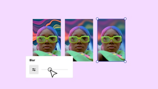
Blurring an image obscures the detail of a photo. Tools like this can be helpful when layering text or graphics over a photo, so that the top layers are more distinct than the background image. Blurring can also be a tonal choice to soften the lines of a photo in contrast to sharpen.
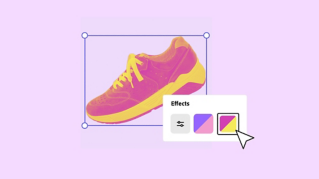
Filters are premade templates for adjusting the aesthetic setting of a photo. They provide a way of instantly enhancing an image for greater impact with fewer adjustments. Depending on the filter and the aspects with which it's designed to interact, filters can help minimize glare, enhance color, and increase contrast.
Some filters more specifically engage color presets like greyscale or duotone options. Others will affect the overall cast of an image by lightening or darkening it. Many photo editors will allow you to adjust the filter to increase to decrease its overall effect.
Tools that enable you to remove the background from an image open a lot of possibilities. This function can completely shift what the image means and allows a lot of room for play and experimentation. There are a number of reasons you might want to remove the background from an image. Maybe you want to isolate the subject of a photo, like a figure, or an object. Removing the background and placing the image on a transparent background allows you to reimagine the way you can use aspects of the image. Suppose your background doesn’t suit your image. You can put a subject in a completely new environment or an artistic, colorful background. You may also want to use an object for product shots. By taking your product out of context, you can apply a section of an image to any number of reimagining, collaging and manipulating it so that it shows up best to your customers.
Certain tools will also allow you to edit the cutout, so flaws or unnecessary parts of the image can be left out. You may also be able to invert the cutout, so you are able to keep your background and remove the photo subject if that’s the desired aspect of a photo you wish to manipulate.
Stock images allow us to accessibly source photographic material without capturing a photo ourselves. Ideally, they also can enable us to source quality images that we may not be able to achieve on our own. But what makes a good stock image?
A good stock image reflects content and supports the message of the project. The image can be abstract, like a decorative background, or more specific, such as an image of a crossing guard escorting children along a crosswalk. Either way, an image can resonate with a given project or appear out of step with it. A stock image that does not make sense may confuse viewers or detract from the efficacy of the message.
When picking a stock image, consider color, orientation, and size. The image should fit the given scheme of a project, whether in terms of its thematic or aesthetic qualities, or fit more literally. If the space you have for an image suits a landscape-oriented image, for example, you shouldn’t waste time browsing through portrait-oriented images. Some stock image resources will allow you to filter these needs.
Look at the image quality. High quality images are well lit, of a proper resolution (this dictates the number of pixels in an image file and thus, the amount of detail and clarity of the image), relevant, and up to date. It should look good, but it should also reflect your message, and be current (or appropriately dated).
Stock images should be held to design standards like everything else. Think critically about the composition of the images you’re browsing. Does the image carry the eye? Does it successfully engage the principles of design? Consult the rule of thirds, which breaks up an image into sections placing the subject at one end of a composition and leaving the remaining two thirds open.
A good stock image tells a story, rather than presents something posed, or contrived. How your image topically links to your message will give your message greater weight. Candid images of people will often resonate more deeply than awkward, staged images. This may be less relevant if you’re specifically trying to engage an audience with a specific figure. In this respect, eye contact with the viewer may be important.
Stock images with lower contrast sections enable better use of adding text and graphics. Because low contrast visuals have a greater uniformity to them, they are similar to a “blank canvas,” making them easier to read from than high contrast areas. If you’re planning to layer various elements for a project, making sure you have some of these areas is pivotal.
So, there you have it — a general guide to photo editing and production. There is so much to know and explore here, so many effects to bring out of your images. Experimentation is key to creation. Have fun!