Try these tutorials with Adobe Express
Create web pages, social media graphics, and videos.
Why choosing fonts that match your brand matters
In this course, Brooklyn-based musician, designer, and DJ, Andrey Azizov will talk about why font pairing matters, how to choose the right font for your project or brand, and even some of his favorite tools in Adobe Express to make font pairing easier than ever.
When headings, subheadings, and body copy are differentiated from one another it makes it easier for viewers to understand the content they’re seeing and reading.
Hierarchy is only one element that makes content easier to read, choosing legible fonts is also super important.
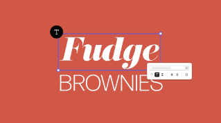
Consistency with font pairing helps to establish and maintain your brand’s identity.
Font pairing allows you to set and maintain the tone in your designs.
All of these things work together to increase recognition of your brand. Think of your favorite brands, the fonts they use play as crucial of a role in recognition as the colors and brand name itself.
As we’ve established, fonts are an important part of your brand’s identity. They help you convey the personality of your brand as well as inform and set the tone for other design elements you may create.
Have you already established your brand’s personality? If you have, what is it? Refer back to your brand book and take notes of the words you use to describe your brand. You can use these same words to search for font ideas to get you started. Try searching on your favorite sites to get inspired (Behance, Pinterest, TikTok, etc.) for fonts that are:
Playful
Modern
Serious
Professional
Retro
Make sure fonts match the mood you’re going for. If a font is too serious it can convey completely the wrong message. Make sure they match!
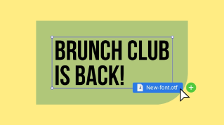
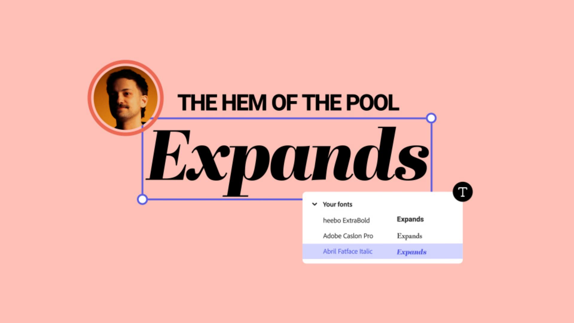
You’ve heard this advice before, but using too many fonts can make a design feel chaotic. Limit yourself to two or three fonts. A good rule of thumb is to choose one font for the header text, one for the subheader text (this can also be called an “accent font”), and one font for the body text.
Choosing fonts that are artistic and fun is important, but so is legibility of the fonts you choose. An easy way to approach this balance is by leveraging hierarchy to your advantage. By using the loudest font as your header font and a more simple font as your main body text you maintain readability and have fun.
Strategic font pairing can help you establish mood, personality, and hierarchy in your designs and in your brand overall.
The fonts you choose can make or break the legibility in your brand: don’t choose fonts that are pretty to look at if they’re hard to read. Think about your font in context of your designs.
Take a look at some of Andrey’s favorite Adobe Font pairings in the conclusion video above to get you started.