Photography
A little color saturation goes a long way.
Small shifts in saturation can have big effects on your photos. Learn how to make changes in post-processing to get the look you want.
Photography
Small shifts in saturation can have big effects on your photos. Learn how to make changes in post-processing to get the look you want.

Artists and photographers use hue, saturation, and lightness (HSL) to describe color. Hue refers to the dominant wavelength of light that the human eye interprets as color, but you can think of it as the basic color on the color wheel. Saturation describes the intensity of the color. And lightness refers to how light or dark the color is.
A grayscale or black-and-white photo has no color saturation, while a full-color photo of a field of sunlit wildflowers might be extremely saturated. Some photos are naturally more saturated than others, but how much you decide to add depends on your subject and your intention.
Highly saturated photos can look artificial, so use saturation with care — especially if you’re going for a natural look. Many people can tell when photo saturation has been altered. We judge the health of plants and the freshness of food by color, so we notice unnatural saturation shifts very quickly.
If you want to create surreal images, you might make larger shifts in saturation. But for realistic pictures, keep real-world references in mind as you edit, so you don’t overdo the colors. “It’s rare to see pure colors in nature because ambient light makes colors less saturated,” says photographer Heather Barnes. “That’s why you have to be really careful in post to not overly saturate your color.”
Consider what you’re trying to say in your photography. If you want to capture a foggy mountain lake early in the morning, you might find that low saturation adds wistfulness to the photo. With fashion photos, you might want the colors in an article of clothing to stand out. “Think about the story you’re telling,” says Barnes. “Maybe you take a picture of a woman in a red dress, and you want it to have this vibrant, fiery feel. In that case, boost the saturation.”

Image by Heather Barnes
Just remember that subtle tweaks tend to work better than extreme ones. “I think about how my eyes saw it,” says Barnes. “I try to remember what about this scene felt the most saturated to me.”
More generally, you can also use memory colors, which are the hues you envision whenever you think of certain objects. Based on your encounters with these objects in life, you know what the red of an apple or the yellow of a banana should look like.
Be especially careful when you change saturation levels in portraits and other photos that contain people. If you oversaturate, clothing suddenly looks painted on, and skin tones begin to look unrealistic.
Histograms are graphs that show you the tonal range of an image, from shadows to midtones to highlights. Their most common use is for exposure and tonality, but you can also find a color histogram in your digital camera or in your photo editing software.
Look for points on the graph where your color values spike off the chart. This is called clipping, and it means the camera sensor was overloaded, so you’ve lost detail for those pixels. If you desaturate a little, you might regain some of that detail.


Change the intensity of color in your photos using the color editing tools in Lightroom.
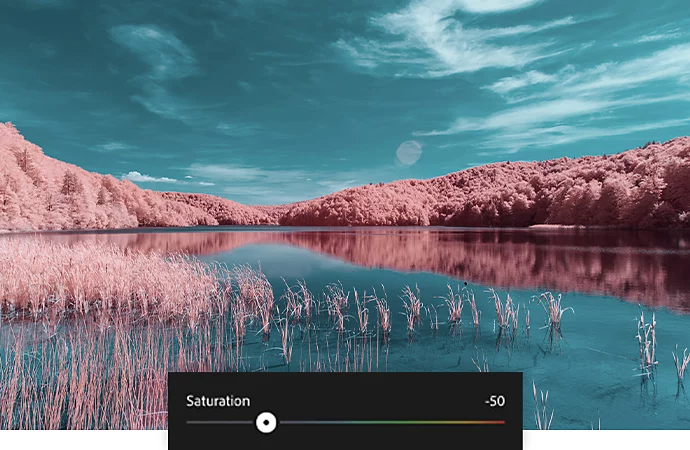
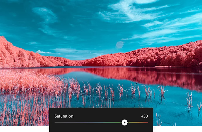
Move the Saturation slider to the left to decrease and to the right to increase the saturation of all the colors in your photo.
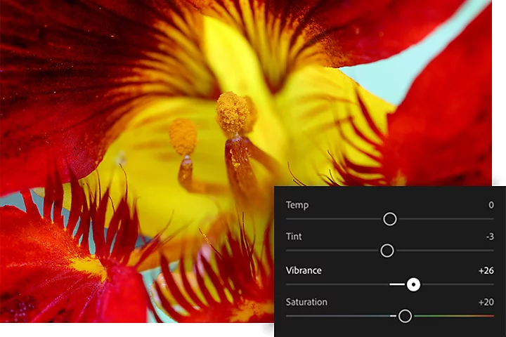
The Vibrance slider adjusts the intensity of only the less saturated colors in a photo. You can make subtler, targeted increases to color saturation by moving the slider to the right.
Think of Saturation as the color paint roller and Vibrance as the color detailing paintbrush.

To pick up quick tips about how to make effective saturation adjustments, download Lightroom and check out these step-by-step tutorials.
Learn how to tweak color intensity in a flower photo by moving the Saturation slider. Too far to the left, and you have a black-and-white photo. Too far to the right, and you lose detail.
Bump up or mute less saturated colors with the Vibrance slider without making big changes to skin tones.
Learn how to make targeted adjustments to specific colors in the Color Mix panel.
With a little practice and close attention to the colors around you, you can ensure that your photos capture the world in all its natural vividness.
Contributors
Heather Barnes