VIDEO
Select a perfect aspect ratio for your film.
Aspect ratio used to be determined by available technology, but now the choice is yours. Discover the aspect ratio that matches the substance and style of your project.
Start free trial|Start free trial {{premiere}} Explore {{premiere}}
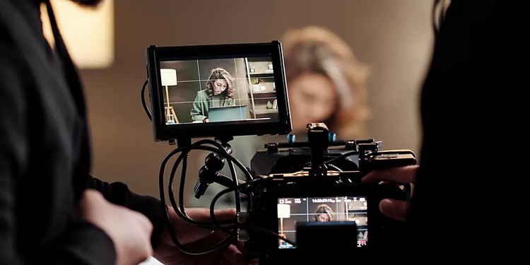
What is film aspect ratio, and why does it matter?
Aspect ratio describes the relationship of an image’s width to its height. This relationship matters because it determines how much space surrounds the subject of an image (or series of moving images). If you’re trying to shoot a conversation between two people, a square format might capture both people, but it won’t show much of the background behind them. A vertical format might capture more of one speaker’s body language, but it will cut out most, or all, of the second person.
Throughout most of motion picture history, directors have preferred frames that are wider than they are tall. Widescreen formats can occupy a viewer’s whole field of vision, immersing them in vast landscapes, great battles, and elaborate musical numbers. “We have two eyes side by side on our heads,” editor and colorist Gerry Holtz notes. “You see wider than you do tall, so it feels more natural to watch something in a wider format.”
To reduce file size, you can use two types of compression — lossless and lossy. What’s the difference between the two formats? Lossless compression is a way to reduce file size without losing quality — this is what happens anytime you create a ZIP file. In this scenario, the original data is preserved, and nothing is thrown out. On the other hand, lossy compression shrinks the file size by throwing out unnecessary data.
You’ll want to choose the lossless compression format if you need to preserve your video in its original quality. However, if a similar copy is “good enough,” lossy compression can make your video files even smaller, which in turn can make sharing them more manageable.
The history of aspect ratios.
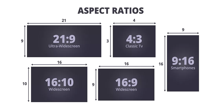
In the first motion pictures, the film aspect ratio was 1.33, or 4:3. This was the result of literally hand-stitching together multiple frames of 35mm photographic film. This ratio became the aspect ratio of television from its inception up until the digital age.

In 1932, filmmakers developed a ratio of 1.37, which added an audio track to the edge of the video frame. The Academy of Motion Picture Arts and Sciences declared this the new official ratio, so it became known as the Academy Ratio.
With the rise of television, films moved to widescreen aspect ratios to offer expansive viewing experiences that TV couldn’t match. Ratios of 2.59 (Cinerama), 2.35 (Cinemascope), 2.2 (Todd A-O), 2.76 (MGM 65), and 2.20 (Super Panavision) presented extremely wide pictures, perfect for telling epic stories like Patton, Ben-Hur, and Lawrence of Arabia.
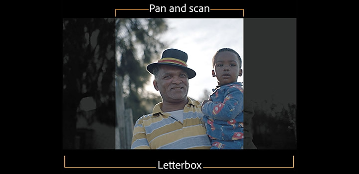
To present these film formats on television sets, editors had to “pan and scan,” cutting off the edges of the film (which could be as much as 50% of the footage) to capture the central action. If important action happened at the edge of the frame, editors had to pan over to that edge. Directors hated this practice. Sydney Pollack even sued Danish TV for compromising the artistic integrity of his film Three Days of the Condor. Viewers needed wider televisions so they could watch films properly.
HDTV aspect ratio.
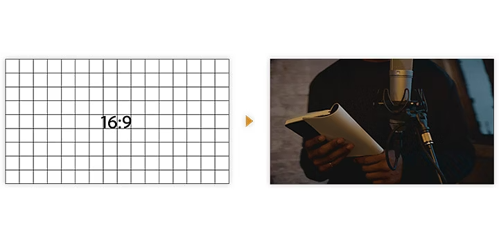
Developed in the 1990s, high-definition television found a middle ground between boxy 1.33 and extra-wide 2.59. That middle ground is the high-definition widescreen format of 1.78, popularly known as 16:9. This ratio remains the standard aspect ratio for YouTube and Vimeo content. (In pixels, the ratio is 1920:1080, or 3840:2160 in 4K resolution.)
This common film aspect ratio is wide enough to capture background visuals and tall enough to convey human emotion and intimacy. You can view the widest format films on your TV in “letterbox” format (with black bars at the top and bottom) to avoid missing any of the action the director wanted you to see.
Vertical video on the rise.
With the rise of smartphones and social media channels like Facebook and Instagram, aspect ratios have shifted in a vertical direction. Instagram’s standard aspect ratio is a square (1:1), which is great for close-ups of people’s faces but fails to capture the magnificence of an alpine vista or beach sunset.

With so many of us viewing video content on our phones now, a vertical aspect ratio (9:16) has gained wider acceptance. Enough people are making vertical short films with their phones that a biennial Vertical Film Festival was created in Australia.
Some filmmakers regret this trend — especially if it means watching content on a widescreen with thick pillar boxes (vertical black bars) on either side of the video — but others take a more practical view. “There’s a cool challenge to making the best story possible in a vertical orientation,” director and producer Taylor Kavanaugh says. “If all the viewers are watching things in vertical, then why wouldn’t you go fully into that and make it the best you possibly can?”
Creative director Toby Harriman agrees. “If the majority of your content is just being seen on Instagram, then you should be thinking about that real estate.”
Which aspect ratio should you use?
Understanding how aspect ratios impact storytelling and viewer experience is important for choosing the right one for your film.
Is your project character-driven, or is the setting itself one of the characters? “Those projects where the environment is a character don’t play as strong in vertical as they do in horizontal,” Kavanaugh says. “The projects that are largely character-driven play better in a vertical orientation.”
How to change aspect ratio.
You can fix a lot in post-production. If you’re shooting in 4K or higher, that high resolution will allow you to use any portion of the frame. You can change the aspect ratio of any video in {{premiere}} by creating a new sequence, clicking on Settings, and then adjusting the frame size.
Reconciling various formats.
You can change the format type in several ways. If you have 16:9 footage, but you want all of your video to show up on a 4:3 TV, you can insert black bands above and below your image.
You can also avoid letterboxing by panning and scanning. In {{premiere}}, click Settings, and set the vertical frame of your sequence to match the vertical frame of your 16:9 footage. This option will crop the edges of your widescreen video, so you may have to pan left or right to ensure you keep the important action in that smaller frame.
Problems arise when your video has a lot of action. “If you’re working in a very dynamic environment where things are moving, and you need that movement throughout a horizontal frame to tell the story, figure out a strategy for how you’re going to keep enough of that information in that portion of the frame,” Kavanaugh says. Panning and scanning can be time-consuming, but it’s the easiest way to solve that problem.
Mixing things up.
Some filmmakers work with various aspect ratios in the same project. Wes Anderson did this to great effect in The Grand Budapest Hotel. He used the Academy Ratio for most of the film, since it takes place in the 1930s, then switched to a 2.35 ratio for action that took place in the 1960s, and switched again to a 1.85 ratio for its “present-day” action of the 1980s.
If filmmakers like Anderson inspire you, try varying aspect ratios in your own work. When you import assets, {{premiere}} preserves the frame aspect ratio, pixel aspect ratio, and frame dimensions whenever possible so the asset does not appear cropped or distorted. Create different sequences and manually adjust the aspect ratios to ensure that you don’t accidentally crop any footage.
Learn how to make a feature film with your iPhone.
You can get some helpful tips in this article about Tangerine and other films shot on iPhones.
From feature films to sizzle reels, think about how your video will be viewed before you start shooting. If you know most people will watch it on their phones, you can avoid editing-room headaches by constructing your shot list with a square or vertical aspect ratio in mind. If you want your work to play on various formats, and you want it to look great on all of them, you might just have to shoot some scenes twice with different types of shots.
As with most creative decisions, the key is to plan ahead and think through the tough questions: Which film aspect ratio fits with how people are most likely to view your work? Which ratio will serve your story? Can you reconcile the two?
