Try these tutorials with Dreamweaver
Design modern, responsive web pages.
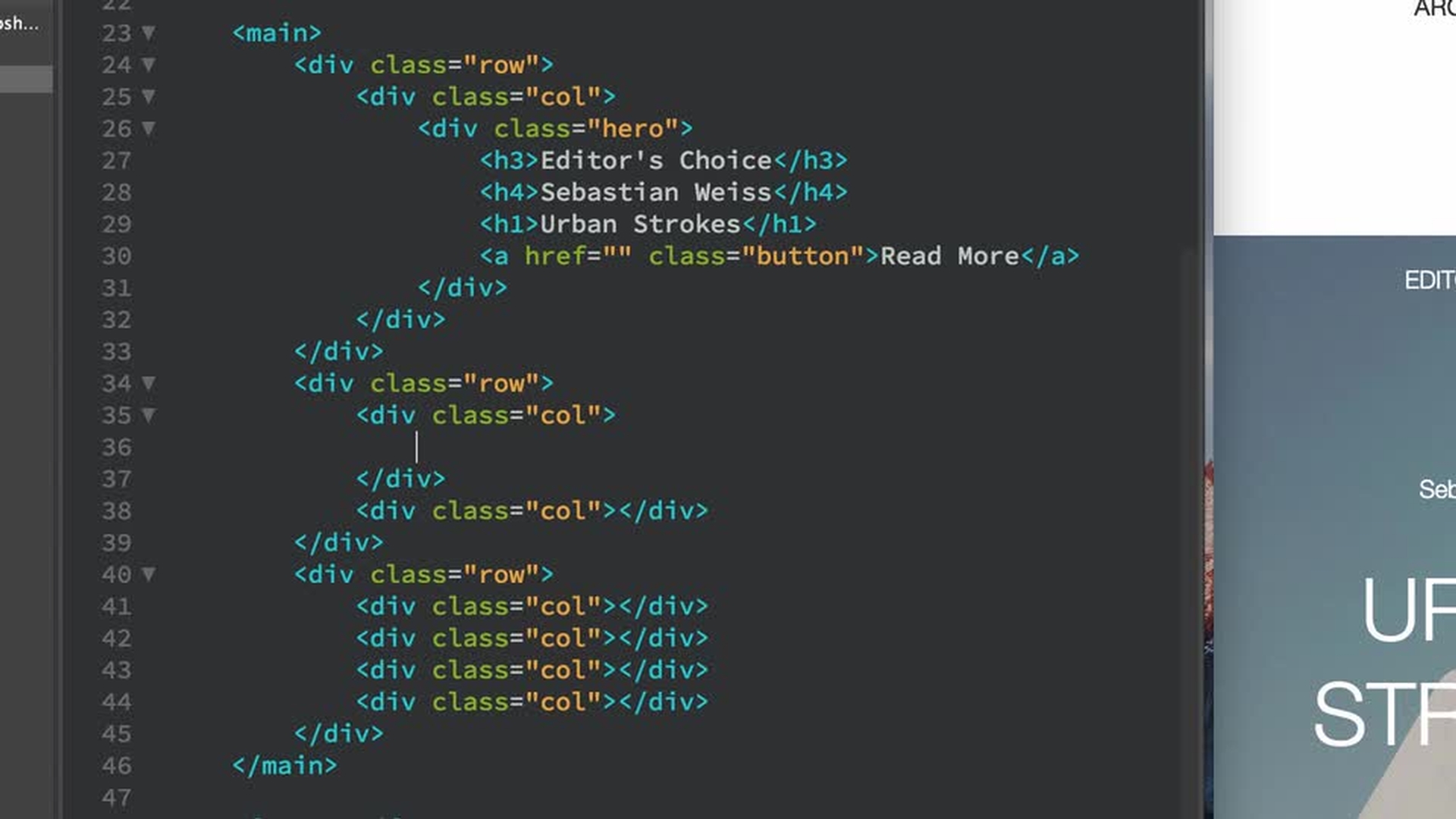
Define a responsive grid layout that allows the contents of your web page to scale across devices.

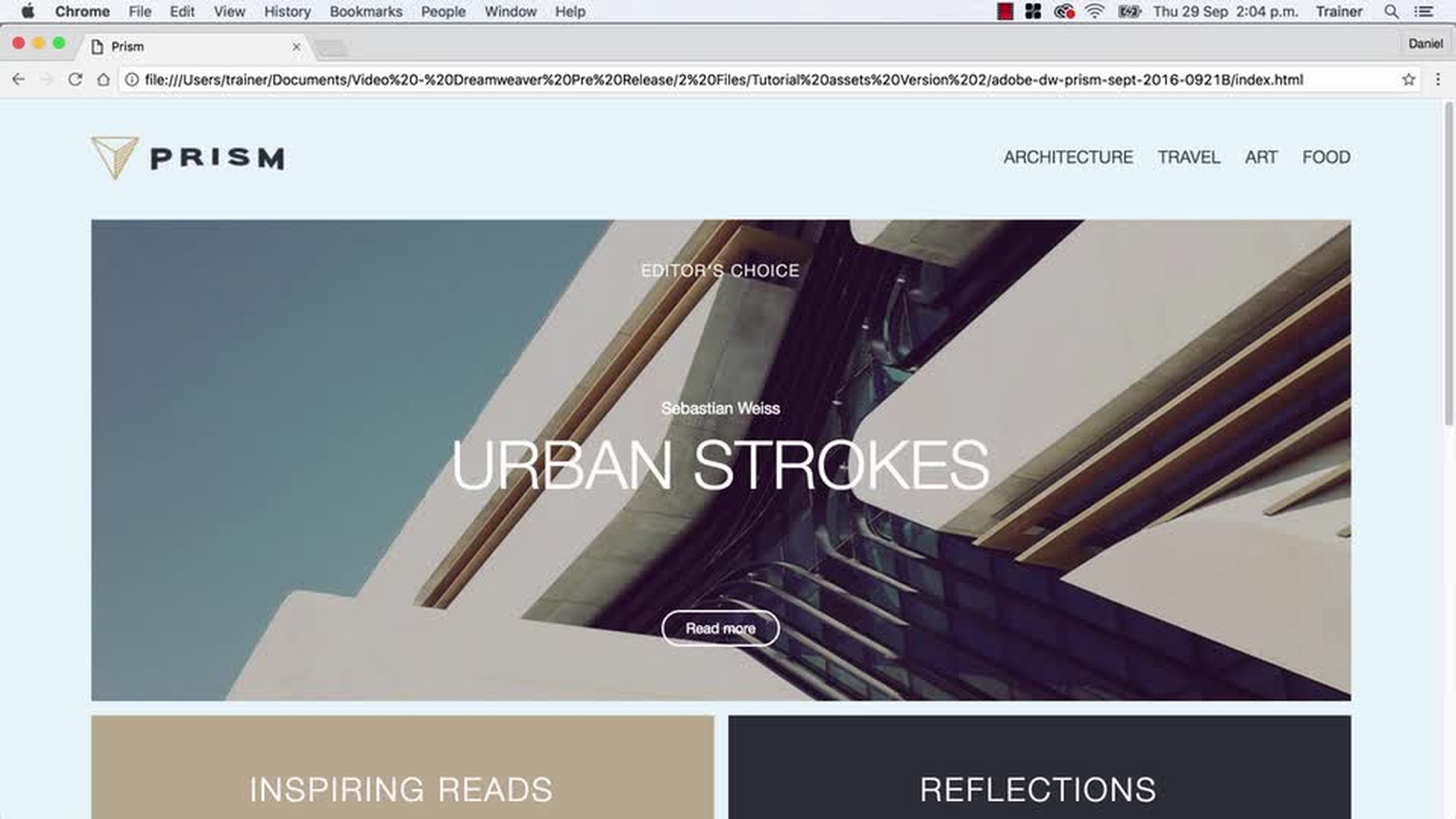
Dig deeper into HTML and CSS to organize your content into a grid of rows and columns that begins with a striking header image and engaging text.
Every web page needs text and images to convey a message. With the grid structure in place, now add and organize the rest of your web page content — text, images, color, and a footer.
The web design looks great on mobile devices, now let’s use CSS media queries to ensure your layout automatically adjusts when viewed on tablet and desktop screens. Once you’re done, that’s it — you have successfully created a responsive web page in Dreamweaver.