DESIGN
Understanding primary, secondary, and tertiary colors
See how different color combinations can help you make a splash with attention-grabbing work.

Color shapes our world
Colors can evoke emotions, trigger specific responses, or subliminally communicate a message. When artists choose a particular hue or shade in their work, they must consider if the color scheme matches the tone they set out to create. With an understanding of how colors work together, artists and designers can make the best choices to amplify their creative work.
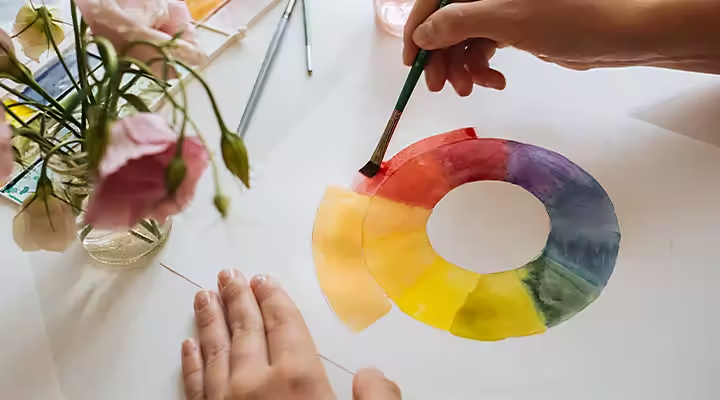
Put your color wheel in motion.
The color wheel represents all visible colors. It’s the standard tool for viewing and understanding color combinations. Arranged in the order the colors appear in the light spectrum (red, orange, yellow, green, blue, indigo, and violet), Sir Isaac Newton created the first color wheel in 1666.
There are two types of wheels: one based on the primary colors of RYB (red, yellow, and blue) and one based in RGB color (red, green, and blue). Typically, print artists use the RYB color model, as it’s best suited to illustrating the correlation between physical colors in inks and paints in the color mixing process.
For designers or artists who work in the digital medium, the RGB color palette is most typically used, as those colors are found in the photoreceptors of the eyes. The light source of a monitor or screen can create any color you can imagine with the combination of different shades of red, green, and blue. However, if printing is your ultimate goal, digital artists and designers can use, or convert files to, CMYK (Cyan, Magenta, Yellow, and Black). These are the four basic colors of ink used in printing color images.

Color categories to know.
The color wheel is based on three categories of colors:
Primary colors:
The building blocks from which all other colors are derived. Also known as basic colors, as they can’t be recreated by color mixing, traditional art and color theory accept RYB as the primary colors. As humans are trichromatic, RYB is fundamental to see the color spectrum of our world.
Secondary colors:
These are color combinations created by the equal mixture of two primary colors. On the color wheel, secondary colors are located between primary colors. According to the traditional color wheel, red and yellow make orange, red and blue make purple, and blue and yellow make green. If using an RGB color wheel, there’s another set of secondary colors called additives: blue and green produce cyan, blue and red make magenta, and blue and yellow will make green.
Tertiary colors:
The combination of primary and secondary colors is known as tertiary or intermediate colors, due to their compound nature. Blue-green, blue-violet, red-orange, red-violet, yellow-orange, and yellow-green are color combinations you can make from color mixing. On a color wheel, tertiary colors are between primary and secondary colors.

What is color theory?
Color theory is the creative and scientific use of color. It’s a system of logic that places guidelines and rules of how colors contrast, mix, and match with each other.
“When it comes to color theory, there’s no set list of ‘Don't do that,’” says illustrator Alyssa Newman. “It’s a push-pull thing and it comes down to preference.” With so many options, how do you decide what color palette works best for your illustrations? The color wheel comes to the rescue. You can use it to determine what color scheme matches the mood you’re trying to set.
The grand color scheme of things.
Do you want colors that flatter each other? Choose colors that are located right next to each other on the color wheel. These are called analogous colors. You’ll need to have the proper contrast, so most illustrators choose one dominant color, along with a second supporting color and a third color to be used as an accent or highlight.
This is a simple method to develop a color system, but it’s not without its flaws. “There are mixed opinions with this approach because it’s very easy to have a calming color palette, but then you also have very low contrast, and all the colors blend together,” Newman says. For instance, yellow-green, yellow, and yellow-red are all vivid colors, each with their complexity, but when used together in a painting, it can look like a primary yellow. Luckily, digital illustration doesn’t have the same properties as traditional art, so it allows some flexibility in how you use the color palette you choose.
“With illustration, you can definitely get away with taking the analogous color palette for your secondary colors. And then picking your primary color that is opposite on the color wheel,” says Newman. This is what’s called a complementary color scheme. If you choose a color on the opposite side of the wheel, it gives whatever you color the most substantial contrast while it remains pleasing to the eye. Keep a color wheel handy to determine what the best complementary colors are for your next project.

Get the temperature right.
Color wheels are arranged in order of how those specific colors appear in the visible light spectrum. The left side has warm colors, based in red, while the right side has cool colors, found in blue. While these classifications are stable, more subtle color connections are relative, meaning that a warm color can be considered a cool color and vice versa, depending on their relationship with the neighboring color. Colors from the same hue can also be regarded as colder or warmer than one another based on what color they appear beside.
Before you create, think about what type of emotions you want to portray. Cold and warm colors have unique properties that can change an image in a variety of ways. Cool colors offer a calm, soothing feeling, while warm colors are energizing and happy. Warm colors make things look closer to the viewer, whereas cool colors give a faraway look to an image.
Make your next piece in living color with Adobe Creative Cloud.
Let your imagination run free and play around with different color combinations to achieve a distinctive look, customized to your next project. “Secondary colors open the door to interesting color combinations that make people feel like it’s their project, it’s original,” says designer Jacob Obermiller. “It’s not just blue, yellow, red, or black. It now has some character and ownership to it.” The Adobe Creative Cloud All Apps plan has all the tools you need to give anything you create its own character.
If you’re interested in learning more about colors, explore color photography, how to colorize black-and-white photos, or how to calibrate your monitor for more vivid colors. The better your understanding of color, the better you can find the perfect look for each new piece you create.
https://main--cc--adobecom.hlx.page/cc-shared/fragments/seo-articles/creativity-for-all-blade
