What is an infographic? Examples, templates and how to make fantastic designs.
Discover what an infographic is and how to use them in your own designs to boost interest and engagement. Get infographic tips, templates and more to help you get across your message.

Summary/Overview
An infographic is a powerful way of communicating ideas in a visual form. Different types of infographics are used in design and marketing to present information in a simple and visually appealing way. They can be a useful alternative to standard text-based content.
While infographics might seem like a more modern feature in design, they actually have a long and varied history. In fact, infographics have played a key role in communicating ideas since the early 20th century, and even as far back as ancient times! The first graphic depictions of information date all the way back to cave walls and Egyptian Hieroglyphs. So, why not take some inspiration from these early forms of information sharing?
Whether you’re a business owner, social media expert or education worker, you can use infographics to convey key messages, share data in an interesting way, or simply entertain. Read on to discover what makes a good infographic and how to make your own with Adobe Express.
What are infographics?
An infographic is a clear and visual representation of data and information. Leaning on elements like imagery, symbols, charts and diagrams, an infographic can make complex ideas easy to understand.
The simple meaning of an infographic is to tell a story through visual aids. This means they can take the form of a static visual or a video infographic – depending on what you feel would suit your subject matter and appeal to your audience.
Infographics have become a workplace and classroom staple to communicate information quickly and clearly. They can simplify lots of complicated data into a neatly presented package and can help you to spot patterns in meanings.
Why use infographics?
Infographics can be extremely useful for all sorts of projects, whether it’s sharing your brand values on social media or explaining a complex process to your students. And there are various reasons why you might want to use infographics to convey your message. For example:
- Infographics are more eye-catching and attractive than a word-heavy document.
- The combination of pictures and words helps to tell stories.
- According to the Picture Superiority Effect, visual cues like pictures are more memorable than words.
- They can help display or explain a complicated topic in a simplified way.
- Relevant infographics used within an optimised webpage can help boost search engine rankings for websites.
- They can be easily turned into posters or flyers for physical copies.
- They can be shared on social media and help raise your brand awareness.
- They’re an important tool to display relevant, research-led data.
Types of infographics.
Depending on the information you’re sharing or the purpose of the content, you can use different types of infographics to display information.
Data visualisation infographics.
This type of infographic – also known as a statistical infographic – is useful for displaying survey results or research data. Data visualisation infographics can help you tell the story of your data in a clear and eye-catching way, using design elements to enhance people’s understanding and make the data more memorable.
Charts are a key feature in data visualisation infographics. You can use bar graphs and pie charts to give people a snapshot of the stats, with some colourful annotations to build on your analysis.
Timeline infographics.
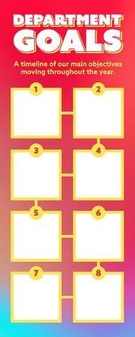
A timeline infographic can help when explaining the history of something or showcasing a timeline of events. You can use different fonts and icons to emphasise important dates or moments, which can make them useful displays for project timelines.
Process infographics.
Process infographics are best suited to display a step-by-step sequence. This makes them ideal for things like recipe cards, science posters and “how to” posts on social media.
The visual nature of infographics allows you to simplify each stage of the process and make it memorable and easy to follow.
Comparison infographics.
Just as the name suggests, comparison infographics are useful when comparing two or more options. Having a visual comparison can help with decision making, as you can see your options side-by-side. This makes it easier for users to compare and contrast.
List infographics.
List infographics are ideal for sharing a list of items, tips, resources, or examples. They’re simple to create and follow – and are much more visually appealing than a basic list consisting of words alone.
Hierarchical infographics.
This type of infographic is useful for prioritising information and showing links between different elements.
One of the most common hierarchical infographic examples is Maslow’s Hierarchy of Needs. The pyramid details humanity’s five essential needs, with the most important at the bottom (the largest area of the pyramid) and the least important at the top (the smallest part of the pyramid).
Infographic examples & templates.
Infographics can be used for brands and businesses or personal use. Maybe you want to highlight a new delivery process for your eCommerce brand on Instagram? Or you might want to make a funny infographic for your friends filled with key memories from the past year?
Whatever your reasoning for using infographics, these handy infographic examples can help get you started. Here are some of our favourites.
Climate change awareness.
Whether it’s eco-friendly changes your brand has made or key facts about climate change you’re presenting to the board, an infographic can help break down the key facts into clear takeaways. You can then build this into a webpage, presentation deck or post for social media.
Business process explainers.
Got a new internal way of working to share with your colleagues, or a new purchase process to share with customers? Infographics are the perfect way to outline each step of the process.
Just make sure you keep the wording simple so it’s easy to follow and use icons or imagery for a visual aid along the way. This will help to improve consistency and ensure everyone is on the same page.
Do I want a pizza?
Infographics don’t need to be reserved for the heavy stuff – they can be a fun way to add humour too. A humorous comparison chart or decision tree would stand out on a physical display and attract more attention to a shareable social media post.
Whether it’s pizza, shoes or a puppy, this type of comparison-based infographic could work a treat for most of life’s important decisions.
Medical guidance.
An infographic can help make important medical information easily digestible – like a guide to washing your hands. Breaking things down and making the most of text, imagery and colour can help to make the key information more memorable.
Resume.
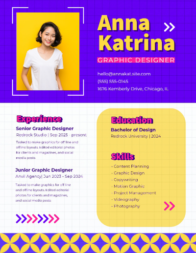
You can create a powerful resume with an infographic. Make use of symbols and colour to help your key skills stand out and catch the attention of prospective employers. Consider using charts or fact clouds to emphasise key information.
Not sure where to start? Our infographic templates can be a good starting point for making your own infographics.
How to make a good infographic with Adobe Express.
A good infographic needs to be bold, eye catching and clear. It needs to effectively communicate complex information in an easy to digest way.
Take a look at our top tips and guidance on how to make and use strong infographics for business, marketing, social media, education and more with Adobe Express.
1. Pick a shareable topic that suits your brand when making infographics for social.
Firstly, make sure that you pick a topic that suits your brand. It’s a bonus if this topic is easily sharable too, as you can use it to raise brand awareness. With Adobe Express, you can create an eye-catching social media post that can be shared across your consumer’s feeds.
2. Break down complex but important information.
Infographics can break down important, complicated information into easy-to-read chunks. A topic like climate change, for example, can be broken down into more manageable personal actions. Adobe Express can help you create posters and flyers to raise awareness of important information.
3. Choose topics that resonate with your target audience.
A good infographic is carefully thought out and resonates with your target audience. Think about the topics that are relevant to them and what they’re sharing, so that you can create a piece that’s relevant and popular.
4. Use visual aids to present your information.
A picture speaks a thousand words – so prioritise them over text! Pictures help to make infographics eye catching and engaging. The better the infographic looks, the more likely consumers are to notice it. Using symbols to break things down also helps to make the data more digestible.
5. Make it memorable.
It’s key to make your infographic as memorable as possible. Lean on images and short sections of copy to keep your infographic clear and catchy. You can also use brand logos and colour schemes to make your infographic instantly recognisable, so users know it’s from your brand.
Useful things to know.
What is an infographic poster?
An infographic poster contains text, symbols or images to tell a story. It presents information using visual aids to make it clear and easy to digest. Examples might include a poster explaining the steps involved in photosynthesis for your science classroom, or an infographic poster explaining your shop’s returns process behind the till. Creators should consider the use of colour, fonts and imagery to make the poster as eye-catching as possible.
What’s the difference between graphic and infographic?
The main difference between graphics and infographics is the use of text. An infographic tends to include some copy within the design, as it primarily aims to inform with visuals for support. But a graphic can often contain little or no text at all – relying purely on visuals to convey its message.
Can infographics include images?
Yes, infographics often feature imagery. Images help to tell the story of the infographic, and visually communicate information to the viewer. The more eye-catching and exciting the infographic is, the better. Images may also help make your infographic more memorable.


