Colour grading in Adobe Photoshop Lightroom.
Discover how to create cinematic images full of emotion and depth with this guide to colour grading in Adobe Lightroom.
Why is colour grading important in photography?
Colour is a compositional element in the structure of photography, just as much as the rule of thirds or perspective. It can be used to control the mood or feeling associated with your image, to draw the viewers’ attention to a certain subject and to convey meanings and associations. Whilst there are many ways you can directly control the colours in your photos - such as adjusting your lighting or carefully choosing the time of day - you can also adjust and perfect colours in Adobe Photoshop Lightroom.
Colour grading is important because it can give your photo a storytelling edge and instil mood and emotions. It’s what transforms a nice photo into a cinematic one, rendering it with emotion. You can colour gradient photos to have a cool tone, which can convey a sense of sadness, isolation or seriousness. Alternatively, you can colour gradient photos with warm tones to evoke a sense of joy, nostalgia and warmth..


The difference between colour correction and colour grading
Contrary to popular belief, colour correction and colour grading are not the same thing. Colour correction is the process of making your image appear accurate and true to the original scene. It can be used to correct for colour casts, for example, when photos are taken with an incorrect white balance or when they appear under or overexposed.
If colour correction is the process of ensuring consistency and accuracy to real life, then colour grading is all about stylisation and adding creative colour effects to create a specific look, feeling or mood.
With colour grading, you can elevate your photography into something more evocative and personalised.
A step-by-step guide to colour grading in Adobe Lightroom:
- Access the colour grading tool
- Use colour grading
- Adjusting Hue, Saturation and Luminance
- Use colour grading to enhance mood or atmosphere
- Save colour grading presets to increase efficiency.
1. How to access the colour grading tool
In Lightroom, select the photo you wish to edit from the Gallery Page and click the Edit icon in the editing tool bar on the right side of the screen. The Edit side-panel will extend out from the right-hand side with sections such as “Light”, “Colour” etc. In the Colour section, scroll down until you see a subsection called “Colour Grading”.
2. How to use colour grading:
In the Colour Grading section, you’ll see various attributes you can edit, including three wheels marked Midtones, Shadows, and Highlights.
Midtones, Shadows and Highlights refer to your image’s Luminance values. Luminance is the light, medium or dark parts of your photo. In essence, each of these wheels affects the colour balance of the relevant luminous sections of your photos
You will see smaller open grey circles within each Colour Wheel. These circles are positioned in the white centre of each colour wheel before any adjustments are made. You can pull these circles in different directions of the wheel, which will affect the colour balance within that range of luminance values.
For example, pushing the cursor in the Midtone circle towards the blue hues injects more blue into the middle/grey values of the photo. Similarly, pushing the Highlights towards an orange or red tone will add a rose-y tint to the bright values. To refine only the Saturation, drag the circle within the wheel. To refine only the Hue, drag the circle on the edge of the colour wheel. If you want to remove your edits, position the cursor over the name of the colour wheel (the name will have to “Reset xxx”) and click.

To view each of the colour wheels larger and/or to enter numeric values for Hue and Saturation, click the individual circle icons. Additionally, you can select Global editing which will add a colour tint to the entire image, regardless of the luminosity.

As well as the colour wheel, there are three additional sliders.
The Luminance slider controls the brightness of the relevant wheel.
The Blending slider controls the amount of overlap between the tints assigned to the shadows, midtones and highlights. With blending set to 0, there is a small amount of overlap to avoid abrupt transitions, but each colour should remain “pure”. With the slider set to 100%, the colour tints will overlap (crossover) and create additional colours between shadow/midtones and highlights
Use the Balance slider to shift the range of values that define the shadows/midtones/highlights. For example, if you apply a blue tint to the shadows and want that tint to extend further into the midtones/highlights, move the Balance slider to the left. If you apply a yellow tint to the highlights and want that tint to extend further into the midtones/shadows, move the Balance slider to the right.
3. Hue, Saturation and Luminance

Above the Colour Grading section is the Colour Mixer section. Within this, rather than editing attributes of the photo by their luminance values (shadows, midtones and highlights), you can edit by individual colour ranges on the spectrum.
For example, you can edit the Hue for the relevant colour - in the below photo, selecting the purple icon and pushing the Hue slider towards the left will shift the purple colours towards blue in the photograph.

You can also alter the Saturation to change the intensity of the specific colour and the Luminance to make the selected colour range lighter or darker.
4. Using colour grading to enhance mood or atmosphere
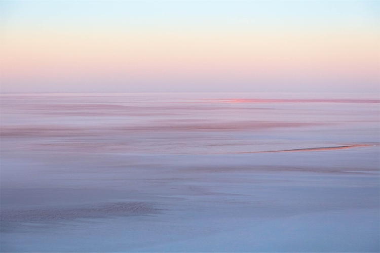
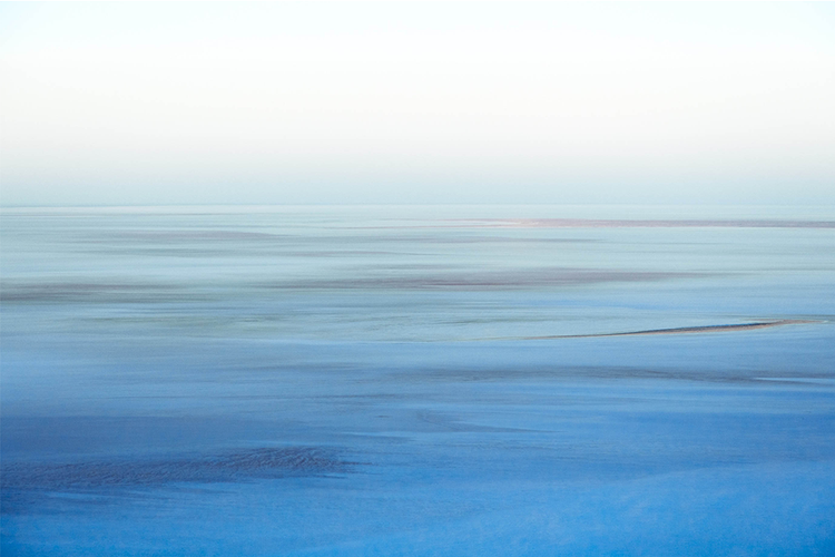
Colour grading can completely change the feeling of a photo. For example, in the below image, you can transform a sunrise with rich, warm colours into an icy, arctic scene that feels desolate and cold.
To do that, pull all the red, purple and yellow into colder hues, altering the saturation and luminance to remove colour from the photo or to darken or lighten the specific colour ranges within the photo. In this example, it has the effect of making the sky appear more like a white hazy fog.

5. Saving colour grading presets to increase efficiency.
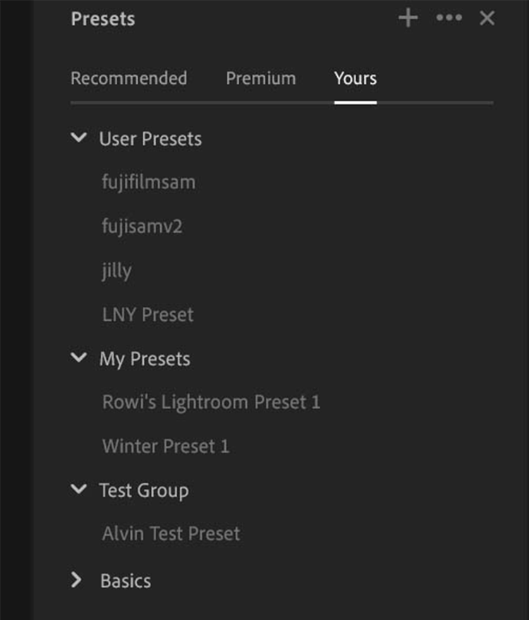
If you want to apply a particular colour gradient to a whole series of photos to create a cohesive look, you can save your edits as a Preset. Firstly, click the Presets icon on the top right corner of the Edit panel.

Click the Plus icon to create your own preset. A dialogue box will popup, where you can edit the name of your preset and which Group it will sit in. Then, check the settings that you want to include in the preset. Press save, then when you navigate to the Yours section of the Preset panel, your new Preset will be available for easy application.


Do more with Adobe Photoshop Lightroom
For more Lightroom tutorials, visit the Adobe Photography Explore page.
Take your photo editing to the next level. Discover Adobe's principal evangelist, Julieanne Kost’s other image editing guides, including how to edit specific parts of an image, how to use presets and how to make light adjustments in Adobe Lightroom.