Picking the right font: Serif vs. sans serif.
Designers have thousands of typefaces to choose from, and step one is choosing between fonts that have serifs and fonts that don’t. Explore how this stylistic choice has a big impact.
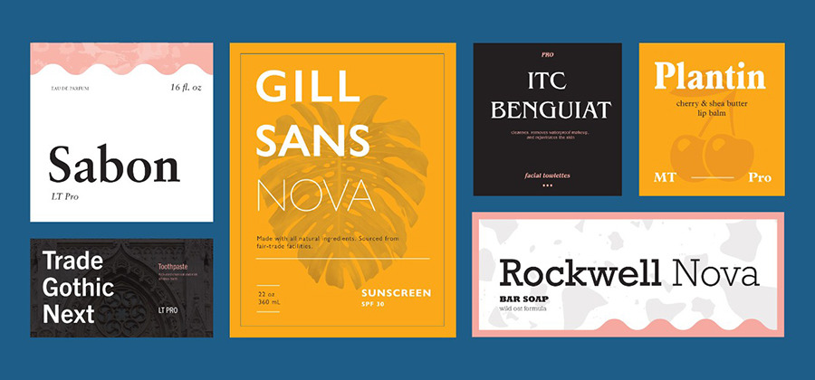
The choice between serif or sans serif fonts.
“Typography is basically word art,” says designer Dylan Todd. “When you are designing with type, the typeface you choose tells a story.”
Typefaces tell you a lot about what you’re viewing. Type in a logo, for instance, can clue you into a company’s history and the attitude it’s trying to convey. Type in advertisements can subtly indicate the kind of audience an ad is trying to reach, and type on book covers and movie posters can indicate genre. It’s not easy to find the right font for a particular project, but one way to begin the process is to decide whether a serif or sans serif typeface is more appropriate.
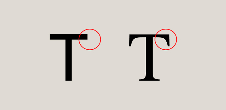
What are serifs?
Serifs are the small lines attached to letters. Their origins are a mystery; one theory suggests they arose when scribes using brushes or quills left small marks with the writing implement as they finished each stroke. This evolved into deliberately adding smaller strokes in more regular, artful ways, and those decorative strokes became an expected part of the letters.
Learn more about fonts.
Looking for a crash course? Study the basics of type with this guide to understanding and using fonts.
When to use serif fonts.
Serif fonts can look authoritative, professional, and suggest the weight of history or experience. Serif typefaces like Times New Roman are suggestive of typewriters’ old style — The New York Times and other reputable institutions that have existed for over a century still use this font. “They feel a little bit more old-timey,” says designer Madeline DeCotes.
“Serif fonts can have a more clinical and institutional look to them,” says Todd, who uses serif fonts to evoke earlier eras. When working on book design for a story set during World War II, Todd used serif fonts to give readers the feeling they were in a world that existed prior to modern design conventions.
Serifs aren’t just aesthetic, though. They also have real functional value as body copy. “Serifs often lend a bit more legibility at smaller scales,” says DeCotes. “When you’re reading a 9.5 font in a printed book, serifs help you distinguish the letterforms and create flow as you’re reading.”

Explore the basics of kerning.
It’s not just what letters you use. How you space them matters. Learn the basics of kerning with this guide to Adobe Illustrator.
When to use sans serif fonts.
While some older writing is serif-free, such as Norse runes, sans serif fonts are mostly associated with modern typefaces. In 1928, Futura became one of the first popular sans serif fonts and other typefaces like Helvetica soon followed.
Sans serif typefaces were controversial when they first appeared and were sometimes called “grotesque” typefaces. But when modernist designers like the Bauhaus movement embraced sans serif typefaces, they became associated with cutting-edge design, commerce, and modernism’s attempt to break with the past.

That association still holds; for example, Todd uses sans serif for a comic book set in a contemporary, cosmopolitan, and fashion-oriented Los Angeles. However, sans serif typefaces can also evoke today’s handwriting, which is missing the extra strokes that were a product of the brush or quill. “The conventional wisdom is that sans serif fonts are supposed to mimic handwriting, which has more of a flow to it,” says Todd.
Sans serif fonts also work well where there’s very little room for copy. Signs, text in apps, and names on maps tend to be sans serif. (There are exceptions, of course. Some sans serif font families, like Arial, are meant to work as body copy — text that goes on for more than a sentence or two.)
“If you’re building an app or designing a site, sans serifs are generally the way to go,” says DeCotes, because legibility is a concern on screens that are small or have lower resolutions. She adds, “Sans serifs are for wayfinding or signage applications.” One of the most recognized fonts in the United States, Clearview, is a sans serif font. It was specifically designed for highway signs. Drivers needed to read a small amount of type from a long distance away and, in that instance, sans serif fit the bill.
Find out how to use font combos with designs that make the most of different fonts and font families with this article from Adobe Create magazine.
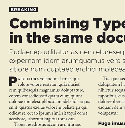
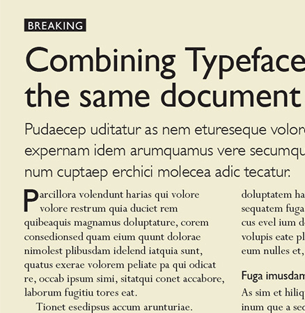
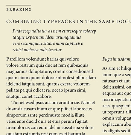
Ultimately, finding the right font is about balancing whether it will be used in body text, the user experience you want, and the attitude you’re trying to convey. There’s a time and place for both serif and sans serif, and knowing when to make the call between them is a key skill for any designer.
Contributors
You might also be interested in…
Learn about the versatility of this file format and discover how to use it in your design work.
Take your skills to the next level with drawing exercises and advice from professional illustrators.
Explore inspiration to help fuel your logo ideas.
Dive into the technical and aesthetic concerns of distilling a brand into a symbol.
Learn about kerning and how to use it to improve your typography.
Get Adobe InDesign.
Craft elegant page layouts for print and digital media.
7 days free, then ฿876.33/mo.

