By Matt Rae
Dec 22, 2020 ·
4 min read

G
etting started on your first web design project in Adobe XD is simple and easy. With a number of preconfigured artboard templates to choose from, you can hit the ground running, designing experiences for screens of various sizes.
Getting started
Creating your first artboard is as simple as selecting the preset you wish to use from the welcome screen. These presets get you started quickly, but can be changed to any dimensions you’d like.
Since Adobe XD is built from the ground up for experience design, you’re not limited to a single artboard. Create as many artboards, of varying sizes, as you need to, and position them on your canvas in an organization that works for your workflow.
At any time you can create a new artboard with the artboard tool on the left panel, or by copy and pasting an existing artboard. Dimensions can be changed by clicking and dragging on the artboard, or by using the dimensions inputs in the property inspector on the right.
Finding alignment
Guides
To ensure elements in the design remain aligned, XD provides a few different types of guides. As you drag elements around the canvas or artboard, you will notice the ‘smart guides’, or pink lines that appear relative to other elements on the screen. These relative guides help you align objects, and provide distance measurements between the selected element, and those around it.
Fixed horizontal and vertical guides can also be applied artboard to artboard by hovering just off the edge of the artboard, to the top, or left, and dragging in guides. Numbers at the top of the artboard indicate distance from the edges, to ensure precise positioning. As elements are moved around the canvas, their edges will snap to these guides allowing you to place them exactly where you need them.
Grids
Guides are great for working on the fly, or having simple guidelines on your artboards like defining margins. However, when you’re working with intensive layouts, you will likely want something more fixed.
Adobe XD has both Layout (column) and Square (graph paper) grid options available for your layout needs. The layout grid provides a column overlay on artboards, great for working with responsive web, or email layout applications. The number of columns, width, and color are all customizable to fit your needs. As the artboard is resized, the columns also adapt accordingly.
The Square grid option creates a graph paper like overlay on the artboard, allowing you to define the size of the squares based on the parameters you’re working with. With the square grid enabled, keyboard commands like Shift + L/R Arrow Keys will move in grid increments rather than the default 10px increments. Resizing with Shift + CMD + L/R Arrow keys works the same way. As with the guides above, both Layout and Square grids allow elements to be snapped to ensure accurate layout positioning.
Building the layout
Web designs come in all shapes and sizes, from multi-paned web apps, to spacious mobile-first websites, and fixed-width to full-width. Considering a layout that will adapt to various screens and devices is important when creating your design. Thankfully with features like Content Aware Layout, and Responsive Resize, Adobe XD can help you craft, and explore, the layout that is right for you.
Quick Mockups
If you’re really stumped on where to begin, the Quick Mockup plugin by Adobe can get you off to a running start with pre-built layout templates to choose from, and spark your imagination. Simply click on the template from the plugin panel, and watch it build on the page in front of you. Pull in your own copy and imagery, and you’re well on your way to creating an incredible design. Install the Quick Mockup plugin and try it for yourself.
Reordering with Stacks
As your page design evolves, there is a good chance that the layout may change and adapt with it. Traditionally, reordering sections of a web design can be tedious, you have to make sure everything is selected, move it out of the way, move in the other section, and then move the original content into its new home. You shouldn’t have to play Tetris with your web design.
Stacks streamlines layout iterations by making reordering of content as simple as clicking and dragging a group, and dropping it where it needs to go. Adobe XD handles all the content shuffling for you to ensure nothing is missed. Discover the possibilities with Stacks in Adobe XD.
Stay consistent with padding
If you’re building out your design in sections, leveraging Padding can help you maintain consistency in spacing between the section content and the borders. With Padding enabled, as content changes, or is moved around, the padding remains consistent, saving time and energy that would have been spent on ensuring pixel perfect alignment.
A great application of Padding is with buttons. If you’re reusing a button component, or group, it is likely that the button label (or text) is changing for different calls to action. Rather than adjusting the button every time the text label changes, enable padding, and let XD handle that for you.
To enable padding, select the group you wish to enable it for, then toggle on the ‘Padding’ option in the Layout section of the property inspector. XD will automatically assign the values based on the current configuration, but these can be adjusted by entering in values, or by holding the ‘~’ key and dragging to resize directly on the element.
Crafting interactions
With the layout built, creating interactions, and links between pages will help bring the design to life. The built in Prototype mode in Adobe XD, makes moving from design to prototype seamless.
Anchor links
If you’re working on a landing page for the web, or creating a single page scrolling layout, it’s likely that you’re making use of anchor links in the web implementation. With support for Anchor links in Adobe XD, the same ‘Scroll To’ effect can be prototyped by selecting ‘Scroll To’ as the action, and dragging the blue arrow to the group, or element you wish to scroll to.
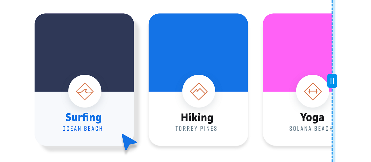
Fine-tuning the scroll positioning is as simple as clicking and dragging the lightning bolt handle to the exact y-offset you wish to use.
Hover states
Generating micro-interactions like hover states is easy to do with Component States. States allow these interactions to be built onto reusable components like buttons, and reduce the number of artboards needed to create rich experiences.
To create a hover state, select the component you wish to use, and then click the ‘+’ next to ‘Default State’ in the top right corner. It is best to do this on the Main Component so that interactions apply to all instances. With the ‘+’ clicked, select ‘Hover State’ - the lightning bolt indicates this state is pre-prototyped for you. Then simply adjust the parameters and style of the element for how it should look when hovered. Set the state back to default, and click preview to interact with the new state.
Auto-Animate
Micro-interactions like page loads, expanding menus, and sliders are all made possible inside Adobe XD with Auto-Animate. It works by animating elements between artboards or states, creating smooth transitions between different sizes, positions, and more.
Used in conjunction with component states, Auto-Animate is a great way to create selected menu states, dropdown menus, or accordions for FAQ sections. The possibilities are endless for your web design project.
Feedback and handoff
As you work through your design, sharing your progress and gathering feedback is a click away in the Share tab. With several preconfigured share modes in Adobe XD, you can generate a share link in seconds to gather feedback, test your designs with your audience, present a concept, or handoff to development.
Sharing for review
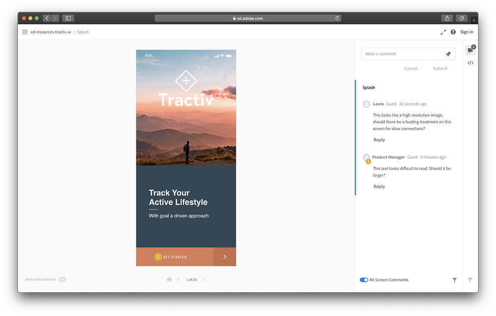
Gather feedback quickly, and asynchronously using the Design Review view setting. This view provides login-free access (unless permissions are set otherwise) so anyone with the link can see your prototype and leave comments and questions on the design.
This mode helps streamline design reviews, and helps you gather in-context feedback to take your design to the next level. Learn more about gathering feedback in Adobe XD.

Handoff to development teams
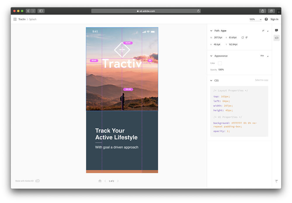
When it comes time to handoff design documentation to development teams, have no fear. The Development mode in XD saves the hassle of red-lining screenshots of your design, and drafting separate documentation. With integrated Spec modes, and variable definitions, the development share mode makes it easy to provide development teams with the information they need. Learn more about collaborating with development teams in Adobe XD.

From setting up precise layouts with guides, grids and stacks, to creating rich interactions with Auto-Animate, Adobe XD provides the tools you need to create and share amazing web experiences.


Related content
