Try these tutorials with Illustrator
Create illustrations and other graphics with vectors.
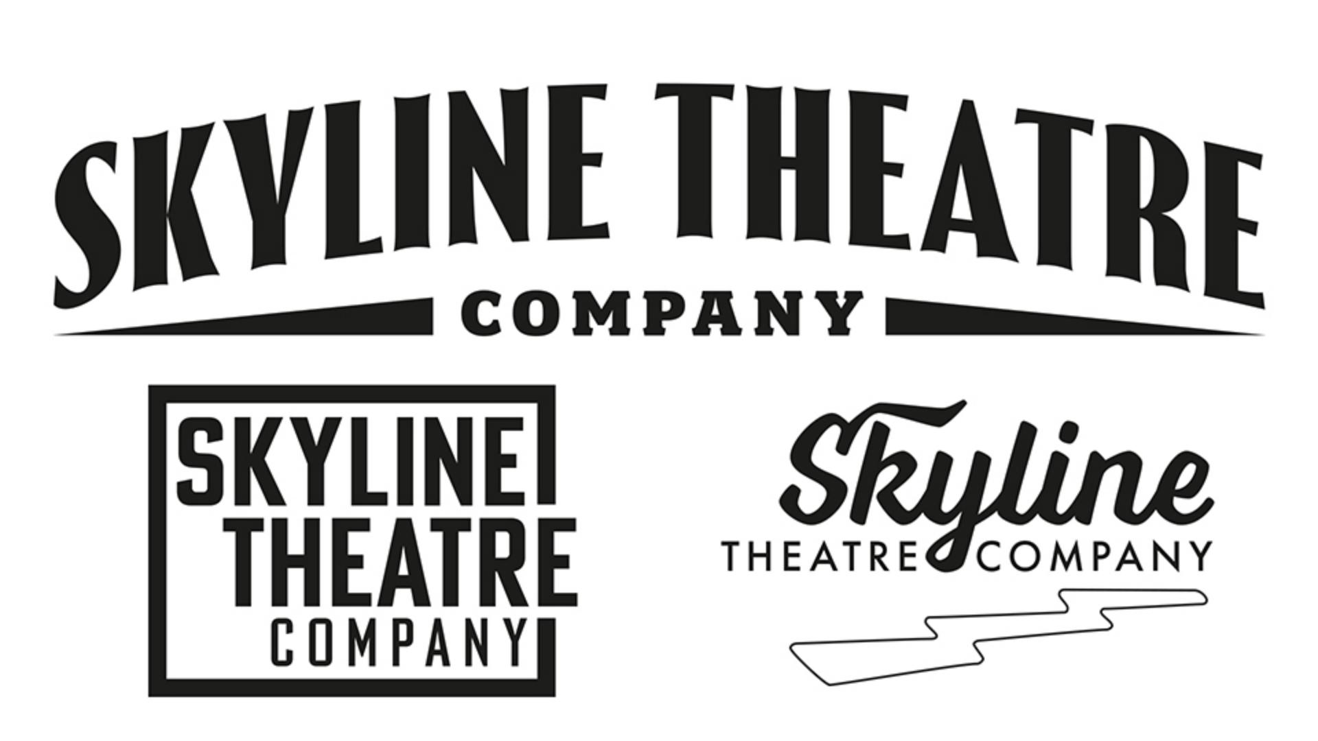
Choose the right font, refine spacing, and tweak alignment to craft three polished logo variations.
Choose fonts and refine spacing
The right typeface defines your logo’s personality. Choose one that’s bold, classic, or distinct, like an Art Deco style. Then fine-tune letter and line spacing with precise numerical adjustments and visual refinements to create a balanced, polished look.
Arrange and align text
Text arrangement shapes the logo’s impact. Stack words for boldness, stagger text for movement, or center everything for structure. Adjust justification and alignment to create dynamic, well-balanced logo lockups.
Add stylish details
Typography is more than just letters — it’s an art form! Use ornaments as graphic elements, frame the design, or experiment with decorative styles like arched text or Art Deco details to bring each variation to life.