Design YouTube thumbnails that make a great first impression.
A custom thumbnail image can make all the difference when it comes to who sees your YouTube video. Get tips on how to make your thumbnail stand out.
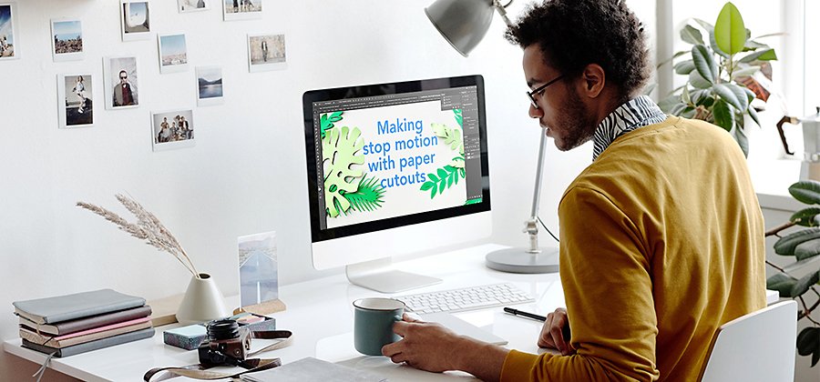
What is a YouTube video thumbnail?
YouTube thumbnails are the static preview images you see for videos as you scroll through your homepage or search results. When you create a YouTube video, you’ll have the option to choose a thumbnail that the platform automatically generates from your footage or upload your own custom thumbnail design.
Many seasoned YouTubers opt for custom thumbnails. This gives them more control over what they convey through the image. The thumbnail is a big opportunity to win someone over as they explore YouTube, so it’s important to make it count.
Custom YouTube thumbnails can be crucial for clicks.
“A thumbnail is basically your billboard for your video,” says YouTuber Brad Rodriguez. “People put all this time into their video, hours and hours. And then they’ll spend 10 minutes on the thumbnail. They should really spend hours on the thumbnail as well. Because you don’t get viewers until you get clicks. So thumbnails and titles are the most important thing.”
Tips for “scroll-stopping” thumbnails.
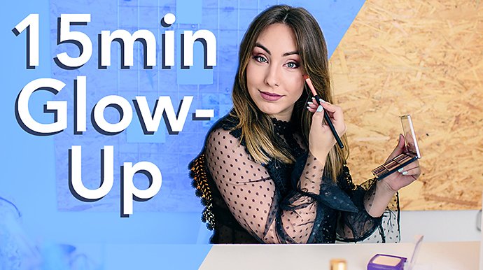
If you want to establish a YouTube channel with a large following, a clickable thumbnail is essential. Functionally, it should give viewers a peek into what the video is about but not reveal everything. Build some curiosity or intrigue that only your video can satisfy, and the clicks will follow.
Aside from an intro to the content of your video, your thumbnail should be a showcase of design elements that are eye-catching at a small scale, like high-contrast overlays of text or color. These are easy design elements to master, even for non-designers.
Whether it’s a still from the video or a photo you took at your shoot, your thumbnail will seem more authentic if you use your own images, rather than stock photos. And don’t be afraid to get playful. “The big rule on thumbnails is there are no rules,” says Rodriguez.
Clicks are not the only thing important to the YouTube algorithm. Length of engagement is also crucial. Avoid putting misleading images in your thumbnail just for the clicks. Create an image that’s true to your content, and be sure to satisfy the viewer’s curiosity a few seconds into the video so they stick around. If you consistently give viewers what they came for, you can convert them into subscribers.
See what types of thumbnails other people in your same industry use, and decide whether you’d like to go with the flow or stand out with something different. Create a few different thumbnails and show them to your friends. See which ones they prefer.
You can change the thumbnail of your video even after it’s been posted. If a video hasn’t performed well, change the thumbnail to see if that helps with the click rate. Then keep an eye on the performance. You can change the thumbnail as many times as you want.
Make your own YouTube thumbnail templates, and it will be easy to batch out new ones. If you’ve found a few thumbnail designs that work well for your style of content, save the files to work from each time you need a new one.
How to make your video thumbnail.
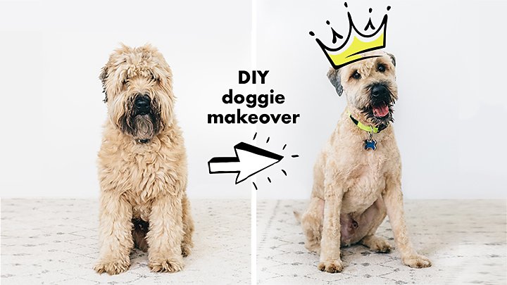
Ideate on your thumbnail early in the video-making process. A photograph can look better than a video screenshot, but it takes some prep work. For example, if you plan to do a transformational video and want to use before and after photos in your thumbnail, be sure to capture them before and during the process. Once the project’s done, you can’t go back.
YouTube thumbnail size and file specifications.
Your image should:
- Ideally be sized at 1280x720 (or at least a minimum width of 640 pixels).
- Be saved in the JPG, PNG, or GIF image formats and be below 2MB in file size.
- Keep the bottom right corner clear. The timestamp will show up here.
- Use the 16:9 aspect ratio.
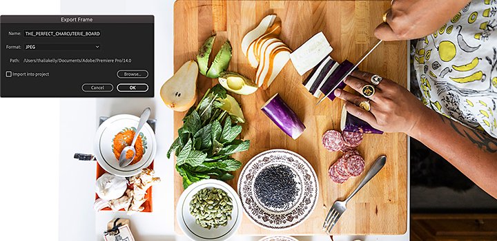
Export a still image from a video in Adobe Premiere Pro.
To use a still from your video as your thumbnail, follow the steps below to quickly pull a frame and save it as an image. This will give you a more precise and high-quality thumbnail than a computer screenshot would.
1. Find it: Drag your time indicator so your desired frame is in the playback window.
2. Hide layers: Hide any layers you don’t want in your image, such as text.
3. Capture it: Click the small camera icon at the bottom right of the playback window.
4. Export it: Choose your file type and click Export.
Edit your image in Adobe Photoshop.
Once you have your image to work with, it’s time to pull it into Photoshop and add photo presets or text and graphic overlays. Remember to keep it simple. A busy image won’t read well at the size of a thumbnail. “What I’ve found that works is more contrast and less clutter,” says Rodriguez.
Any image you upload will automatically be sized down to 1280x720 pixels, so it’s best to resize your image to these dimensions before you edit. This will give you a better idea of how your designs will look at scale. If you work with your image enlarged or zoomed in, you may be tempted to add too much to the design.

Add your branding.
While standing out on the feed is important, you may also want to build a consistent brand presence on your channel’s homepage. Accomplish this with a repeated and recognizable style. Perhaps your logo is always in the bottom left and you use a text overlay in the same font each time.
However, too many branded elements can be bad, warns Rodriguez. “Don’t let your branding overpower what you want people to see,” he says. “Because people who are not subscribers yet don’t care about branding.”
Practice makes perfect.
Use digital design tools to make a YouTube thumbnail in this Photoshop tutorial. Then try your own design and see how it affects the performance of your video.
“The most important thing is click-through rate, because that will tell you if you have a good thumbnail. Don’t worry so much about what a good number is, but compete against yourself. It will become very clear what resonates.” says Rodriguez.
“Basically you want to drive emotion. You want somebody to be intrigued. You want them to be surprised. You might even want them to be angry,” he says. “You’re trying to get an emotion out of somebody so they’ll want to see your video.”
Contributor
Do more with Adobe Premiere Pro.
Make visually stunning videos virtually anywhere — for film, TV, and web.
You might also be interested in…
Educate and inform with explainer videos.
Find out what goes into a good explainer video and how to effectively educate your audience.
Share your smarts with educational videos.
Learn how to make educational videos to help beginners tackle new skills.
Introduction to video editing.
Learn the principles of video editing and practical tips for both big and small screens.
Learn the basics to help you break into this popular audio medium.
Get Adobe Creative Cloud All Apps
20+ creative apps including Premier Pro, Premiere Rush, and Photoshop.
7 days free, then RM278.64/mo.


