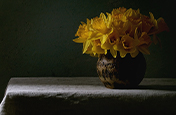
Learn the key components to minimalist photography.
Like other forms of minimalist art, minimalist photography is about stripping a subject down to its essence. Create photos that cut through the clutter with clean lines, empty spaces and only the essential elements.
Keep it simple.
Every time you take a photograph, you make choices about how much context to include around your subject. If you’re drawn to stark backgrounds, fields of white space or geometric shapes, you may be a minimalist photographer.
Minimalist photography grew out of the extreme abstract painting and sculpture of late 20th-century artists. With simple geometric patterns, strong lines or painted colour fields, minimalist artists made work that didn’t refer to anything in the real world but stood only for itself. Minimalist photographers adopted this stress on simplicity and limited compositional elements and they applied these principles to what they saw in the real world.
To make your own minimalist images, you have to be confident that the scenes that appeal to you will also appeal to others. “It’s about focusing the viewer’s eye on a singular object or subject and eliminating white noise,” says photographer Aleks Baharlo. “I’ve learnt over the years to trust my instinct and just go for it, but it’s a fearful thing to make the one subject in the entire frame occupy less than five per cent of the frame while everything else is white.”

Focus on your subject.
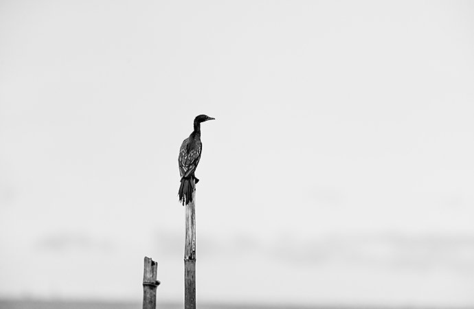
Because minimalist photography tends to be stark, the subject of every photo takes on even greater importance than in other styles of photography. Without other figures or compositional elements in the foreground or background, the subject has to grab the audience’s attention. “The subject matter better be interesting or a minimalistic photo becomes a simplistic photo,” Baharlo says. By isolating an interesting subject, you give the audience space to use their imagination to tell their own story.
Pay attention to composition.
Without background noise, the elements you include in the frame and the angles at which you capture them become even more important. To draw the viewer’s focus to your subject, compose your photo carefully in your viewfinder. Ask yourself if everything in the frame is essential. “Take an element away and see how you like it,” suggests photographer Nicole Morrison. “Does it feel more balanced? Does it feel like your attention is going where you want it to go?” You can do this over and over again, moving the camera or changing your position until only the bare essentials remain.
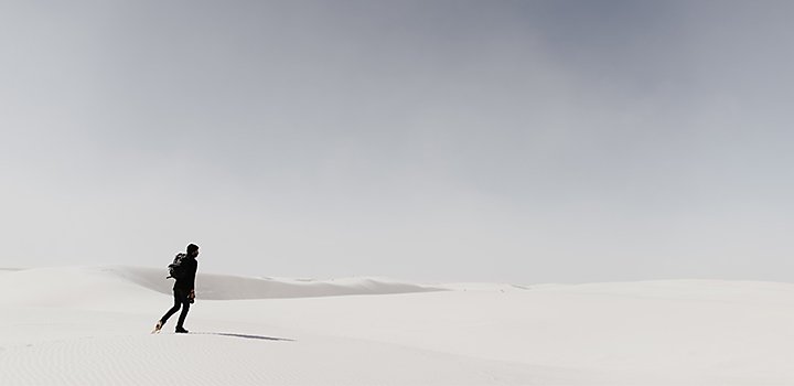
Remember the rule of thirds. This is more of a guideline than a rule, but it may be helpful to divide your photo into a grid of three horizontal lines by three vertical lines and to move the frame until your subject or other elements sit at the intersections of those lines. “I usually use the rule of thirds to know where to put a subject,” Morrison says. “But you learn the rules and then you figure out which ones you like, which ones to push and which to completely ignore. I’ll look at the guidelines, but usually I’m just asking myself if it feels right to me.”
Baharlo has no problem breaking the rule of thirds. “My photography is often a lot of contrasting lines: a horizontal horizon, vertical subject matter,” he says. “Either everything in the frame is vertical, everything in the frame is horizontal or it’s a contrast of the two.” Experiment with each photo to see what works best with each particular subject.
Decrease depth of field.
With a shallow depth of field, you can keep the viewer’s attention on the subject by blurring the background. “I use a shallower depth of field, so the subject matter is in focus and everything in the background is completely blurry,” Baharlo says. You can achieve this by widening the aperture, which lets more light into the camera’s sensor or you can increase the distance between the camera and the subject and then zoom in on the subject. This will result in a blurrier background. If there are lights behind your subject, a shorter depth of field can create a bokeh effect, turning points of light into blurred circles.
Experiment with different exposures.
Widening the aperture isn’t the only way to increase the light that reaches the camera’s sensor. You can also slow down the shutter speed to create a higher exposure or a more light-filled photo. A higher exposure can turn a cloudy sky into a field of white. “Most of my photographs have a lot of negative space in white, which accentuates the grey or darkly coloured subject matter,” Baharlo says. He recommends bracketing, taking a picture at the proper exposure, then taking one at a much higher exposure and another at a much lower exposure. These variations give you more options when you edit the photo.
Find minimalist shots everywhere.
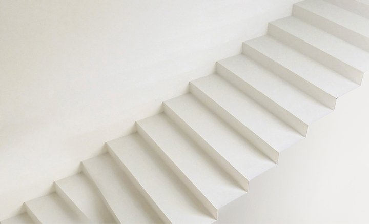
To make minimalist landscape photos, quieter settings tend to work best. “It’s very difficult in an urban environment to take a lot of minimalistic photography, but desert, beach or mountains tend to be more friendly to minimalistic photography,” Baharlo says.
Even if you live in a crowded city, you can find minimalist subject matter. There are blue skies, blank walls, stretches of concrete or fields of grass in parks. “Keep your eyes open in your everyday life,” says Morrison. “I did a shoot in my neighborhood and after I made the conscious effort to pay attention to what was around me, I saw backdrops all over the place.”
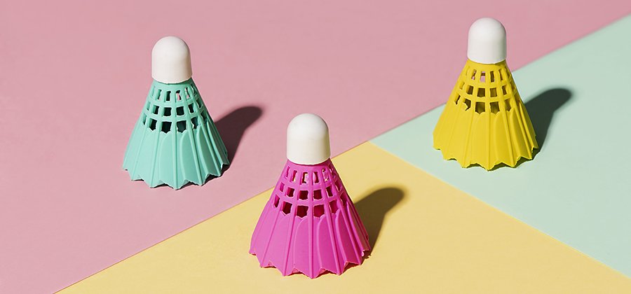
You don’t even have to leave the house to get good photos. For much of her product photography, Morrison uses her flat as her studio and coloured paper for her backgrounds. With proper lighting, you can create dramatic shadows.
Use colour with intention.
Colour may be one of the elements you decide is unnecessary for your photographs. Some minimalist photographers see it as a distraction from their focus on form, but you might just as easily find colour an essential part of your minimalist photo. Most of Baharlo’s photos are in black and white. “But,” he says, “there are instances where the colour augments the photograph or the subject matter. Let’s say I photograph a flower with a lot of negative space and the only focus is the flower. If the colour isn’t distracting from the subject, I’ll include it.”

Take minimalism into product photography.
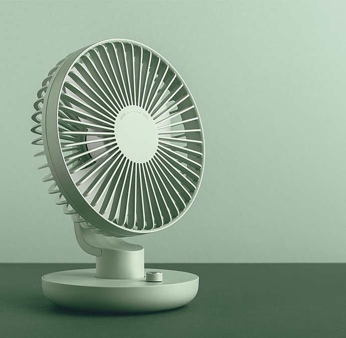
Minimalism works well for product photography. The trick is to draw the viewer’s eye to the product while still composing an interesting photograph. Morrison looks for colours that complement the brand or she takes products out of their usual element. “You might see something like a shoe by itself in front of a cement wall and there's something interesting about the contrasting textures of soft shoe and hard wall. The difference between those two things can really highlight certain qualities of a product.”
With few compositional elements in a product photo, angle becomes very important. Photographers often showcase products with flatlays or shots taken from a bird’s-eye view. “I’m also seeing a lot more three-quarters above shots,” Morrison says. These are shots halfway between overhead and eye level.”
You can also play with lighting to add drama to your minimalist product photography. “Long, exaggerated shadows or mysterious shadows from something off camera are becoming more popular,” says Morrison.
Give yourself homework.
Constraints are known to increase creativity, so don’t be afraid to give yourself limitations or embrace the ones you’re already working with. “Give yourself random assignments,” Morrison says. “Reverse engineer work that appeals to you.” She also recommends using things you have around the house to see what you can make with it. From artfully scattered tea leaves to drops of oil on paper, the simplest elements can produce beautiful images. “I pulled tea out of my cabinet, took a picture of it and then made tea with it,” Morrison says. Just use what you have and play.
Edit with a light touch.
You’ll find more room for experimentation when you edit your photos after the shoot. Baharlo edits in a minimalist style. “To me, the editing tool is really fine-tuning the photograph,” he says. “I use simple things. Turn colour pictures into black and white and exaggerate the contrast between the subject matter and the negative space.”
With Adobe Photoshop Lightroom, you can make those small adjustments to contrast, highlights and shadows, but you can also make big changes, like removing an object you don’t want in the photo. Explore the post-processing tools or try a tutorial and make the most of your minimalist photos.
Contributors
Do more with Adobe Photoshop Lightroom.
Edit photos easily with Lightroom presets, Super Resolution, easily share photos from any device and access your projects anywhere with cloud photo storage management.
You might also be interested in…
Building a great landscape photo.
Explore ways to artistically capture scenic views with tips on landscape photography.
The art of still life photography
Improve your composition skills by learning the art of still life photography.
Creating great portrait photography.
Take a step closer to perfect portraits with tips and advice from professional photographers.
Crafting narratives with street photography.
Embrace this form of candid storytelling and start capturing snapshots of everyday life.

