With vintage logo design, everything old is new again.
A retro logo can say a lot about where a company came from, its values and attitudes or what time period it’s trying to emulate. Learn how you can make a unique logo with a classic look.
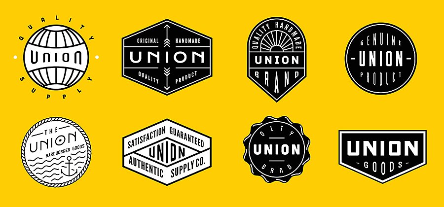
The emotional power of retro design.
Graphic design has the power to instantly conjure up a specific time period. A complex monogram can look like something from before 1900. Weathered, stenciled lettering is characteristic of the early 20th century. Psychedelic colours call to mind the sixties, whereas bubble letters look like seventies signage and pixel art taps into memories of the eighties and nineties. Vintage logos and retro design are often nostalgic and inspirational and a clever, creative vintage logo can make a company seem original and like something from another era all at once.
There are two types of vintage logos: Those based on older, existing business logos that really do come from a retro era and new logos meant to evoke previous time periods. Here’s what you need to consider when pulling an old logo into the present or creating a new logo that evokes a different time.
How to update an existing vintage logo.
A vintage logo can reflect a company’s longevity and solid roots, a benefit that many heritage companies are able to capitalise on. “Some companies are more concerned with tradition, like a family business with a long history,” says designer Sarah Giffrow. “They’re interested in communicating their decades of experience.”
Bringing an old logo into the present usually involves simplifying complex vintage design elements. Logos from the late 1800s and early 1900s often featured details like coats of arms, scrollwork and intricate typography that cannot be scaled down easily for items like stationary or merchandise.
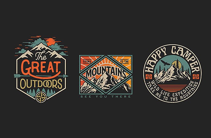
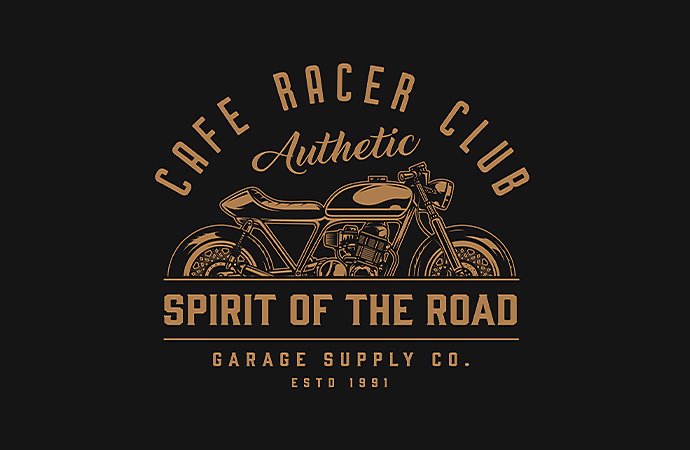
To update existing vintage logos, you must identify the necessary elements of the older logo and reimagine those logo elements within current design needs, like infinitely scalable vector images. When done skillfully, an updated vintage logo represents history and experience but also conveys that an organisation is relevant and with the times.
“It’s about simplifying an idea from the company’s past,” says Giffrow. She specifically calls out the IBM logo, a symbol that went from being very busy to its current incarnation as three clear letters. Over time, the logo became simpler but simultaneously more recognisable.
Sometimes a company will want to use older logos to highlight how long they’ve been around. If an organisation is celebrating a big anniversary, for instance, bringing back the original logo and putting it on celebratory merchandise can be a good way to stoke nostalgia and highlight the company’s brand story from the past.
For older logos that include intricate graphic design elements, ensure that they’re in a setting where those elements are all clear and visible. Hand-lettering and older forms of typography can get lost in the visual shuffle. Logos should always let the viewer sense what your brand is about without making them squint.
Tips for contemporary vintage style logos.
Some vintage logos aren’t old at all, but they want to call to mind a specific era. A barbershop might want to capture the feel of an early 20th-century tonsorial parlour or a record store might want to look like it’s straight out of 1967. To do that, a logo maker has to dive into the design trends and conventions of the time period they want to evoke. As much as possible, examine publications and artefacts that you want to emulate for design inspiration. Simply making a logo look weathered is not enough. “A lot of people will make it look worn,” says designer Ashley Lippard, “but that’s just an add-on.”
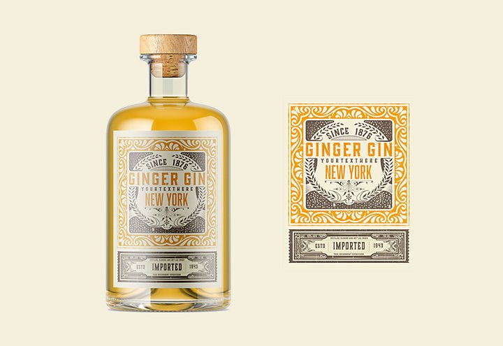
To truly call to mind a long-gone era, familiarise yourself with the printing and replication technology available at the time. Media from the past wasn’t as crisp or consistent as it is now. Vintage colours were less vivid and well defined than what modern printers produce and line registration and other details were often less precise.
“If you want an Americana feel,” says Lippard, referencing early 20th-century American design, “there’s a dirtiness to it. Use creams and strs. There’s texture.” Colours in the latter part of the 1800s and early 1900s were seldom clear. “Take pure red and add some black to it,” says Lippard. “That’s very Americana. Their printing wasn’t as good as ours, so it’s not as clean. Nothing was slick back then.”
However, bear in mind that your vintage logo still needs to function in the 21st century. Logos have to be legible, they need to scale up and down and they must look good in grayscale, colour and black and white. A logo might look like something straight out of the heyday of disco, but it needs to do real work in the digital age. “Look at what seventies t-shirts were doing,” says Lippard. “Pull from that, but don’t copy it.” Drawing on older trends doesn’t mean simply replicating the kind of work graphic designers were doing in previous decades.

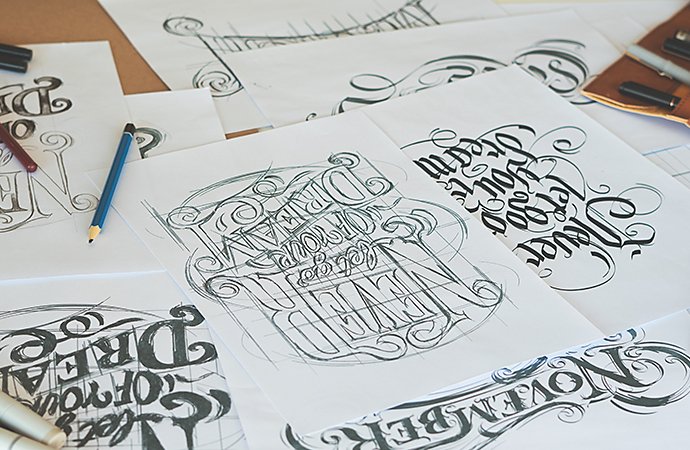
Make your own vintage logos.
A vintage logo might look like a screen-printed piece of analogue art from an earlier decade, but it’s still going to be a vector file you put on business cards and coffee mugs. Making something that looks like the past but works in the present means that a logo designer has to do the same thing for a vintage logo as for any other project: Get to know the client, their industry and what works now. “The big challenge is to create something that recalls a vintage era but in a way that doesn’t look dated,” says Giffrow.
A good way to do this is to look at the field your company is in, and play to the contemporary design trends in that sector. “The industry they’re working in will help to narrow it down,” says Giffrow. “Certain colour palettes will not fly in certain industries.” Tech companies, for instance, tend to use deep blue colours. A vintage tech logo could evoke a monogram from the era of adding machines, but add in that contemporary blue to modernise it.
To get started, you can find vintage logo templates on Adobe Stock. Use them for inspiration or as the customisable building blocks for your next retro logo design.
Nostalgia is powerful, as is tradition and experience. Done right, a vintage logo can draw upon all of those and use retro style to tell a new story.
Contributors
Do more with Adobe Illustrator.
Create logos, icons, charts, typography, handlettering and other vector art.
You might also be interested in…
Explore the art and science of typesetting.
Learn about typesetting methods like tracking and padding that help improve readability in design.
Make a lasting impression with tattoo design.
Explore creating customised tattoo designs and help people express themselves through this timeless art form.
Create beauty and find inner peace with mandala art.
Discover the history of mandala design and get tips for how to draw these sacred symbols.
Create new worlds with matte paintings.
Explore how to create sci-fi cities and fantasy landscapes for film, television and video games with matte paintings.
Get Adobe Illustrator
Create beautiful vector art and illustrations.
7 days free, then RM110.16/mo.


