DESIGN
Introduction to the world of symbols.
Symbols are all around: in the streets, on the web, in the very language you speak. Learn how designers create symbols and icons to visually convey messages with creativity and get tips on how to make effective symbols.

Symbols make the world go ’round.
From maps to emojis to playing cards to musical notes, we rely on symbols to make sense of the world. A symbol is a visual stand-in for a word, idea, concept or even a sound. Brands use symbols to become more recognisable to consumers and to express features or values in a way that is easy to understand. While symbols are intuitive and simple, coming up with a new symbol design is harder than it looks.


Say it with symbols instead.
What makes symbols so popular? “Something about visual symbolism just sticks with us a bit more than words,” says designer Alyssa Newman. “Humans are very visual thinkers.” The earliest civilisations used symbol systems to communicate, from ancient Egyptian hieroglyphics to the hexagram-shaped Star of David that dates back to the 17th century. The iconic French fleur-de-lis has been used in everything from French royalty to interior design and the peace sign is almost certain to be recognised anywhere you go.
We are just as reliant on symbols today as we were then. Text symbols, such as exclamation marks, bullet points and check marks, are a part of our everyday lexicon. Even special symbols like a smiley face or heart symbol are used with words as we send messages on a variety of platforms.


In addition to being more memorable, symbols speed up the transmission of messages. “They’re quicker to interpret,” says designer Jacob Obermiller. “What would be five words could instead be a symbol that you can interpret automatically. Take a stop sign with its red octagon. You don’t even have to read the word stop, you just see the shape and colour and you know.” Speed matters when you’re driving on the highway, but it also matters when you’re browsing a website and need to find what you’re looking for fast.
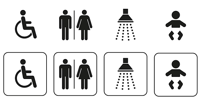
Symbols also create a universal language that can be understood by people from around the world. Toilet signs, currency symbols and public transportation signs use symbols for this reason. A traveller in a foreign country would easily be lost without these types of visual guideposts to point them in the right direction.
How to make your mark stand out.
Whether you want to design a pictorial mark for a logo design, make a new app icon or do anything in between, here are a few design principles to help you to create symbols that stand out.
Keep it simple.
“Less is more. You need to know what that symbol represents immediately,” says Obermiller. “If you look at the icons on your phone, they’re tiny,” says Newman. “If you try to pack a bunch of detail in an icon, it’s going to get very muddy and you won’t be able to really see those intricate details.” An effective symbol will stick to the basics and depict only the essentials. “It’s more pleasing to the eye and allows some breathing room for the reader,” says Newman.
Stay minimal and keep your colour palettes simple. “Use very basic, geometric shapes to create your initial design,” advises Newman. “And make sure it’s unique.”

Make it your own.
There’s no one track to a differentiated symbol; that’s the beauty of the design process. Different designers will think about concepts in different ways and with luck no two symbols will look the same, even if the concept is universal.
To get in a headspace where you’re receptive to new ideas, play around with shapes and think about different ways you can illustrate the same concept. Ask yourself what words or colours could be associated with the concept. “A cool exercise would be to think of an everyday symbol or brand, like a handicap icon and try to design a new symbol for it,” says Obermiller.
Base your design on brand guidelines.
If you’re tasked with making a new symbol or set of icons for a company, use the brand guidelines to your advantage. Presumably, the company has spent time differentiating themselves from other brands and the symbol you design should adopt some of those unique characteristics. “It’s important to stick to the brand kit so that the icons look unique and visually associated with the company,” says Newman.
Experimentation is key.
As you set out to design a symbol, be ready to embrace trial and error as part of the process. “A lot of it is abstracting your shapes and pushing and pulling them to see how you can make a new shape that still reads clearly,” says Newman. Make lots of concepts and rapid iterations and don’t worry about perfection. Give yourself the freedom to try anything that comes to mind; you might surprise yourself in the process.
To get started, look at different icon designs for inspiration. Sites like Behance are a great way to discover new ideas and designers. “But don’t get too sucked into looking at other people’s work,” advises Newman. “Do what feels right to you. And don’t be obsessed with emulating what is popular right now. You’ll ultimately have a design that’s uniquely yours if you’re not constantly referencing other people’s work.”
https://main--cc--adobecom.hlx.page/cc-shared/fragments/seo-articles/do-more-illustrator-color-blade
