How to Best Capture the Magic of a Destination in Photos

[Music] [Ron Timehin] Hello. My name is Ron Timehin. I'm a professional photographer and director based in London. Today, we're going to be exploring how to capture the magic of a destination in your photos. On the screen here, I have a series of photos that I shot on a recent trip to Cape Town in South Africa. And one thing I really wanted to do was just to celebrate how beautiful and colorful the light was there. So I'm going to show you how I approached this shoot and also how I edited some of the photos. Before we jump into Adobe Lightroom CC, I wanted to share a few tips and tricks on equipment. So when I travel, I like to travel light. It means that I've had less to worry about. I'm not messing around with different lenses and missing shots. And it also means that I'm inconspicuous, and I blend in more as a tourist, which can be crucial when you're trying to get certain shots. In terms of the camera body, I took the Sony A7CR, which is very small, compact, lightweight, but full frame and really powerful. So that was my camera of choice. In terms of lenses, I took the holy trinity for travel, which was 16 to 35 millimeter F2.8, a 24 to 70 millimeter F2.8, and a 70 to 200 millimeter F2.8. And with those three lenses, I was able to shoot anything I needed to.

In terms of accessories, I always try and take a tripod with me. It means that I'm able to shoot in low light situations, and I'm also able to experiment with slow shutter photography too. In terms of drones, I very rarely travel with a drone now. The laws and regulations are quite strict in a lot of the places I've been to. So I will often contact a local helicopter tour company and just ask and see if they're willing or open to collaboration whereby I take some photos for them, and then they can offer me a free flight or a discount on a flight.

Some shooting tips for consistency. Now, of course, shoot whatever you want and be open-minded. I found that when I'm trying to create a cohesive body of work, there are certain things that I look for. So one, I always try and shoot at similar times of the day. So for this trip in South Africa, I really wanted to show the golden lights that was there. And so most of the photos I took were during the morning, golden hour during the morning, golden hour during the evening, and then also sunset. And I found that that gave me enough time to shoot the hero images I wanted to shoot.

Shoot in similar weather conditions. Now although I did shoot some foggy rainy stuff in South Africa, the collection of images that made what I shared were all taken during similar weather conditions. I find that if you have a sunny photo and you pair it with a rainy photo, it doesn't quite gel. So try and shoot in similar weather conditions. Now, of course, we can't control the weather. So if you do end up at a location and the weather is temperamental or is changing drastically quite a lot, then I would suggest to look for color and try and play with color to make that a theme within your imagery. And lastly, editing your photos in a similar style will help just bring the whole project together, and that's what we're going to do in Lightroom right now. Great. So we're now in Lightroom CC, and we've got a selection of images that I took from Cape Town in South Africa. I think let's start off with one of the aerial shots from a helicopter trip I did, and this is straight out of camera. Now there's a lot of work that needs to be done on this image. What I would suggest is when editing a photo, always starts with lens corrections. Now you can find that by scrolling down to the bottom here, and you'll see something called Optics. If you click Enable Lens Corrections, you can see that it just removes any distortion that is inherent from a wide angle lens, and it just makes the image a lot cleaner to start off with. You can also remove chromatic aberration, which will just help with any of those issues there as well. So that's the first thing I do. I then look to crop and straighten my image, and that is contributing to having a nice composition in my image. So for this image, for example, I would like to rotate it ever so slightly because the horizon isn't straight. And then I'd also like the horizon to be on this top third here on my rule of thirds diagram. So I'm going to change my aspect ratio, and I'm just going to drag this up until that line sits on the horizon somewhere like that. That looks good. And we'll straighten it even just a little bit more.

That looks good to me. And what's really nice as well is that the stadium is very close to this intersecting point here on the rule of thirds, so that should be a good composition. Let's uncrop, and that looks great. The next step is to tackle the biggest, I guess, contributors to the image, which for me is the exposure and the white balance. So we'll go into our Light panel here. One thing I like to do is I like to get Lightroom's recommendation of what's my exposure should be. So I can do that by holding shift on my keyboard and then double clicking on the slider. And Lightroom is saying that...

The exposure needs to be darkened ever so slightly. And looking at the histogram at the top here, I can tell that actually this is a nice exposure now. So we'll leave that there. Our white balance can be found in color. And now when I was taking this photo, I definitely remember it being warmer. Reason being it was at sunset, so I think the camera has tried to compensate and cool off the image a little bit. So we're going to move the tint slider to the right ever so slightly. That looks good. And, of course, if you move the temperature to the warmer side, you also need to move the tint to the magenta side. So we're just going to do that ever so slightly. So something like that looks good to me. Great. So this is before and after already.

The next step is our tones. So we're going to bring some contrast and clarity and detail back into this image. It's very flat, and the reason being is that it was shot in really soft light. We're also by the ocean, and there's a lot of water and mist, which is just creating this haze around the scene. So one thing we're going to do is start off in the light panel and just work our way down. Now contrast, I don't actually touch. Reason being is I do my contrast adjustments in the Tone Curve because it's much more precise and you've got much more flexibility. So I'm going to leave that.

Highlights, we can bring down to bring some detail back into the sky and some of the brighter parts of the buildings. The shadows, we're going to lift ever so slightly. We don't need to do it too much. The whites, we are going to move to the right just to bring a bit of punch back into the brighter parts as we've decreased our highlights. And then for the blacks, we're going to bring this down. Now if I look at my histogram, I can see that there's quite a bit of the area here that has no data. So we're going to bring the blacks down so that we have a bit more data within that region. So something like this looks good to me. That looks nice. So just with those adjustments already, we have gone from this to this. Lots more punch, lots more color, and it's looking great. We're not done yet. We are going to now head into the Tone Curve.

Now a lot of people find the Tone Curve intimidating at first, but I think once you play around with it, you will honestly find it a breeze. It's just a little bit of trial and error, a bit of experimentation, and some online tutorials, and you'll be good. But what I like to do when using the Tone Curve is to create an S-curve, which essentially means adding contrast into the image. Now the S-curve confuses people sometimes, but, essentially, all you're doing is you're taking the darker parts of your image and making them darker like this, and you're making the brighter parts brighter. And now as you can see, this has created a nice S-curve, and this is a contrast curve. So I'm just going to do something like this just to bring a bit of contrast back in.

Something like that looks great. So before and after. Look how amazing that is. Now you can really go to town using the Tone Curve. A lot of photographers that you might like or admire their editing style, most of it will come from the Tone Curve. So have some fun, experiment, find your own style. And one thing people neglect as well is the individual channels. So the reds, the green, and the blue channels. If you play around with these channels, you can create some very interesting colors and styles. So please do spend the time and play around. Unfortunately, because I don't have much time in this tutorial, I'm going to have to move on. But, yeah, the Tone Curve is amazing.

Great. So now that's done. We've played around with our tones. Next is color. Now color for me is applied in two stages. First, I like to do my color correcting, which is trying to get the image to look as real and true to life as possible, and then you color grade and the color grade is where you add your stylistic approach and your source, if that makes sense. So when we're color correcting, what I like to do is I like to go down to the color mixer here. I know some people like to play with vibrance and saturation, but I really like to just play with the colors individually and get my balance that way. So color mixer is where I start. As you can see, you have a list of colors here. And within each of these colors, you can change the hue, which is essentially how green or magenta a color is. You can change the saturation, which is how much of that color is in the scene. And then you can also change the luminance, which is how bright or dark the color is. So, for example, in this image, I would like the hills and the mountains here to be a little bit more magenta. I would like to boost their saturation, and I'd also like to boost their luminosity a little bit as well. So a method that I found really effective in Lightroom is to not actually play with the sliders here, but to use this node here, just this one right here. So if we give that node a click, we're given this option here at the bottom of our screen where it says hue, saturation, or luminance. Now we'll choose Hue for now, and what happens is when we hover over an area of our image and then we click, we get presented with the slider. And what's really impressive about this slider is that it will adjust all of the colors that make up that specific hue on the screen. So whereas before you might play around with the orange and play around with the sliders and do it by eye, when you use this tool here, it will adjust the colors exactly that are affecting that part of the image. So that's another tip for more accurate color grading.

So I'm going to move this ever so slightly to the left somewhere...

Like that. Looks good. Now we'll go down here and click Saturation, and we'll boost the saturation, as I said, I wanted to do before. So just bring up. That looks good. And then the luminance again, we will bring up as well on lighting. So you can see how drastically, we can tweak these, but I think somewhere here.

Looks good. So just with that color correction, we've gone from this to this. It's very subtle, but, again, we're trying to get this as true to life and how I remember seeing it on the day.

For me, I don't like to go too overboard on color grading. For this image, I really want to just warm up the image just to really emphasize the mood of just the warm vibrant sun. So to do that, I'm going to head to my highlights, and I'm going to add a little bit of warmth here by adding some orange and some yellow.

Somewhere like that looks good, and we'll do the same in the midtones.

That looks okay. And now we're going to add some blue into the shadows because we want some color contrast. And naturally, our eyes see shadows as cooler. So I'm going to add a little bit of blue in there just to balance things out ever so slightly. That looks good.

I might change the blue ever so slightly.

That looks good. I am going to blend the colors in my color grading panel a little bit more, and then I'm also going to bring the balance to the right just so that the yellows and the oranges are taking precedent over the blues and the shadows.

There we go.

Something like that. So before and after, you can see that already that looks a lot better. And if you wanted to add a little bit more warmth overall, then I can go into the global panel here and just give that a little boost as well. Something like that. So before and after the color grading, which is nice. Again, this is all trial and error, so feel free to go back and experiment and play around. That's the whole part of this process. It's meant to be fun, so experiment. Now the last things I'm going to do on this image is head down to Effects, and I'm going to add a little bit of clarity to add some midtone contrast. And I'm also going to add some texture just so that there's a bit more detail in the edges of the mountains here. Sharpening, I'm going to bring up to around about 50, but 40 is normally a good starting point, the Adobe standard. And then I'm also going to add a little bit of noise reduction. This image was shot at ISO 800, so I'm going to add, around about 15, on the luminance, and I think that looks good.

Now what I might do is I might increase the vibrance ever so slightly just so that the image pops a little bit more. Something like that looks good to me. And there you have it. That's my final edited photo for this shot. So if I click before and after, you can see a huge difference has been made by using these tools in Lightroom.

Now how do I take this edit and apply it to another image? So I have another image taken from the same flight, and I just want to copy and paste the edit that I've already done on this onto the next image. So to do that, I am going to click these three little dots here, as you can see here, and I'm going to click Copy Edit Settings. So once I click that, I can head over to my new image, click the three dots again, and then just Paste Edit Settings, and my Lightroom will do its magic. I mean, look at that. One click, and it's nailed it. Absolutely nailed it. So really, really nice. And then that way, you can paste these settings to all of your images and have a consistent feel across the board. Now there will be adjustments you need to make to each individual image. It's never just a one click, preset, and it's done. So always do keep that in mind. Now for example, this image, I am noticing that the propeller of the chopper is just protruding here at the top left, and there's also a dust spot down the bottom here. So I'm going to remove those by using the Spot Heal Tool or the Heal Tool on Lightroom CC. So we'll just draw over that, and we'll draw over this.

And there you have it. That looks lovely. So now if we have these images side by side, look at that. We have something that is consistent, cohesive, and we can use this as a blueprint for our remaining images. And I'll show you what I mean now. So first and foremost, let's create a preset of this image so that we can use it across the rest of our images. So to do that, we want to head up to our Preset icon here. Give that a click, and there's a plus icon here. So we're going to press that, and we'll call this Cape Town Sun.

Brilliant. Now when creating a preset, there are certain things you want to include and certain things you don't.

For example, exposure is going to differ depending on the photograph. So I would always uncheck exposure. I would actually also uncheck contrast, highlight, shadows, whites, blacks because your tonality is going to change between image to image, especially if you're shooting in different settings. So I would only keep the Tone Curve as selected on your preset here. Color, we can keep everything, but I would suggest removing the white balance because, again, the white balance drastically changes between scene and between photo. So we'll uncheck that. Vibrance, we'll uncheck as well, and saturation, we'll uncheck.

Now in terms of effects, we don't really need any of these in our presets. Again, they are specific to each individual photo, unless you are adding grain, then maybe you want to select Grain here, but we're not, so we're going to leave that off. In terms of detail, again, I'm going to sharpen my images individually, so I'll take that off, and then we'll leave optics as well. And we'll click Save.

So now you can see our preset has been saved here under our User Presets, and it's ready to apply to another image.

So let's try it on this image, for example. We'll click Cape Town Sun. You can already see contrast has been added. It looks really nice. And now all we have to do really here is play with our exposure, our white balance as we did before, and this was shot during sunrise. I know that it was in the shade, so I'm going to click Shade as my white balance. And then I'm now going to just brighten this up, bring down the highlights to bring some detail back into the sky, lift the shadows a little bit...

Maybe boost the whites a touch and the blacks a little bit.

And there you have it. Just all ready from that to that. A few clicks, and we're done. So really, having putting in the time at the start of the editing process will really help you save time later down the line. So now if we have, for example, these images together side by side, they have a similar color palette and feel to them. Now what if you wanted to edit a portrait? Let's jump into this photo of Pogba here, and I want to have a similar feel with this portrait as I did with my landscape shots. So how do we approach that? Well, let's apply our preset.

As you can see, the preset is very heavy handed on this portrait. And the reason being is that with portraits, you want to push the tonal values a lot less than you would when it comes to a landscape photo. So we've applied our preset. You can see there's an amount slider here. If we just drop the amount ever so slightly, then we get a more, I guess, nuanced effect on our photo. So something like that looks good to me. And then what we can do, we can then go into our tonal adjustments, and we can make our tweaks again as we did before. Now one thing I really want to show off on this photo in particular is just how powerful masking can be. So I'm going to boost the exposure so that Pogba's face is nicely exposed. I think that looks good. But, of course, you can see this area, his clothes, the background is all overexposed, and it doesn't look good. So how would I approach editing that? Well, I would go into my masks, and let's let this icon do its work. Adobe Lightroom is amazing for AI masking at the moment. It's definitely the leader in the world right now. So it's just so intuitive. So it's already created a mask based on Pogba. And now what we're going to do is select his clothes. And just like that, we have a mask already created that is just selecting his clothes. So we're going to create that. Now I can see that the mask didn't select his bag and a little bit of his clothing. So I'm going to click this button here, plus, and use the brush just to manually fix that selection just to make sure that all of his clothes are in. There we go. And now what we can do, we can decrease the exposure slightly...

And we can decrease the highlights.

And then you have just like that. So before and after. Just one adjustment, one mask, and we've got something now that's having a bit more balance within this photo. So something else I want to do, I want to tweak the color of his clothing a little bit. So I'm going to use the Point Color feature, which, again, you can find under the mask, which is amazing. And we use the color picker here to select the green on his garment. Now I want to desaturate this green a little bit. It's looking a bit too cartoony for me, so I'm going to bring the saturation down ever so slightly.

And what's amazing is because we've made a mask of just this clothing, it's not going to affect any of the green anywhere else in the photo.

So I'm just going to bring this down slightly, and then I'm going to bring the luminance down a touch as well. So before, after. You can see the green is just a little bit more refined, which is quite nice. I want to make another mask now, and the mask I'm going to make is for the background. So I'm going to click this plus here, select background, let Adobe do its thing...

And look at that. A perfect mask. It would have taken me ages to do this in Photoshop. So, yeah, thank you for that, Adobe. Now I want to darken the backdrop a little bit, just a touch so that my subject can stand out a little bit more. And I also want to make the green in this background a similar hue to the green that he's wearing, and that would just help create a bit more unity within the photo. So again, I'm going to go to Point Color. We'll click the green on the background, and we're going to shift the hue to something that's a bit more closer to his garment, somewhere like there, maybe. And we're going to desaturate that green because it's quite garish at the moment. So something like that looks good to me. That looks nice. So we've gone from this to this, and it just makes the overall image feel a bit more cohesive, I think. So that looks good. We shall leave that. And lastly, we're just going to tweak his skin tones a little bit. His skin is looking a little bit fake to me, so we're going to tweak it ever so slightly. We'll do that again by selecting people. Here we go. And we'll select facial skin and body skin. Again, it seems to have made a selection of his bag, which we don't want, but that's fine. So we'll click Create, and then we'll click the minus button here and the brush, and we will just paint over the bits that we want to remove.

There we go. And that looks good to me. There we go. Lovely. And now we can start making adjustments to his skin and again, we're going to use Point Color. I love Point Color so much, honestly. It's so good. So we use Point Color and we'll select this part of his skin. And I think his skin, one looks too green, so I'm going to move it to the magenta sides very slightly. That looks good. We'll desaturate the skin ever so slightly as well, so it's not as cartoony. And then we'll also bring down the luminous, just a touch to bring some richness back in to his skin as well. We'll bring that down.

Cool. So there you have it before and after. One thing I also like to do is just to minus some clarity a little bit on his skin, which just adds a softening effect on his skin. So I'm going to put maybe minus 10 on the skin. That looks good. Just like that. A little bit of difference. There we go. And I'm happy with this. I think this looks good.

One thing that I would also like to do on this image is just to give it a little bit more blur. Now although I shot this image, a shadowed and fulfilled, it might be nice to have a little bit more. So I'm going to play around with lens blur, which you can find at the bottom here. I'm going to click Apply. I'll wait for Adobe to do its thing.

And as you can see, it's already-- It's automatically masked out the background and the subject and added depth and blur to it, which is amazing. I'm just going to lower the blur amount ever so slightly.

Maybe something like this looks good, and I like the bokeh style as well, so we'll leave that. This Visualize Depth Tool here is also very good for visualizing what is in focus and what is out of focus. And as you can see, Pogba there is nicely in focus, so we'll leave that as is.

If you did want to make any refinements, then there's a little toggle here that you can click, and you can brush in blur or brush in focus. It's up to you. Great. I'm really happy with this image. I am now going to copy and apply this to the other version of this portrait just to show you how well the AI masking really works. So, again, I'm going to go to these three icons here. I'm then going to choose this option here, which says Choose Edit Settings to Copy, and I'm going to make sure that masking is selected. I'll click Copy.

I head over to this image, and I'm going to click Paste.

And, again, wait for Lightroom to make those adjustments.

And just like that, you can see from this image to this image, it has copied and applied the mask successfully without me having to recreate the masks. Lightroom has automatically done all of that in the background. So that's how I would edit these photos. I hope you have enjoyed this tutorial, and you've got some useful tips and tricks. And thank you for tuning in, and I'll catch you guys soon. Thank you.

[Music]

Online Session

How to Best Capture the Magic of a Destination in Photos - OS421

Sign in
ON DEMAND

Closed captions in English can be accessed in the video player.

Share this page

Speakers

  • Ron Timehin

    Ron Timehin

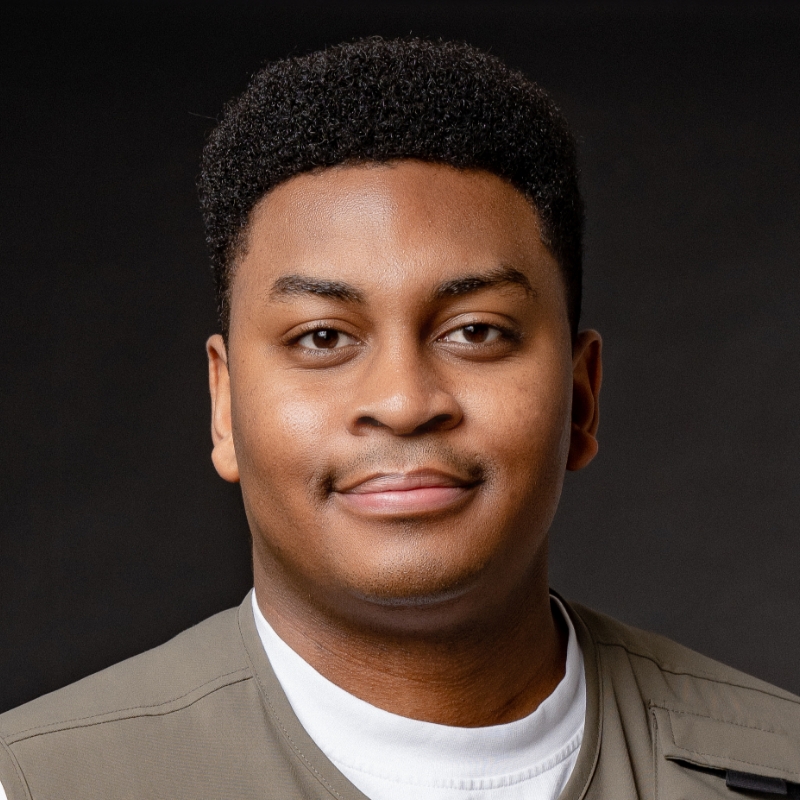
    Photography and Video Director, Ron Timehin Productions Ltd

Featured Products

Session Resources

No resources available for this session

About the Session

Join photographer, Adobe Insider, and world traveler Ron Timehin as he demonstrates how to capture the essence of a travel destination through photos. Ron will share expert tips and techniques for photographing diverse travel subjects, post-processing images, and curating a photography essay, including practical aspects of curating and editing landscapes, cityscapes, and portraits using Photoshop Lightroom. This approach will help you build a comprehensive body of work that celebrates a destination and creates memories long after the trip ends.

Youll learn how to:

  • Maximize photo opportunities through effective planning and equipment selection
  • Photograph locations and people to tell the story of a destination
  • Curate a series of images to tell a story
  • Edit landscapes, cityscapes, and portraits to make them look their best
  • Develop and maintain a cohesive visual style across subjects

Technical Level: Intermediate

Category: How To

Track: Photography

Audience: Photographer

This content is copyrighted by Adobe Inc. Any recording and posting of this content is strictly prohibited.


By accessing resources linked on this page ("Session Resources"), you agree that 1. Resources are Sample Files per our Terms of Use and 2. you will use Session Resources solely as directed by the applicable speaker.

Not sure which apps are best for you?

Take a minute. We’ll help you figure it out.