Putting My (Design) Cards on the Table

[music] [Taryn (Arynlei) Hampton] Hello and welcome. I'm artist Arynlei, and this is Putting my (Design) Cards on the Table. I'll be talking about my viral at the table playing cards project, and within its origin story, I'll be talking about how embracing the warm and fuzzies of nostalgia birthed a fan base. I'll be giving an ode to Easter Eggs and design intention, and finally, I'll share some Illustrator tips and tricks that earned "my mind is blown" comments on social media.

To set the scene, or rather the table, it was December of 2021 when this project first started to take shape in my mind. We had just been seeing a lot of the lockdown and restrictions lifting from the COVID pandemic, and I was able to throw my very first Friendsgiving party. I cannot overstate how formative of an experience this was, both from the perspective of finally being able to gather with my group of friends for the first time in years, but also from a visual perspective, the table after the fact, strewn with cups and dishes and half eaten items, food and knickknacks, et cetera. It was just such a potent artifact of how successful the evening had been. So visually that really stuck with me. And of course, the experience had me reflecting on how much I had been missing IRL connection. And I know that not only me and my friends, but also all, pretty much everyone in the world had the same sort of feeling of loss from having to stay away from their loved ones for years at that point. In the same breath, it being December, the new year was right around the corner, and I knew that I wanted to set some goals specifically revolving around honing skills. I was looking specifically at Illustrator at the time, and I knew that I wanted to take on a major project and share the process of its completion on social media. So what exactly would that project be? I knew that I wanted it to hit a couple of different criteria. Specifically, I wanted it to be personal, so something that related to me. We know all great art draws from the self, at least in some capacity. But also I knew that I wanted it to take an episodic format. So something that could allow me to tell not only my own stories, but potentially other people's stories, if there was that level of participation, in a way that was very replicatable, very formulaic. And perhaps most importantly, I wanted to create a play object. So not something that was just a series that could hang on a wall somewhere or be exhibited, but I wanted to create something that could be held in the hand and encourage people to reconnect across the table once again. So there were a couple of ideas that got shot down before I arrived at playing cards. So speaking of that episodic format, I want to show you what one of these episodes looked like.

My family and I have always loved playing a board game after dinner, our favorite being Cluedo. We all like to stick with one character, myself playing Colonel Mustard, my sister playing Miss Scarlet, my mom playing Misses Peacock, and my dad playing Reverend Green. Over time, we have become completely loyal to our characters. We're also really competitive, and we each have our own different techniques we use to try to outsmart each other. Unfortunately, even though I don't like to admit it, my mom is easily the best at Cluedo and often wins. We're all very curious to know how she does it. The game always ends with a race to guests first and a tension filled moment when the cards are revealed and we can finally find out who done it. This memory was sent in by Ruben as part of the At the Table Playing Card Series. If this story resonated with you, decks of playing cards and art prints are available on my site. It's Mother's Day in the States tomorrow, so don't forget to call your mom. Okay, bye.

So that was one episode. Fast forward over a year and the deck is complete. This is what it looks like. So 52 custom illustrated card fronts, several card backs, and several Joker designs come together to form three different decks of cards, all at varying levels of production quality. And I could not be more proud, honestly, of how this project took shape.

I want to talk about the realities of sharing an unfinished project, in real time, as it's being completed publicly on social media. Obviously, it comes with a fair number of risks. It puts you in an extreme position of vulnerability to open yourself up to critique and open up the door for feedback when your project is unfinished. That feedback, obviously it could be positive, but it could just as easily be negative, it could be unhelpful, and it could unfortunately be mean. And that's just a really tough reality of existing online as a creative. Additionally, you also open yourself up to bad advice from non experts, and it becomes your job as an artist existing online to parse through that advice and decide what is worth, even acknowledging what's worth implementing, and what is worth ignoring entirely.

That all said, I think the rewards of sharing in real time far outweigh those risks. Least of all is getting access to the hive mind. Getting access to ideas and perspectives far beyond what your own brain is capable of conjuring up is so valuable. It creates actually what I like to call the Positive Feedback Loop. Putting forth an unfinished product and saying, Hey, what are your ideas for making this better? The audience then gets to chime in and you, as the artist, get to decide what's worth implementing and ultimately show the implementation of those ideas. In return, the audience then gets to feel like they've been seen and like they've been heard and like they are a part of the project itself. And so it's amazing if your project has an element of communal feelings, such as nostalgia, that people can connect to, but it's even better if they can also connect on the level of being within the project itself, how it comes to fruition, and essentially be able to see themselves in the process itself.

Of course, this causes lingering thought, people get to imagine, Hey, how do I fit into this project? What are some of my traditions that happen around the table? What can I possibly chime in? And for my project specifically, that came into the gift of story submissions. I ended up receiving hundreds of story submissions as part of this project, and they came from all over the world. I ended up being able to represent 16 different countries, I believe, in the first edition of this deck, and I hope that it's even more in the second edition. But that story submission portal was such an unexpected gift. How many people felt safe to send in their memories to me? Part of that safety, though, was creating this amount of trust between myself and the audience, and that was something that happened entirely behind the scenes. Basically, with every single participant, I had a lengthy amount of back and forth. I viewed hundreds of personal photos as visual references, did a lot of Google image searching with participant feedback as well, and basically was, upon reflection, treating every participant like a client in the sense that I was offering them opportunities for feedback and revisions, and then actually, going in and making those revisions as they suggested. I ultimately wanted everyone to feel like their culture, their memories, were being honored and being represented accurately. And in order to do that, I had to approach every single story with a certain level of curiosity and reverence. And that was something that took a lot of commitment.

With that, like I said, happening behind the scenes, there's plenty of stuff happening in front on the screens, being published live on social media, and it all is very strategic. So what do I mean by Show AND Tell? These are the things that you can show visually and talk about to really, like, hammer home the messaging.

So within this category, I would put derivative content. Anytime anybody asked a question or expressed a curiosity on social media, being able to respond to those comments with derivative content became so crucial in offering windows deeper into the project. In my case, I shared so much tutorial content, anytime anybody asked how to execute a thing that they saw happen in one of the episodes, I was happy to break it down in a tutorial. I also did a lot of closer looks. My Illustrator files look kind of insane, and so being able to zoom super, super far in, make certain layers invisible or visible, and really like get behind the scenes, in the creative process like that, I thought was a really rewarding thing to share. I also offered different variations of certain cards, did multiple colorways, for example, and took audience polls on what the preference was, which direction to go. And finally, anytime anybody had any curiosity about the mental rationale that went behind certain design decisions, I was happy to elaborate on that as well. I think even more importantly than derivative content, derivative content is a good way to get deeper into the material, but like I said, with that positive feedback loop earlier, showing and telling the implementation of community suggestions is so crucial. It's not just showing you implementing, but you also have to be able to give credit at every single opportunity. So some examples of that very, very early on in this process, I had a lot of people asking for lefty numbers and what they meant was corner index, a corner index in every single corner of the card so that the cards could be fanned in either direction and you would still know what cards you're holding. I didn't realize as a righty that left-handed people, if they're fanning with one hand, they fan in the opposite direction, and it makes it so that only the top card is visible. That's not very helpful when you're playing cards. So I thought that this suggestion was really cool and a really neat opportunity to add an element of accessibility within the deck as well. So I was loud about the implementation of this one. Additionally, at the very beginning of this project, I wasn't really sure how the stories were going to be divided between the cards until somebody suggested doing themes for each of the card groupings. So this example here, you see the threes are all board games, but I was really just looking for a way to create harmony within each of the number groups. So if you're holding four of a kind, they each look like they belong together. And assigning story themes to each of the numbers was just a no-brainer. And I was shocked that I honestly didn't think of it myself. But I was happy to give credit for the audience suggestion on this one as well.

On the flip side of things, I think that there are things that are absolutely worth showing, obviously, as part of the process, but not necessarily talking about. To explain further, I'm talking about obvious layers of interaction, design decisions that are like no-brainers. And what I mean is like, it's not necessary to spoon feed your audience every single design intentionality that goes behind a project, because when you choose not to do that, you offer these easy open doors for the audience to notice the thing that you're doing and step through that door, and elaborate, and, I don't know, comment on it, and just acknowledge it themselves. That's the word I was looking for. So that room for discovery, I think, is essential. Some things that I showed in the process of this, of creating this project, but not, I did not spoon feed to the audience, include the number of pips within each of the illustrations corresponds to the number on each of the cards. This was kind of a thing where I was showing the illustration process behind each of the cards. The audience did not need me to say out loud, Oh, and also I am hiding five clubs within this illustration because this illustration is going on the five of clubs card. That's too many words. That's obvious things that people can see with their eyes. That does not need to be said out loud. It is, however, something really easy for somebody to notice themselves happening, say, Hey, oh, my gosh, there are five clubs on that five of clubs card. That's so cool. I love that you did that. And that's something that's consistent throughout the entire deck. Another example of things that I did not feel the need to spell out for audience members is the phrases on each of these cards. They all tie back to the stories that influenced the card design. So the episode that you saw earlier, the format is story being told, audio, and then the visual of the illustration being made. So the audience already knows what the story is. They don't need a breakdown verbally of what the phrases are. And then even with these cards that have phrases not in English, there are English translations on the flip side of the cards. So it just would have been redundant.

Finally, the choice to do rotationally symmetrical court cards was one that I did not feel the need to spell out for the audience. Just like on traditional court cards where you have portraits of the jacks, queens and kings, and they are rotationally symmetrical so that you can view them the same no matter how you're holding the cards, I knew that I wanted my court cards to have the same effect, so I chose to make mine rotationally symmetrical. Did not feel the need to spell that out for the audience because ultimately, I had plenty of people in the comments saying, Oh, are those symmetrical? I like how these are the only symmetrical cards. That's so smart. Easy layers of interaction, an open door for the audience to step through.

Present secrets make future Easter Eggs. What I mean by this is when you have a large scale project, there are going to be so many minute details that are being thought about, that are being executed, that are being put into the project, that like the last few examples, don't need to be said out loud, at least not immediately. And the strategy behind this, the thought behind it, is it offers an opportunity to reengage the audience at a later date when these things are revealed. So some examples, these dice that are in the borders of the cards around the illustrations, they have dice on them. The dice either have one dot or two dots, depending on whether or not you're holding a first edition or a second edition card. And that's something that will continue as hopefully more editions of this deck are created down the line.

Likewise, the borders around the illustrations are references to Tablecloths. They're not just patterns chosen at random, but they have specific references. This is something that maybe somebody who has the deck might show a loved one and be like, Hey, this cool feature. Oh, did you know that these are tablecloth references? It's this, like, neat little piece of insider knowledge. And finally, my favorite Easter Egg in the entire deck is the fact that as the numbers increase on the cards, the complexity of the illustrations also increase, and it creates a sort of data visualization based on card value. So that's something that, if it's not spelled out, somebody might not necessarily catch on. But when I pointed this out on socials, people's minds were blown. They were like, Oh, my God, this is incredible. So clever. And all of a sudden, they were reengaged with the project once more, even though it's been completed for quite some time. Now, I think it's time to get into some Illustrator tricks. First, I'm going to show you the trick that went absolutely so viral the very first time I shared it, it is how to make a heart in, like, literally 10 seconds. With the pen tool, I have the Stroke window up. I'm going to set my Stroke to 10, and I'm also going to change my end caps to the round end caps. Then again, with the Pen Tool, I am clicking and holding Shift and dragging to get that perfect 45 degree angle, and then using the guide there to make sure that those end at the same point. I have a V created. Then with the Stroke window, I'm going to hold Shift so that this goes a little faster. I'm just going to increase this until we have a heart. Honestly, mind blowing when people first saw this. But if we want to take it a step further, I want to show you the hearts that I drew on the eight of hearts club. They have this. The sort of a nested stroke is what I'll call it. And to get that effect, it's actually really, really easy as well. No offset path, none of that. I'm just going to use the appearance window. We'll change that first Stroke down to 40. And then with that selected, I'm going to option+click and drag it down to duplicate it. This will cause it to go underneath that first stroke. I'm going to change the color to tan or beige. And then we'll do 40 times three. Did you know that you could type in any equation into the number fields in illustrator? They will do the math for you. I've always thought that was kind of cool. But if we take that 40 point stroke again in red, drag it down once more so that it's on bottom, we can then do 40 times five to create another layer of stroke. Then with the tan once selected option, clicking to drag it down and duplicate it, we can do 40 times seven to get one more layer of stroke. And then finally, we'll do the 40 more time in red, all the way to the bottom. 40 times nine gives us our final layer. And what's cool about this is it has applications beyond just this heart. Like, if I change this to the curvature tool, I can essentially make it a really interesting graphic effect by using this nested stroke technique that has always just been like a really cool sort of shortcut.

But onto illustrating food away from graphic elements and into the realistic. My secret has always been blending modes. We no longer need appearance or stroke available.

Let's take a look at some food illustrations. In the context of this project, I had to design many, many different types of food that all had to look like they belonged in the same universe of food, but also different, as they're different dishes with different ingredients and in different settings. So in order to achieve that, the secret to getting that universal feeling across many illustrations has to do with color palette. So challenging oneself to limit the color palette will create a sense of uniformity across many executions of different subject matter. That limiting color palette will be essential to that. But in order to illustrate realistic food, you need more colors than just this. So the secret becomes blending modes which, let's take a look at some that I like to use. We look at one single noodle here. This looks crazy. We can admit that. But to break it down, let's start at the bottom. The color on the left here is one directly from my color palette. The color on the right is with a blending mode activated. So this first base is just a flat color. The second color is this. I don't know what you would call this brown color, with a hard, light blending mode, which turns it into a yellowish tint. Then if we open up this dark blue color, which has no place in pasta whatsoever, and change the blending mode to a soft light, then it becomes more like a shadow. Then if we go back to this horrible beige that, again, doesn't look like it belongs in food, and change that blending mode to a hard light, it becomes more like a highlight. And finally, if we want to add some saucy red tint, we can then change that to a soft light as well. So that is what goes into one single noodle. To get an entire dish of bolognese like this, it requires a lot more layering than just that. So let's break it down. I'm going to make these layers a little bit less visible and start at the bottom. We have a plate, and we have some sauce, which, of course, is in itself using a blending mode. The beauty of blending modes is it tells Illustrator what colors to show visually based on what colors are beneath the one that you're working with. And so it creates the color interactions, is what I'll call them. And so with that first layer being sauce already, we don't need a flat color using a blending mode there. Let's open it up to a bottom layer of pasta and meat. And these meat chunks are using the same sort of construction as the pasta, where it's many layers of different colors within this palette, using blending modes to achieve that look of ground meat. The next layer is what I'll call a filter. It's a shape over the stuff that we've already put down to make it all a little bit darker, a little bit warmer, and create a sense of depth within the bowl. So that's another layer right there. Then we have a middle layer of pasta here, which, might I add, these noodles, I think there are maybe five different noodle shapes total. They're all just duplicated, rotated, reflected to look like different pasta shapes. But, yeah, I think there's only, I only illustrated, like, maybe three different meat chunks and three different noodles, or five different noodles, whatever it may be. On top of that middle layer of pasta goes another filter. This one is a little bit red tinted, a little bit more subtle. And that's to really just increase the sauciness of the dish. And then we add the utensils. And then to make the utensils feel like they're integrated within the illustration, a final layer of noodles. So you can see how crazy that all looks, where every single noodle is based off of, is made up of a bunch of shapes, many layers of colors, using various blending modes. And then there are many, many layers of noodles and meat and sauce and utensils, et cetera. And that's just one illustration of 52. And because it's satisfying, I'll show you the outline view. This is what that looks like, which is actually on the lower end of chaos compared to some of the other ones that I've done for this deck. So that concludes the illustrator tips and tricks. Let's hop back over to the presentation to talk about social media once more.

When it comes to winning and keeping an audience on social media for your design projects, there are three main pillars that I consider to be the most important, and those are novelty and excitement, what I call the comfy factor, which I'll get into a little bit later, and then also rewards. So when winning an audience, this is your first few pieces of content. It needs to hit on these three things in novelty and excitement. My project had a high level of visual spectacle. People had not really seen Illustrator being used in this way on social media. And often the process of watching this illustration unfold was satisfying enough to win people in with just a visual hook. When it came for the comfy factor, however, this is also important because you need to create a sense of belonging within the content. So this is where the type of project comes into play, at least in those first few pieces of content. For me, it was hammering home that shared relatable feeling, that element of nostalgia, this, like, ability for the audience member to see themselves within the project. And then in the category of rewards, whenever anybody gets served a piece of content to their feed and they feel like they're early to something, get a sense of bragging rights for that level of discovery, like, oh, I'm, I'm early to this. I can tell it's going to be big. And that is in sort of intrinsic reward for audience members. But then you as the creator, can continue those rewards by being interactive in the comment sections of your videos. So, chiming in, thanking people for the support, thanking people for good ideas and really engaging in this back and forth when it comes to feedback, just in those first few pieces of content, this is essential. Now, when it comes to keeping an audience, we circle back to the novelty and excitement factor, because every new piece of content needs something to keep the audience engaged. Basically re upping the excitement via new stories that cover other cultures, offering an opportunity to learn about those cultures, an opportunity to learn new techniques in Illustrator. These are all things that people can see and recognize as new material in the series, and re up that novelty and excitement factor. And then, of course, when the project was complete, circling back on those Easter eggs was like, one more like, hey, this was a really cool project. Take a look at this design decision here. Comfy factor plays more of a role in this keeping an audience aspect. It's the longevity of the project as it exists on social media. So for my project, it was that familiar and formulaic and consistent amount of storytelling. So every episode basically intro the same way, it visually unfolded the same way, it had a lot of the same calls to action toward the end, and it took on a very formulaic appearance, I guess. And so when audience members found it on their feed, they know exactly what to expect. And there's a level of comfort there, a level of belonging within the content. Additionally, that trust that was developed in the treatment of that submitted content was, again, just enhancing this comfort factor. The final rewards for keeping an audience. The ongoing chance to be featured, is honestly huge, especially when taking in story submissions. This idea that, oh, my story might be chosen next is an incredible motivator for people to be invested in the project. Of course, as the project comes to its completion, there's a huge amount of gratification in seeing every new card reveal. As the field of cards starts to get filled in, there's a gratification that comes with seeing it completed and seeing it finished. And then finally, what I would argue is the top reward at the very end of the journey is the ability to hold the deck in your hand. After watching all of these episodes unfold, after watching all of these design decisions, listening to all these stories, being able to physically hold a project or product that was originally just a part of somebody's imagination, that I think is the most rewarding thing of all. So that concludes my talk about the At The Table Playing Cards And Strategies Within. Thank you so much for tuning in. If you have any lingering comments, questions, curiosities, you are free to find me on socials. My handle is @arynlei on all the things, and then also my website is listed here as well. Thank you so much, and I hope you enjoy the rest of MAX.

Online Session

Putting My (Design) Cards on the Table - OS302

Sign in
ON DEMAND

Closed captions in English can be accessed in the video player.

Share this page

Speakers

Featured Products

Session Resources

No resources available for this session

About the Session

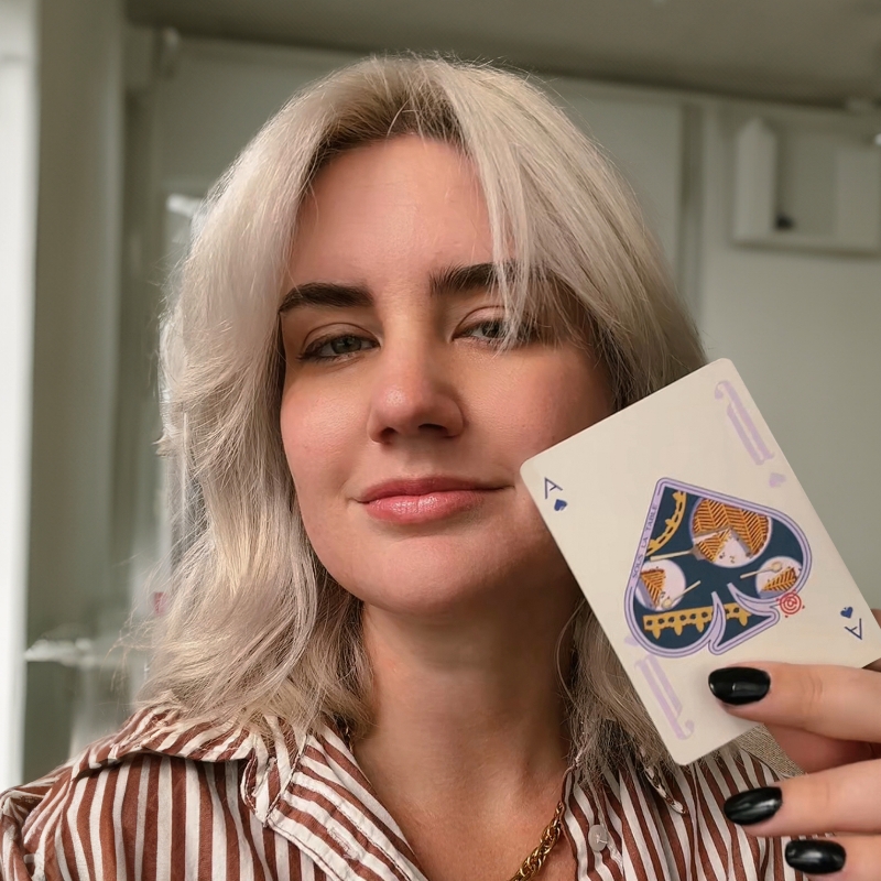
Join artist Arynlei as she unwraps the narrative design layers of her viral At the Table playing cards. Learn how her passion project turned commercial success used real stories and education across cultures to tap into a communal longing for IRL connection, create portals for viewer participation, and win an audience’s emotional investment. To bring everything together, Arynlei will also share her top Illustrator tips and workflows for creating storytelling designs.

In this project’s origin story and deep dive, you’ll find:

  • How embracing the warm and fuzzies of nostalgia birthed a fan base
  • An ode to Easter Eggs — how design intention keeps viewers’ attention
  • Illustrator tips and tricks that earn “my mind is blown” comments on social media

Technical Level: Beginner, Intermediate

Category: Inspiration

Track: Graphic Design and Illustration

Audience: Graphic Designer, Illustrator

This content is copyrighted by Adobe Inc. Any recording and posting of this content is strictly prohibited.


By accessing resources linked on this page ("Session Resources"), you agree that 1. Resources are Sample Files per our Terms of Use and 2. you will use Session Resources solely as directed by the applicable speaker.

Not sure which apps are best for you?

Take a minute. We’ll help you figure it out.