MAX SESSIONS Hi, I'm Tania Yakunova. Thank you for joining me here at Adobe MAX. I'm a Ukrainian artist and illustrator, and before I start talking about illustration, I want to share with you a little bit of myself and how I ended up here. So my journey towards illustration, which looks like this, is about two things. Number one, my struggle to find my natural traits and strengths and understand who I am and what I'm capable of. And number two, my discovery of the right approach, right tools and methods that helped me to express my creativity with authentic impact. Let's go back in time. Ten years ago, on a late night, after work, I was sitting on this concrete pavement of a huge futuristic building in Kyiv, just across the street of my office, and I was crying myself out. From a stranger's eyes there was no reason for tears. I'm a successful copywriter, working in a worldwide creative agency and had a nice salary. My team just won another award, but I felt desperate, frustrated and unhappy. I knew I couldn't do it anymore, but I was confused of what else I'm capable of. I wasn't even thinking of becoming an illustrator at the time. How did that happen? So that brings me back to my childhood. As a kid, I loved two things, drawing and daydreaming. I could do both for hours.
And I asked my parents to send me to art school. And it was so boring. It was old school, very academic-style teaching. I faced this conflict. Despite my love of drawing, I was discouraged by art school. I hated it. Tools and methods I was offered were very wrong for me. So after seven years, I decided art is not for me. I'm not good in it, and I definitely don't want to do it for another four to six years in uni. I left art school and got degree in social science and social technologies, for whatever reason, but I was always leaning towards something creative anyway. On the way, I discovered other things that I'm good at but hate doing, like journalism or copywriting. I loved creating ideas, dreaming of them, but I hated writing and I hated office work. That brings me back to sitting on a pavement and crying and asking what I meant to do. My husband Anton came to pick me up and we had a conversation.
And you need to know him, he hates whining. So he said, "You're either going to sit here and feel pity for yourself, and tomorrow you go back to work anyway and hate your life for the rest of your days, or you should take all you got and give art another go. But this time you need to figure out your way, with tools and methods that suit you and your strengths." I wasn't ready for pure art at that moment, so I enrolled into design courses. And it was an eye-opening experience for me. I learned about the power of visual communication and how it works. Finally, I got tools to work. Everything that was confusing or hard for me as a child became much more clear and easy. And I rediscovered my passion for illustration, I was so hooked. That was it. I never looked back. And today, I work with global brands like Google, Facebook, Coca-Cola, from all around the world. I won dozen of illustration awards... and I have my works exhibited in many countries. And so I'm still trying to figure out many things in my career. I know what's important. To become successful and fulfilled, you need to find your natural strengths, and to combine them with right tools and methods that will help you bring most of what you are capable of.
So I can't comment on your natural strengths, but you are here to watch this talk about illustration, and therefore, I can assume that you want to explore these [inaudible]. So let me show you three tools of visual communications that help me express my imagination and put it into execution, which is something many of us struggle with, isn't it? Let's move to Adobe Illustrator. ILLUSTRATION IS COMMUNICATION, NOT DECORATION I like the saying, "Illustration is communication, not decoration." It's kind of my credo as an illustrator. This illustration you can see on screen is made for the [inaudible], and it's meant to represent the idea that signing a contract is literally protection for artist or illustrator. But what you can communicate? It can be an idea, feeling, your attitude, story, emotion, etc. I will call them all "ideas" to make it more easy, but it can be anything.
But to make your audience to get your idea, you need to communicate it efficiently. And for that, you need to find the right execution. You might know this situation when you have a great, brilliant, deep idea or you can see it, but the execution is less. And in this situation, your audience will think that your artwork is not convincing. COMMUNICATE EFFICIENTLY RIGHT EXECUTION Or it can be the other way. You might have very great, elaborated execution, but you can't see the idea behind it, or the idea is weak. And in this situation, the audience will think, might think, that your illustration is empty in some way, it lacks meaning.
So in my opinion, the ideal is when idea equals execution...
when execution supports your idea. But how can we achieve that? That brings us to tools of visual communication, and the first tool is composition. But what is composition and how can it help us? Behind every artwork, photography, illustration, there is a formal composition, and by formal I mean the composition of the form. So abstract composition. Before you can realize what the image, what the objects are on the canvas, you will grab this overall feeling, this base.
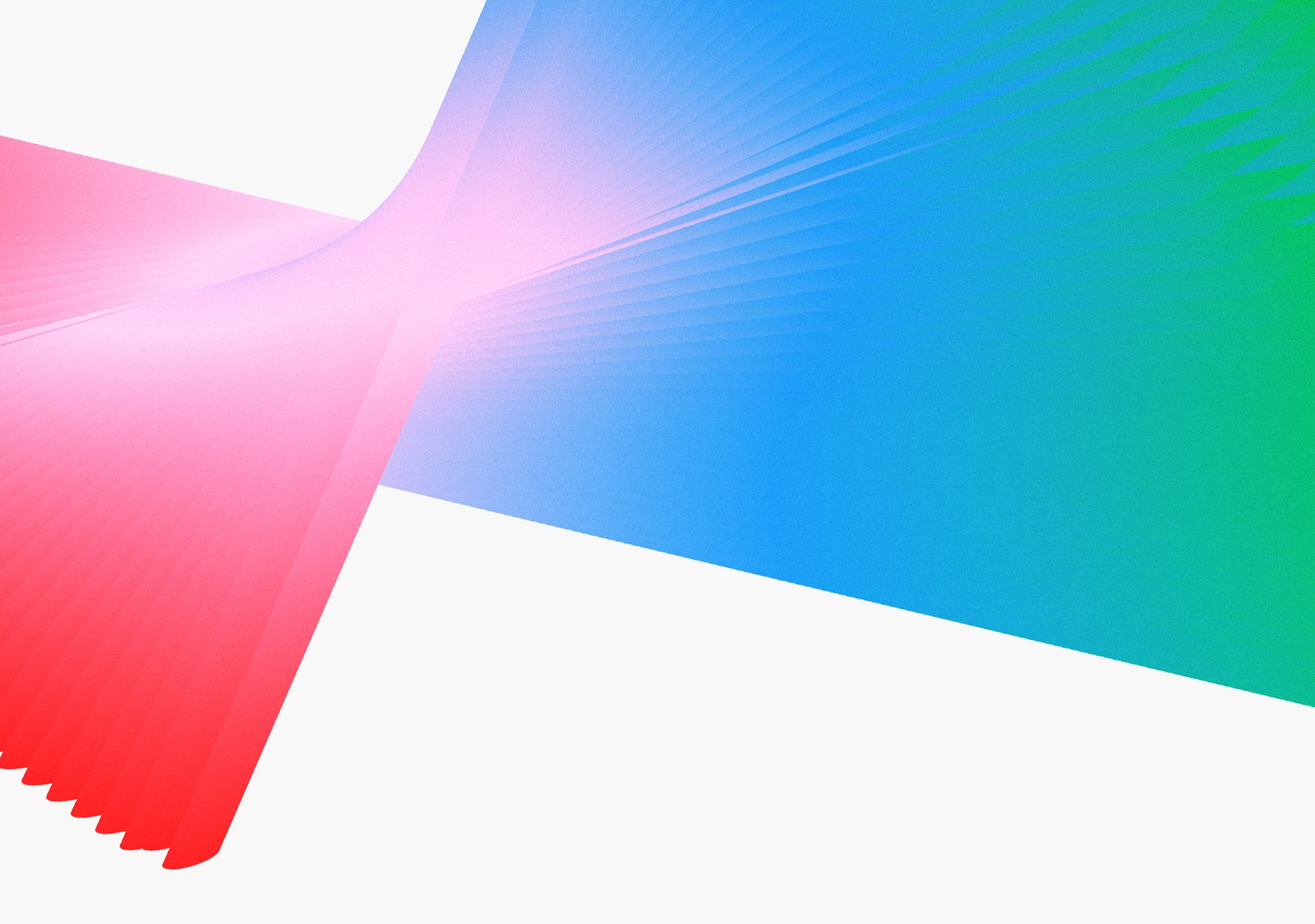
To prove you that, I will show you this is my work made specifically for the exhibition called Utopia. And it's meant to represent this utopic feeling of eternal freedom.
And if you squeeze your eyes, and I will use Blur for that...
you might see the composition, the composition of the forms on the artwork. So even when you see it like that, when you don't really... A little bit less. When you don't really recognize any specific objects, you already got the composition.
Something is bigger, something is smaller. They have some kind of shapes.
So in this composition, it's like a base for your drawing and it will help you to communicate, to provide meaning to your illustration. So let me draw some very simple compositions. Let's do it without colors even. So it would be like that.
Giant shape.
And I'm using the Pen tool, which is my primary tool in Illustrator, and I know it might be a little bit confusing at the beginning, but it's a really great tool. That'll fix it. So joint, like that. And something tiny and sharp. And even though you can understand what it is, I have no idea. You might already feel the tension in this composition if you look closer on it. So something is poking, something small is poking on something big.
So imagine you want to draw elephant sitting on, I don't know, something sharp. That would… This formal composition can help you to get most of this image. And let me show you another one.
Abracadabra. So this one I call "[inaudible] Falling on Me". So without even understanding what it is, with just a simple, very geometric shape, you can already feel some movement and some conflict in this illustration. So we have something small, we have something big. Something big is falling on something small. Right? You can feel it. And the last one.
Here also, even with the same shape, so it's all triangles and just a little bit of shades, not even colors, you can kind of feel movement here also. You can see all the shapes are moving up.
So imagine what you can do with this kind of composition, and that's what I did with it. So you can see...
You can remember this illustration, and here's a formal composition, composition of the shape, abstract composition behind it. So you can see that even without colors, only with light and dark shades, you can already feel the movement and you might feel some air in this composition, and then it will help to add that feeling to the illustration when I put actual objects.
Here's another example. For example, this is my illustration called The Passenger. And composition here helped me to put this main character in front and to grab all attention to this character. So this is the main and all other characters are secondary. And also, to bring this kind of conflict between this main character and secondary characters. Or here. Imagine those are not people, but just objects, just geometrical objects. Even without having the people, you will feel this community and sense of joining, because you will have circular shape and some elements joining it or falling from it.
So how composition can help you to communicate your ideas better? So it can bring static or dynamic to your illustration. It can help you with subordination, so to say what is main and what is secondary. It can add rhythm to your illustration, and rhythm is very useful because it helps you to literally guide the eye of the viewer through your artwork... and this will help you to tell your story. So this is the first tool, Composition. Let's move to the next tool. Next tool of visual communication is Color. You're probably familiar with the concept of warm and cold colors. This is the simplest example of how to bring extra emotions or extra feeling to your illustration. Warm and cold colors are associated with real objects in the nature. So warm colors are associated with sun or with fire, and cold colors are associated with water or with snow, and you have a full range of colors that are warmer or colder. But there's more to color. As a kid and teenager, I struggled with choosing colors and often ended up with a total mess. So I want to share with you this tool that came very handy to me. This is Color Theory by Johannes Itten, and what it does, it basically puts all the colors on the spectrum on this color wheel, and it gives you rules how to combine these colors most efficiently...
depending on your purpose. So, for instance, if you want to have some contrast, some conflict in your illustration, you want to choose colors that are situated on a different sides of color wheel, which are "complementary colors." Those are most contrast colors of the wheel. And if you want to have more subtle feeling through illustration, more calm, you want to choose colors that are situated next to each other, which are "analogous colors." And you have plenty of other options here, depends on what you want to achieve. And also, you have here in the illustration, you have this tool based on this on Itten's theory, which is called Color Guide. And it helps you to literally implement theory into life. So you can choose any color you want. And if you go here, you will see all these rules, which are called Harmony Rules or Harmonies, Color Harmonies, Complementary, Split Complementary, Triad, four colors, Analogous. So it depends on what you want to do. And this is a good starting point. You can then adjust these colors to make some of them dimmer, some of them brighter, so they work better for illustration. But this is very nice tool to use and to start. So when you know what you want to communicate, you can very easily choose colors based on this theory.
Let me bring you an example from work you already saw.
So this is my color palette. My main color is blue because blue is associated for me with the fresh air and sky and therefore, with freedom. And I choose complementary orange color to make a little bit of contrast and to make details to pop up a little bit. And also, there's a lot of off-white color to add some air to the illustration. And you might notice that this illustration looks a little bit different than I showed you earlier. It has no texture. It is because it's work in progress. Almost all of my work I start as a sketch and then bring to Adobe Illustrator for tracing and coloring. And this is because, for me, it's easy to manipulate this image here. For instance, if I want to change any color for background to more dark, it's very easy to do it here. And if I want to recolor several elements at once, I can go Select, Same, Fill Color and I can recolor all the elements of the same color and choose different color for them.
And also, I can adjust composition at any step, and I do it throughout my work a lot. For example, if I feel that there's too much birds maybe here and I want composition to have more air, I can remove some elements easily, for example, maybe like that, or move something.
This is better. So what color can do for you? And how it can improve your visual communication? So it can help you to achieve special mood or to add some feelings to your illustration. It can help you to point what is main and what is secondary. For instance, if you put some red object into more pale background, it will probably be the first thing that your viewer will notice. And also, it can add rhythm to your illustration. And as we know, rhythm can guide the eye of the viewer and therefore, help to tell your story or to communicate your idea. So that's the power of color. And the third tool of visual communication I want to share with you is my favorite. Shape.
Let's start with an experiment. Here are two shapes. What if I tell you that one of them is Bauba and the other is Kiki? Which one is Bauba and which one is Kiki? I will give you a few seconds to think. So if you are like me, and 95 to 98% of people, you would say that left one is Bauba and the right one is Kiki. This experiment took place several times, and the last time in 2001, and it showed that most people, regardless of their native language, ethnicity or age, would associate the word "Bauba" with this more soft shape and the word "Kiki" with this shape. This is called synesthesia, the ability to experience one sense through another. So what "Kiki" seems for us, feels for us, more sharp than the word "Bauba"? Just like this shape, it feels more sharp and this one feels more soft. So what else we can say about these shapes? For example, Kiki...
sharp, maybe aggressive, maybe chaotic. Right? What about Bauba? Bauba, soft, maybe liquidy... maybe adjustive.
So even though these are very abstract shapes, they have already arose some emotions in us. And we, as artists, can use this power of synesthesia, power of shaping, to add some extra emotions and extra feelings in our works.
What if I draw you two characters using these very different shapes? Let's start with this one. So it's a very basic rectangular shape and I will add the same basic head, maybe some ears. WHAT IF I DRAW A CHARACTER Maybe hat. Right? I will speed up my drawing a little bit, so you can follow my process, but not get too bored.
Something like this. So here is a very basic character, made mostly with geometric shapes. But I think you already can feel his persona.
What we can say about him? I would say he's controlling or restricted, stubborn, but he's definitely not agile, right? Let's go to this shape.
And it will be a head and I also will speed up my drawing a little bit.
Something like this.
Also a very simple character, but drawn with very different shapes. And you can see now that those two have very different personas, right? So what can we say about this lady? I would say she is easy-going, dreamy, romantic, maybe adventurous. She's heading somewhere nice, right? So that's how we can use the power of shape to add emotion to our illustrations, even without showing actual face features. So let me bring this example to you again. You can see how I used shapes here to add movement and also to add rhythm. But I also use this triangle shape to emphasize character a little bit, to add here dedication and maybe some persona and some emotions. SHAPE So how shape can help us to communicate ideas? Shape always works within composition. It can arouse synesthesia. It can help us to express emotion and character. It can help us to arouse movement.
So here in these two illustrations I showed you before, you can now see how I use the power of composition, color and shape to communicate my ideas. In this first illustration, I used colors and composition to bring upfront this main character and to set up conflict between this character and the rest of the characters. And I used shapes to add specific persona to this main character. And here I used colors to add diversity to this crowd, and I used shapes and composition to communicate this sense of belonging, community. So here are three tools of visual communication. Composition, Color and Shape. If you want to learn more, you can follow me on Instagram, and I also have a course on Domestika. You can find the link on my insta. And I want to leave you with this saying by the amazing artist Georgia O'Keeffe, "I found that I could say things with colors and shapes that I couldn't say any other way, things I had no words for." Thank you for being here with me. Have a nice day.


