
Watch 150+ sessions from MAX 2025 for inspiration, skills building, and future-proofing your career.

![]()
![]()
![]()
Watch 150+ sessions from MAX 2025 for inspiration, skills building, and future-proofing your career.
Make plans to join us in Miami Beach Nov 10–12, 2026. Join the mailing list to be notified when registration opens.
Watch the Opening Keynote

Our view on Agentic AI: AI assistants that work for you, in your favorite apps

Explore the new Adobe Firefly, your all-in-one home for AI powered creativity

11 new ways to accelerate your creative process with Creative Cloud

Adobe leaders preview the latest product features and innovations that will help you bring your creative vision to life.
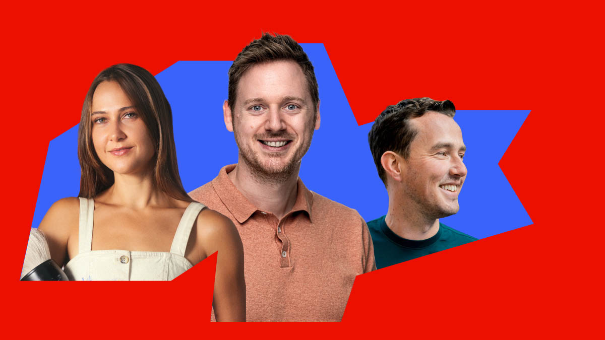
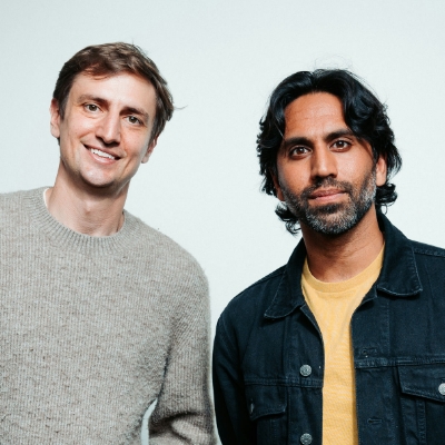
VP of Strategy & Business Operations & Chief of Staff to President David Wadhwani, Adobe

Content Creator & CEO, StudioB
Illustrator and Educator, Yuko Shimizu
Partner and Chief Creative Officer, Peters Design Company
Multidisciplinary Artist and Musician, Wrath Studios
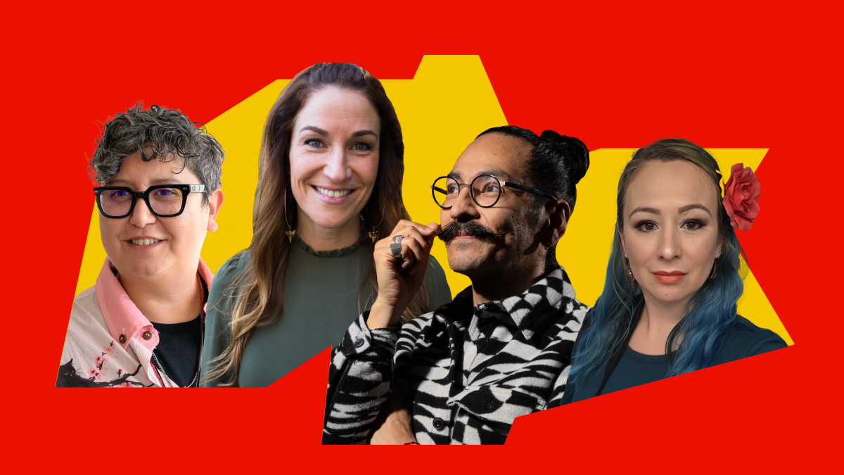
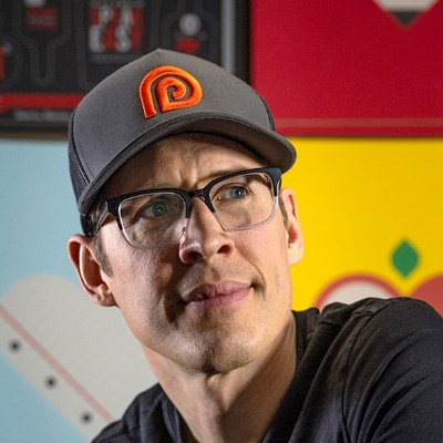
Hosts of the Colin and Samir Show
Artist, Studio Gemma O'Brien

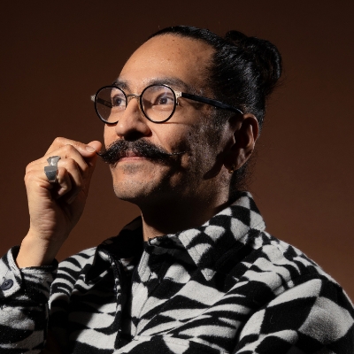
Journalist & Co-Founder, Newpress
Graphic Designer, Brand Specialist, Pink Pony Creative
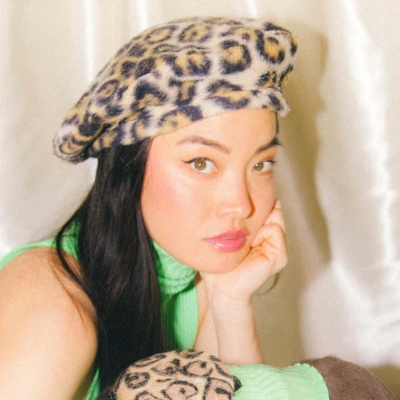
Content Creator, @goharsguide
Artist, Claire Luxton Art Ltd
Film Editor, VH Post
Executive Creative Director, ilovecreatives, Inc.
Art Director, Illustrator & Graphic Designer, ORBEH Studio
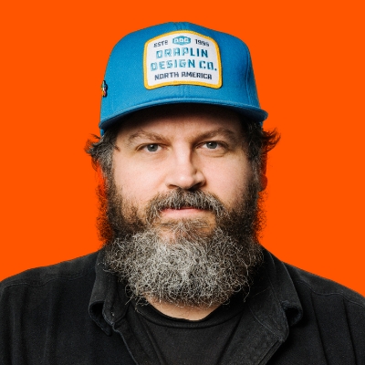
Founder, Draplin Design Co.
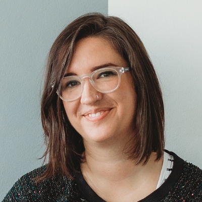
Graphic Designer, Liz Mosley Design
Dig into the apps from today’s MAX sessions and try them out.
Adobe Firefly
Ideate, generate, and create with the top AI models — all in Firefly.
Creative Cloud
Quickly go from idea to done in all your favorite apps.
Quickly go from idea to done.
Discover the 2025 honorees in design, image making, motion, photography, and video.
max diamond sponsors
Their products and services will spark your creativity and help you deliver real business results.