DESIGN
Explore the world of modern logo design.
With bold colours and geometric shapes, you can create a modern logo that speaks for itself. Explore these tips and pull your brand’s unique perspective into a beautiful logo design.
The keystone of branding.
A logo is one of the most important parts to consider when branding a company. An eye-catching and expressive logo can make a brand easily recognisable, whether it’s on a giant billboard or a small business card. If you want to create a cutting-edge, contemporary aesthetic for your brand, consider one of many modern logo styles.
Modern logos are a unique combination of classic graphic design elements and trendy themes. “Lately, I’ve seen a tendency to lean more on typography and sometimes modern logos end up verging into minimalism,” explains designer Sarah Giffrow. While simple logos with clean lines and striking type are in vogue at the moment, keep your business or brand in mind when designing. Make sure your logo stands the test of time. You don’t want your brand to look outdated in just a few years.
Trendy or timeless?
While a modern logo can be influenced by whatever is new and popular, remember that trends tend to repeat themselves over time. What’s popular today has been influenced by logo design trends over the last few decades. “That’s the nature of trends,” says Giffrow. “Somebody has an idea and then everybody thinks it’s great and then everybody starts doing it. So straightaway, you have something that looks like everyone else around you, which is not what you want. With a logo, you want something that’s going to be distinct and representative of who you are and what you’re doing.”
But not all modern logos have to look like they’re made with a cookie-cutter logo maker. You can be inspired by trends, appreciate their beauty and apply those principles to your work in a new or unexpected way. A lot of design trends come about because new design tools or product features become available. Keep an eye on updates to digital design programmes as they’re released and you might just make something no one has seen before.
The elements of a modern logo.
Typography
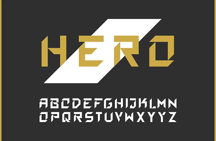
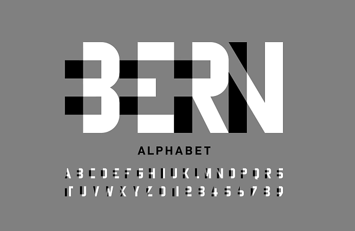
When it comes to logos, the typeface is everything, especially if the logo includes the full business name. Choose a style to fit the industry your brand works within. For a financial institution, you may want a more traditional or classic serif font. But for a hip lifestyle brand, a more modern sans serif typeface may work better.

Icons and geometric shapes
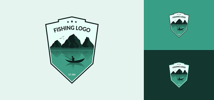
Modern logos often include simple design elements, like graphic shapes or small line drawings. These elements can add visual interest or give a hint at the brand’s industry. “With geometry, simple shapes and lines, you can keep the logo clean and simple and it’s going to last longer,” says designer George Bokhua. “Simple, clean, sophisticated: There’s the formula for a modern logo.”

Colour palette
When it comes to branding, colour matters. And different colour palettes can say a lot about your brand. Blue is a calming, neutral colour that works for many companies across industries. Meanwhile, red is a powerful colour that can signify strength or come across as aggressive. The colours you choose for a logo should reflect the nature of your brand.
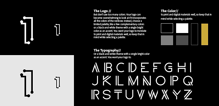
But don’t use too many colours. Your logo can become overwhelming to look at if it incorporates all the colours of the rainbow. Instead, choose a limited palette, like a few complementary colours or a black-and-white theme with a single bright colour as an accent. You want your logo to translate to print and digital materials well, so keep that in mind while selecting a palette.
How to develop a timeless modern logo.
1. Get to know your client.
Before you can design a logo, you need to understand the brand. Meet with your client to talk through what they’re looking for and why they want to redesign their logo. “I don’t think redesigning a logo is something that you should be doing every year or even every two years. It really has to be worth doing, because you’re essentially hitting the reset button on the recognisability of your brand,” says Giffrow.
Ask your client specific questions about what they want. What’s their product or service? What makes their company unique? Who’s their audience? Who are their competitors? What’s their brand identity? And what are some logos they like? When you’ve got these answers, you’re ready to get started.
2. Research the industry.
To design the right logo, you need to explore the context in which it will live. How do other brands in the industry market themselves? When you know what the competition is doing, you’ll know how to set this logo apart from the rest. Think about where the logo will live as well. Consider if the business is completely digital or if the logo will be replicated on signage or printed on merchandise.
3. Sketch out your ideas.
Now’s the time to get ideas onto paper. Draw any idea or inkling of an idea, that comes into your head. These should be rough and unfinished and shouldn’t be shown to your client. “With sketches, only I see the potential in them, while for the clients, it’s harder for them to imagine it. So I’ve always regretted showing sketches to the client early, because there were some very good ideas that got declined and bad ideas chosen that had no future,” explains Bokhua.

4. Pursue your favourite ideas.
When you’ve got some broad logo ideas sketched out, choose a few of your favourites and push those designs further with Adobe Illustrator. “For the beginners, I would advise them to have at least three or four days to develop their ideas. Because it’s usually a process to improve those quick sketches,” says Bokhua.
Keep your designs in black and white at this point, since you want the logo to read well in grayscale. Use vector files to get clean lines and smooth gradients that are easy to edit. This will also allow you to scale the logo to any size needed without losing image quality.
5. Present to your client and get feedback.
Show your logo designs to your client and see what they think. Limit the number of options you show the client, though. “When you end up with 45 logos, it’s hard for everyone to choose. Usually good ones don’t get chosen. It doesn’t work well. For me, I usually present three options,” says Bokhua.
Don’t get discouraged if they ask for edits and revisions. Branding is a process and often takes a few rounds of design and edits to get right. If your clients like specific aspects of different designs, consider how you can combine those into a new logo.
6. Make changes and finalise your design.
With all your feedback in hand, you can go back to your logo designs and make the changes. Now’s the time to experiment with colour palettes as well. You may need to hold several rounds of review and edits with your client to get the perfect logo in the end.
Get modern logo design inspiration.
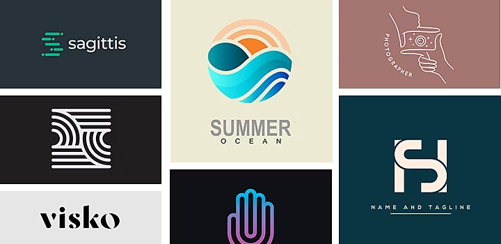
Before you start your next modern logo design, look at what other designers have created. If you stay up on current trends, you can learn what styles you like and which ones you want to avoid. Check out these modern logos on Behance to spur some ideas:
- See how simple line drawings and streamlined graphics combined with the business name can create a clean modern logo.
- Explore this step-by-step breakdown of how an elegant geometric logo was designed.
- See how strong and rigid geometric shapes form the basis for these natural, flowing logo designs.
- Consider the impact of colour with this unique modern logo that incorporates multiple hues and shades.
Modern logo trends are always in flux, but certain styles and techniques can help you to create a timeless logo that stands out from the crowd. Try your hand at modern logo design today.
https://main--cc--adobecom.hlx.page/cc-shared/fragments/seo-articles/do-more-illustrator-color-blade
