DESIGN
Minimalist logo design.
Strip your design down to the bare essentials and discover how simplicity can make your logo stronger. Plus, get design tips for the logo creation process, from research to final product.

Design by George Bokhua
Less is more.
Clean lines, geometric shapes and deceptively simple design are the hallmarks of minimalist design. A minimalist logo strips away unnecessary embellishments and colours to create a mark that is just as impactful as an intricate design, if not more so.
Don’t confuse minimalism with a plain or unfinished look. Minimalist logos may be simple, but they are not simplistic. If you want a logo design that does a lot with a little, minimalism might be for you. Or, if you’re after a clean, modern logo to refresh your brand, you might find inspiration in minimalist design principles.
Why go minimal?
Minimal logos don’t rely on intricate type treatments or detailed adornments to be effective. Their effectiveness stems from the strength of the design alone.
Minimalistic logos typically use simple shapes and monochromatic colour palettes, so they translate well across multiple mediums and sizes. From a business card to a billboard, a brand or company logo should read clearly and effectively. The less detailed your design, the more quickly your audience will recognise it.
For these reasons, minimalism is a great place to start any design, even if you don’t want to end up with a minimalist logo. The tenets of minimalism should be part of all strong logos, so that no matter where you take your design, you’ll have a solid foundation at the core.

Design by George Bokhua

The pre-design process: Visualising brand identity.
Do your research.
A business logo is more than a mark; it embodies the company’s visual identity. Visual identity encompasses everything from a company’s colours and website design to its packaging, fonts and, of course, logo. Get to know the client and their field extensively before you start to sketch. Ask about the client’s mission, values, attributes, audience, competitors and more. All of this background information should inform your design.
Gather design inspiration.
This step is just as important for the client as it is for you. “I like to gather visual examples to see what resonates with them,” says creative director Sarah Giffrow. “A lot of times clients know what they want, but don’t quite have the language to communicate it.” This is where mood boards come in.
“A mood board is good to have as a shared reference point throughout the process,” says Giffrow. Curate a collection of logos, images, colours, visual cues and typography to present to your client. With a visual guide in front of you, you can start to hone in on the direction you and your client want to go.

Sketch and iterate logo ideas.
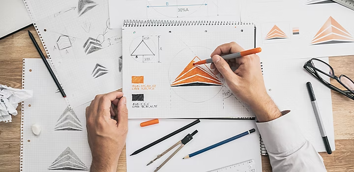
Now that you’re armed with insight and inspiration, it’s time to sketch. Make rapid iterations and make a lot of them. Try to let the ideas flow without being too selective; there will be time for refinement later.
“Don’t show clients sketches,” advises designer George Bokhua. “It can be hard for clients to imagine the potential or final product. I’ve always regretted showing sketches, because there were some very good ideas that got declined and bad ideas chosen that had no future.”
Another tip for this stage is to work in black and white only. A good design will work with or without colour. Plus, this makes lighter work for you and keeps clients focused on design rather than colour palettes.
Develop a few logos and present.
Once you have a handful of solid logo concepts, pick a few to fully develop and present to the client. Two or three is a good number to start with. “Don’t overwhelm the clients with options,” advises Bokhua. “They trust you, the logo designer, to show the best few.” Some clients might initially want more, but a few strong design concepts are worth more than 20 half-baked ideas.

Design by George Bokhua
Tips for making a minimal logo design.
Keep it simple.
Logos naturally lend themselves to minimalism, since you have such a small space to work with. Try to pack in too many details and your design will get muddy at small sizes.
Flat logo design (two-dimensional design with no perspective added) is another popular way you can keep a minimalist profile. Take the famous Nike Swoosh, for example. The simple shape isn’t intricate or dimensional, yet it is one of the most recognisable logos on the planet, thanks to the strength and sparseness of the design.
Simplicity should also transfer into the way you use colour. Minimalism in interior design often features monochromatic palettes and logo design is no different. Stick with the brand’s primary colour or just use black and white.
Stick to geometric shapes.
“I try to use clean, geometric shapes and stick to 45- or 90-degree angles,” says Bokhua. As opposed to more illustrative approaches, minimalist logos tend to keep shapes neat and proportional. For a simple logo that is proportional, graphic designers often use basic shapes like rectangles, triangles and ellipses. You can use rules like the golden ratio to create compositions that are naturally pleasing to the eye.
Use space wisely.
“Space is so important in minimalism,” says Giffrow. Keep elements to a minimum to maintain an airy feel to your logo. This will ensure nothing feels too busy.
With limited room to play, negative space becomes a critical factor in minimalist design. Pay attention to the in-between and white spaces just as much as you do the places you’ve filled; these areas are opportunities to maximise both meaning and space. The universal yin-yang symbol is a great example of how you can use negative space to inform your design.
Choose simple and stark typography.
A customised logo isn’t just designing a pictorial mark; typography is crucial and can make or break your logo. Most brands will include a wordmark or lettermark (which is just the company name) as part of the logo package. This means that your brand must be recognisable by its typeface as well.
“I see a lot of good logos paired with generic text that doesn’t look harmonious with the artwork,” says Giffrow. “Nail down the type first and that will help to anchor the whole piece.”
Most minimal logos use a sans serif font, as serifs tend to add detail and give the logo a more traditional look. But there are certain times when a serif typeface suits the brand name and identity. Play with spacing or tweak individual letter forms to transform a standard typeface into a customised font.

Design by George Bokhua
Master the art of minimalism.
“It’s hard to come up with something that hasn’t been done before,” says Bokhua. “Go in with a clean slate. Don’t look at too many logos beforehand, because they can get in your head and pop up in your design subconsciously.” You might find that too much time looking at other logos constrains you instead of fuelling your imagination.
Still, you’ll need to look at some logos to build your mood board and get your creative juices flowing. Find design inspiration on Behance to see the latest logo design trends in action and get ideas for your new logo.
A unique logo won’t happen overnight. Expect to put in the time with a lot of background research and many iterations to arrive at something that stands out. But the work is more than worth it. Brand recognition is the name of the game and a memorable, easy-to-read minimalist logo is your best bet to create a timeless and unique visual identity.
https://main--cc--adobecom.hlx.page/cc-shared/fragments/seo-articles/do-more-illustrator-color-blade
