Try these tutorials with Adobe Express
Create web pages, social media graphics, and videos.
How to source inspiration, define what you like, and work with a logo designer.
In this course, award-winning logo designer, seasoned freelancer, small business owner, and design educator, James Barnard will talk about all things related to logos and logo design. He’ll share what makes a good logo, how to source inspiration, understanding what you do and don’t like when it comes to design, and even some suggestions on how to find and choose a designer to work with.
A logo is more than just a visual representation of your brand. Your logo is a powerful symbol that communicates your identity to the world. As such, it’s one of the most important pieces of your brand.
There are a few main elements that, when combined, make a good logo:
This element is all about who your brand is. If you’ve heard someone describe a brand as “playful” or “edgy”, those are traits that make up a brand’s personality.
Once you know what and who your brand is, and how it presents itself, it will become much simpler to bring those personality traits into your logo.
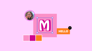
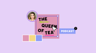
All good logos have this in common: they are as easily recognizable as they are memorable.
It could be as simple as choosing a single shape or honing in on a singular color.
Think of a few of your favorite brands. What do their logos look like? Take notes as inspiration for later.
Pro tip: “Simple” doesn’t have to mean boring!
In this context, relevance means that your logo should be relevant to your business.
You can ensure your logo is relevant by using colors and elements that are relevant to your industry and brand identity.
For example– if you have a floral business, adding elements like a vehicle or an animal would be completely irrelevant. Incorporating flowers into your design would be a much more relevant choice.
Uniqueness–
Among other things, your logo should be unique. After all, there’s only one of you and your brand!
This trait is another opportunity to lean into your brand’s personality. Take the floral business example from before, just because you might want to include plants or flowers in your logo for relevance doesn’t mean you can’t have fun in another way. Maybe pinks, greens, or browns are expected for your industry– what if you took an unexpected approach by choosing a teal, purple, or even orange instead?
Going back to the examples from earlier about memorability, think about things that are unique to you. Do you always write a letter in a certain way? Is there a certain way you sign your name? Do you have a catch phrase that you’re known for saying? These may be things to incorporate or inform your design!
Pro tip: Finding a one-of-a-kind idea often comes after a lot of drafting and experimentation so don’t be afraid to go back to the basics by taking up a piece of paper and a pencil and sketch, sketch, sketching.
When you think about your logo, think about all the places it will be shown– and I mean all the places. You’ve got to assume your logo will show up on many different platforms from social media to TV and in many different mediums from digital screens to print.
It’s also important to ensure your logo can be resized to fit many applications. Can it get really big or really small and still be legible? What about color? Does it look good in your chosen brand color as well as black and white?
Pro tip: An easy way to put your logo to the test is to do mockups. Try using your logo in a social media graphic, put it in a mockup of your website, or print it out at a few different sizes. If your logo becomes illegible in any of these situations, make the necessary changes.
A good logo should stand the test of time and look good for years to come. A practical tip toward achieving timelessness is to avoid using overly trendy design elements or colors.
Think again about some of your favorite brands, brands that have been around for decades, what did their logo look like ten years ago? Twenty? Look up some of these brands and see how (if at all) their logos have changed over time.
Minor adjustments have likely been made to some of their logos, but the base design has remained the same.
In this step, it’s important to consider what you like and don’t like in a logo.
Start this phase by doing some research. Look at your competitors and overall industry to see what they’re doing. Look for common themes, colors, font choices, and even the shapes they’re using. This will help you better understand what’s already working and where you might be able to push outside of the status quo.
Try searching for thematic or stylistic words you see popping up again and again. If you don’t know where to start, start by describing basic aesthetic qualities you like, such as “modern logo” or “elegant logo.”
Collect inspiration as you come across it. This is the exploration phase, there’s no right or wrong thing to save, so don’t worry about knowing exactly what you’re looking for.
Inspiration can come from offline sources as much as it can from online ones. Take photos of signs, billboards, and advertisements you see in your day-to-day life.
Once you’ve gathered a good amount of inspiration, maybe 15-25 items, take a step back and look at what you’ve found. Do any themes emerge? Also, take this time to determine why you saved something– is it the font style, the color, the use of shapes…?
Write down any patterns and edit out anything that doesn’t resonate with the rest of the group. Having your inspiration gathered in one place is useful for you and anyone you may collaborate with.
Being able to articulate why you like something and what about it resonates with you is also key!
Finally, if you’ve decided to collaborate with a graphic or logo designer to bring your idea to life, here are a few practical tips to make your collaboration a successful one:
Research via search: Start with a simple web search to find designers that fit your aesthetic, values, budget, etc.
Look on design websites and / or social media: Sites like Behance or even Twitter and Instagram can be great resources for finding designers.
Ask for recommendations: Do you know anyone else who’s started a brand or had a logo designed for them? Ask them who they worked with.
Read testimonials and reviews: Always read reviews or testimonials for potential hires. First hand experience is invaluable.
Bring any relevant brand documents you have to your first meeting with your designer. If you’ve done research, sourced colors or fonts, pulled together inspiration, or even considered who your audience is and where your brand will show up in the world, this information will all be super helpful.
Communicate clearly what you want, need, and expect.
Ask questions to understand the design process. This is a collaborative thing, after all. Clear understanding on both sides is crucial!
Finally, once you’ve agreed on the terms, price, deliverables, and so on, draw up and sign a contract. Chances are your designer will already have this ready to go.
When working with a designer, they’ll likely already have some sort of intake, discovery, or kickoff process for your project. Here’s a quick overview of the information that James try and get from a client before he starts a logo job:
A detailed brief, answering questions about their brand, their origin story, their target market and much more.
A single paragraph that answers the question: “What does success look like for this project?” Once we have this written out and set in stone, this will be something that can be looked back on and work towards throughout the project.
Four brand nouns. James got this process from Allan Peters. But next, James will work with the client to come up with a list of four ‘things’ that represent their brand. This will be a pre-approved list of objects or concepts that he can work with in the design phase.
Lastly, let’s talk about providing your designer with feedback on the designs they’ve presented to you. Here are a few basic tips and niceties:
Keep feedback constructive, actionable, and specific.
For example, don't just say, "I don't like the orange" because a designer can't work with that. Instead, maybe say, "In my mind, the color orange is synonymous with budget / inexpensive products and since we're trying to represent ourselves as a premium offering I’d prefer we use a different color, like purple.”
Reinforce and praise the positive, don’t only focus on the negative. Your designer should know what parts of the design you do like. This information is just as useful as knowing what you don’t like.
Finally, be nice! After all, designers are people too.
A good logo follows a few basic guidelines: it should be simple, relevant, unique, versatile, and timeless.
Find inspiration and know why you like what you like!
Inspiration can come from anywhere – look online and offline.
Put together a mood board with colors, fonts, and designs you like . That way, if you’re working with a designer, you can easily explain what you like and why you like it.
Come prepared to collaborate if you decide to work with a designer. Bring the research, inspiration, and goals you’ve outlined for your logo (and your brand!) to the conversation and be prepared to explain why you like what you like.
Be specific when providing feedback to your designer. The more information you can give them about what you do and don’t like about the design the easier it will be for them to make edits and you’ll save both of you valuable time and energy.
And one final tip: Think about your brand being a cohesive, unified creation. Independent pieces, like fonts, logos, a color palette, are pieces of a whole. So no matter how many or few people you work with to bring your vision to life, your north star should always be that your end result amount to a cohesive story.