Photography
The basics of photography composition.
Get a viewer’s attention with tried-and-true composition techniques that show you where to place your photo’s main subject.
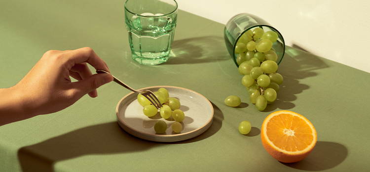
Photography
Get a viewer’s attention with tried-and-true composition techniques that show you where to place your photo’s main subject.
Break your image into quadrants, aiming to balance elements in the photo using the rule of thirds as a guide. Use negative space strategically, boost saturation to pull visual weight and practice identifying which elements in a photo throw it off balance. That way, you can easily spot and fix them next time.
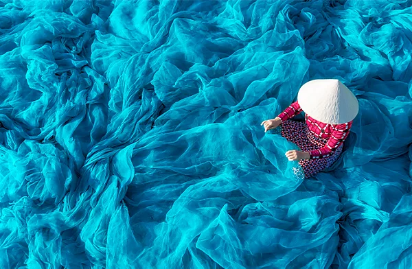

The rule of thirds is a way of dividing frames for optimal composition. It involves evenly dividing the frame between two equally spaced horizontal and vertical gridlines, creating a three-by-three grid. In order to create balance and flow within the image, compositional elements should be placed where these lines of the grid intersect or segment your image. This tends to allow for more interesting images than simply centring a subject. “You want to move your eye around that image and find things with that trio,” says Long. A photo with an interesting element in only one section likely won’t be as successful as a photo that’s interesting top-to-bottom and side-to-side.
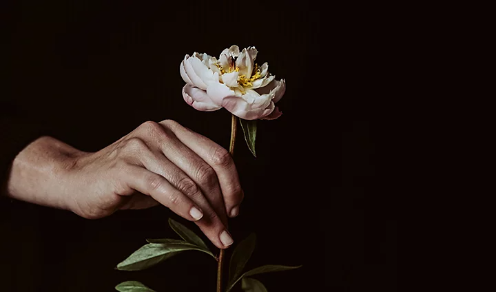
Balance is related to, but distinct from, symmetry. A balanced image doesn’t necessarily look the same right-to-left or side-to-side. Rather, the various quadrants of the image complement each other in aesthetically pleasing ways. A viewer’s eye will likely scan the picture, looking for a point of interest and something else in dialogue with that point — an obvious subject might be balanced on the other side of the image by negative space. “If you have a really complicated photo with a lot of stuff going on, it can cause us to respond by drawing parallels,” says Long, “which can be kind of invigorating, confusing and aggravating in a good way.”

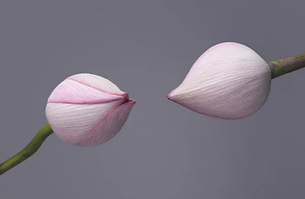
Loud or vivid colours often demand attention and disrupt or complicate. “The saturation of certain hues is really going to pull your eye,” says Long. “If I want something to pull more visual weight, increasing its saturation or its luminance can be useful.”
Unbalanced photos can look disorienting or amateurish. “When a photograph is out of balance it provides uneasiness,” says Long. “The majority of the time we like a sense of fluidity with the image.” Things on the left correspond with things on the right and perhaps they circle around something in the middle. Like having a feel for aesthetics or good intuition about images, recognising balance comes with practice. “Balance isn’t something you can teach people,” says Long. “You really get a sense of it as you look at things.” The more you work, the more familiar you get with how elements of an image work in concert with each other.
Photography flattens three dimensions into two. In order to preserve a feeling of space and dimensionality, a photographer has to be aware of what’s in a shot and how they’re focusing on it.
Leading lines are visual elements that pull the viewer’s eye toward a subject or focal point. They can be anything — roads running off into the distance, an arm stretched out toward something else, tree branches rising toward the moon — anything that pulls attention toward something else. These lines can give flat surfaces the appearance of depth, dimension and shape.
Focus and depth of field also add to the illusion of a third dimension within the photo. Shallow depth of field can give the viewer the impression that they’re focused on something immediately in front of them and it provides a look of depth and scale, even in a flat photo.
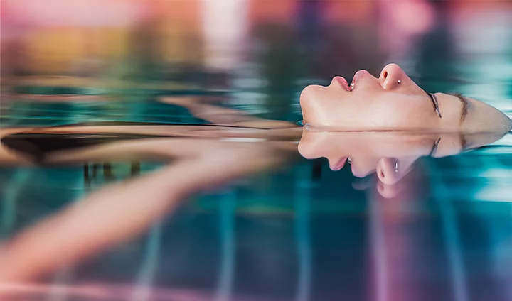
If you want to play with composition, move around. Simply changing perspective can mean the difference between a great photo and a conventional one.” All we’re doing is choosing to exclude things or include things,” says Long.
Play with your spacing and distance from your subject. “I move around a lot,” says Rivera. “I get really low or really high. I see what it’s like if I get under my subject or see what it’s like if they move side-to-side.” Get close, get far and move to find how you want to frame your subject.
Lastly, when you’re composing a shot, keep in mind how the image is ultimately going to be used. “There might be text that goes over an image or it might be a magazine cover,” says Rivera. Allow for those potential extra elements when you’re lining up the shot and try to conceptualise them while you look through your viewfinder.
If the composition of a photo is a little off, it’s often possible to improve it in post-production with a quick crop. A photo might not frame the subject in an optimal way. But, just by moving the edge of the frame, you can often find a good image within a mediocre one.
When going through old images, try looking at them from a different angle or perspective. “Play with the rotation of the image,” says Rivera. “When you do a crop you can rotate it, flip the image or put it upside down and maybe see something else.”
You need to do more than just follow compositional rules to shoot good photos. It’s possible to follow things like the rule of thirds without intention or to use it without purpose. Understand that the elements of composition aren’t like algorithms or formulas — they help guide a photographer’s decision-making skills, not substitute for them. “Leading lines are great, but hopefully they’re leading me to your subject and not leading me to nowhere,” says Long.
Photography composition rules are the foundation. After you’ve internalised the fundamentals of what goes into a good image, you can break the rules. “Once you have the basics down, you can experiment,” says Rivera. “There are no set rules for how you should shoot anything. That’s the beauty of being an artist. You can make your own rules and your own imagery.”
Good photographers have an eye for subjects and scenes. Composition is a tool they can use to help others see what they see. They collect elements of a wide world and, with their equipment and expertise, organise it pleasingly within a rectangle. This is true for any type of photography, whether it’s portrait photography at a human scale, landscape photography on a grand scale or macro photography of tiny worlds.
Contributors
Based on your location, we think you may prefer the United States website, where you'll get regional content, offerings, and pricing.