The basics of drawing noses.
Illustrating noses is all about placement, simple shapes and perspective. Learn some tips from professional artists to help you to start sketching better faces.
The central, often ignored, feature of the face.
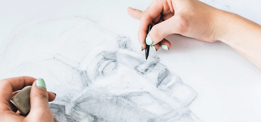
It’s easy to overlook noses. When most people look at a human face, they make eye contact. Or people’s eyes are drawn to the mouth to see if someone is smiling or not. A person’s haircut, hat or earrings might all draw attention before a nose does. When an illustrator sits down to draw, they may have a good idea about these other features or have noticed a strong jawline or a tilt to the eyes. But they might find themselves stumped when it comes to even the basic shape of the nose. And, after a few missteps, perhaps they find themselves reaching for their eraser.
Noses are important, though. Without the right nose, a character can look distorted, incomplete or simply not right. Here are a few things to keep in mind when drawing noses and some simple steps and tips to help you to illustrate those middle-of-the-face features.
Placing the nose on the head.
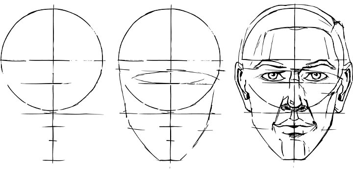
Any step-by-step tutorial for noses begins with where the feature is placed on the head. “The head is roughly divided into the top half and the bottom half,” says comic book artist and illustrator Jonathan Case. “The top of the nose actually starts at the midpoint line.” According to Case, placing the nose properly on the face can be non-intuitive for new artists. “When they start drawing, a lot of people put the nose too high,” he says. Remember, the eyes sit in the middle of the face. The highest point of the bridge of the nose does as well. Making sure the nose sits in the lower half of the face, with the bridge of the nose reaching just past the face’s midpoint, is a key way to make sure the nose looks like a natural part of the face.
Exploring the basic nose shape.
There are a variety of nose shapes, but most noses in drawings begin as a triangle. “Once you have that basic triangle in place, you can do all sorts of other things,” Case says. “You can give them a hooked nose or make it more rounded or bulbous — but you’re starting with the triangle shape.”
The guidance of the triangle shape is something artists can keep in mind with various perspectives. “Let’s say we’re looking up somebody’s nostrils,” Case says. “That triangle shape is going to become a pyramid. If we cut that into various sections, we’ll start understanding where the nostrils should be placed.” Shifting perspectives is much easier when you remember that the front view of the nose is basically a triangle, as well.
Nostrils also have a basic shape. “Nostrils are almost a comma shape, where the end just tapers off almost to nothing,” says Case. Nostrils can be more rounded or elongated, but they’re not perfect circles.
Watch the pros draw noses:
Artist Doc Reed sketches faces — nose and all — from start to finish.
See comic book characters go from pencil drawings to full-colour inks in this video featuring artist Logan Faerber.
What the nose shows.
Other facial features are dynamic. Eyes widen with surprise and narrow with suspicion. Mouths open to shout or form smiles, frowns or grins. Noses are relatively static, but they’re still important for conveying information about who a character is or what they’re doing.
Unlike eyes and mouths, noses cast shadows. They can suggest the presence of a light source (or lack thereof) in an illustration, even when an artist is focused tightly on a character’s face. If all you see are the basics of a face, the length of a nose’s shadow or the way you darken features around it can suggest either low light or the noonday sun — setting a mood and tone for the image.
Noses are also great for showing off, suggesting or exaggerating the angle or direction of a character. “The nose can show the tilt of a character’s head, because it looks very different depending on what angle you’re at,” says illustrator Greg Bigoni. A slightly shifted nose can show a character looking up with curiosity or down with condescension.
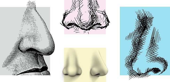
Noses in different styles.
Noses are one of the first features to change in various drawing styles. If an illustrator wants to signal what style they’re trying to use or reference, the nose is a great way to show how they’re stylizing the human face. In more cartoony styles like manga or comics, noses might just be a line or two. An artist that draws a realistic nose is deliberately setting themselves apart from stylization and signaling that they want their work viewed differently.
The placement and basic shape of the nose remains an essential component to depicting the human face. Fine-tune those elements of nose drawing with ease using layers to draw in Adobe Fresco.
Contributors
You might also be interested in…
Take your skills to the next level with drawing exercises and advice from professional illustrators.
How to become a professional illustrator.
Get tips on portfolio creation and art presentation to help you kick off a new career.
Beginning a career in children’s book illustration.
Get insight and advice into the competitive world of art for kid’s literature.
Try your hand at pencil sketching.
Pencil drawing is an essential first step for most artists. See how this skill can improve your art.
