DESIGN
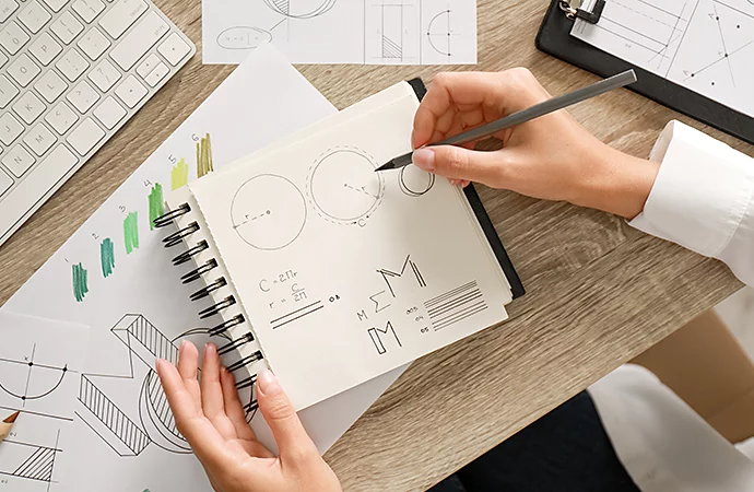
Add personality with hand-drawn logos.
A hand-drawn logo can look like a quick doodle or fancy calligraphy. Here’s what to keep in mind when making a logo that looks handcrafted.
Why use a hand-drawn logo?
A hand-drawn logo can help an organization appear more personable or approachable. Much like a signature, a hand-drawn logo makes it seem like someone in the company took the time to personally inscribe a product or a piece of merchandise. Products with hand-drawn logos don’t just bear the mark of their company; they can also look like they’ve been personally inscribed. Use a hand-drawn logo to project a kind of down-to-earth, low-fi, or rustic brand identity, one that suggests old-fashioned methods of craftsmanship.
Sometimes hand-drawn logos really are done by hand, and sometimes skilled graphic designers just make logos appear hand-drawn. Regardless of how you do it, keep the following in mind to make a logo that has that personal flourish.
How to craft a hand-drawn logo.
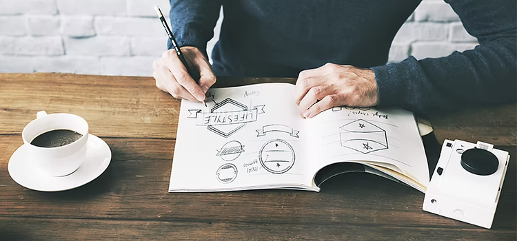
The best way to make a logo look hand-drawn is to actually draw it, either on paper or with a digital stylus. A fake hand-drawn logo made with logo templates or other methods almost always results in something that looks just a little bit off or wrong. If a viewer can tell that a hand-drawn logo is actually just a bit of clip art, that logo is a failure.
A good hand-drawn logo design takes time. Something might look like a doodle the artist made in a few seconds, but usually that doodle is the result of several iterations and drafts. Try different logo ideas, iterate on them in several different ways, and make extensive use of tracing paper. Draft something and trace it. Trace it again and again until you’ve simplified the visual elements down into a single doodle.

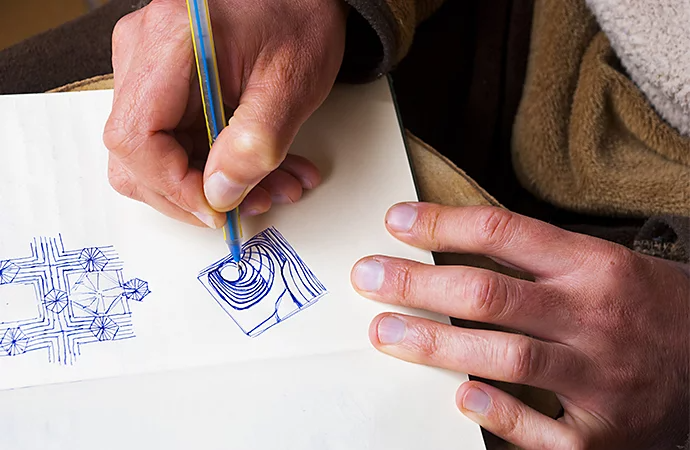
Hand-drawn logos can often bear the marks of a designer’s tools. These logos take advantage of paper texture and weight, the thickness of brushes, the viscosity of ink, and the granular nature of pencils or charcoal. A hand-drawn logo often shows off its process of creation or a version of that creation. These logos show off how they were made and what they were made with.
To get that look, a logo maker has to use the right tools. “Textured paper is very important,” says designer George Bokhua. “It gives more character.” When done well, a viewer can look at a hand-drawn logo or wordmark and immediately imagine the designer sketching it. To best take advantage of the characters of paper, pen, or ink, a designer would do well to avoid straight lines. “Sharp edges are not nice,” says Bokhua. “You don’t get the paper texture.”
Digital tools, low-fi look.
You can create logos with physical media and then scan your work. You can also use apps like Adobe Illustrator and Photoshop to emulate physical tools.
It takes time and care to get the right look from digital design tools. “Some typefaces have a hand-drawn look,” says designer Lenore Ooyevaar, “but you can always feel that they were computer-generated. Don’t be afraid to write the words yourself.” Hone your own skills with calligraphy and typography as you’ll nearly always want to adapt or alter existing typefaces when working on a logo. It’s even worthwhile to spell out the company’s name in a typeface you want to emulate and then trace over it yourself for that hand-drawn look.
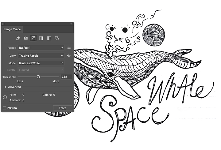
Ooyevaar also recommends using the tools in Photoshop and Illustrator that can emulate tracing paper. “Experiment with Image Trace,” she says. Sometimes you’ll have to redraw it, but by layering images on top of each other, you can create something that eventually conveys brand identity in the right way.
Some typefaces are made to emulate cursive or calligraphy. If you decide to use them, do so with care. “If you do use a hand-drawn-looking typeface, manipulate it,” says Ooyevaar. “If you have two of the same letters in a word, you don’t want them to be identical.” If your viewer can tell that you’ve used a premade font, your logo will fail to communicate a sense of authenticity. Even when you use digital tools, commit yourself to the handmade ethos of hand-drawn logos. Put your personal style into them and make something that truly reflects your skills.

Create versatile hand-drawn logos.
Keep in mind that a hand-drawn logo has to do everything that a functional business logo does. It has to be scalable: look good in color, grayscale, or black and white: and it has to work on everything from digital marketing materials to t-shirts to stickers and business cards. Sometimes a logo stands in for a business name entirely, and it should also be recognizable in an instant. If you’ve planned accordingly, your logo will be able to do all of those things. Also, it will communicate to viewers the kind of business it represents: a place that offers a personal touch and attention in all of their work, right down to the logo.
https://main--cc--adobecom.hlx.page/cc-shared/fragments/seo-articles/do-more-illustrator-color-blade
