Photography
Get expert tips and techniques for colour photography.
Learn about the origins of coloured photographs and discover various ways to express colour in digital photography.
Photography
Learn about the origins of coloured photographs and discover various ways to express colour in digital photography.
The first photographs were black and white and black-and-white photography remains an important medium for exploring light, texture and composition. But today, the default in digital photography is to mimic a full spectrum of visible colours.
“Colour photography is making pictures that look more like how the world looks,” says photographer Nicole Morrison. With colour photography, you can also play with the hues in a colour image to enhance a mood or feeling. And digital editing tools can help you to get the colours in your photos exactly how you want them. “All the images that make me feel good,” says Morrison, “all the photos that I’m really excited about, they’re all really colourful.”
It was a long road from black-and-white film photography to the vibrant coloured images we see today. Long before the digital camera, the very first photographers took black-and-white images as early as the mid-1830s. Called daguerreotypes, these were made on polished metal plates using a photographic process involving extremely long exposure times and light-sensitive chemicals. Black-and-white photography evolved and remained popular through the first World War.
Thomas Sutton created the first colour photograph in 1861. For this famous photo of a tartan ribbon, Sutton used a three-colour method invented by physicist James Clerk Maxwell, who realised that the perception of all colours in an image could be created with a several-step process of taking multiple images through three coloured glass plates: red, green and blue. Louis Ducos du Hauron used a similar technique to create a famous coloured landscape photo of southern France in 1877, named View of Agen.
Autochrome Lumière, created by Auguste and Louis Lumière at the start of the 1900s, was another long-exposure colour photography technique that used “autochrome plates” coated with tiny dots of multicolored starch, instead of just one colour. Still, plate methods were complicated, drawn-out processes that yielded less than ideal results. Until, in 1908, Gabriel Jonas Lippmann won the Nobel Prize in Physics for his method of creating colour in a photo in just one single process using a colour-sensitive film coating or emulsion, on top of a glass plate.
Eventually, Lippman’s chemical emulsion gave way to the most widely adopted type of colour film, which also used light-sensitive emulsion. Two Leopolds, Leopold Mannes and Leopold Godowsky, invented this style of “tripack” colour film in 1935 and it was popularised by companies like Kodak and Polaroid. Yet, even after shops began stocking Kodak’s Kodachrome colour film, it still took a few more decades for colour photography to catch on. Colour was considered more of a party trick than a fine art until photographers like William Eggleston gained recognition in the 1970s through gallery exhibits and respected publications.
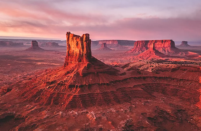
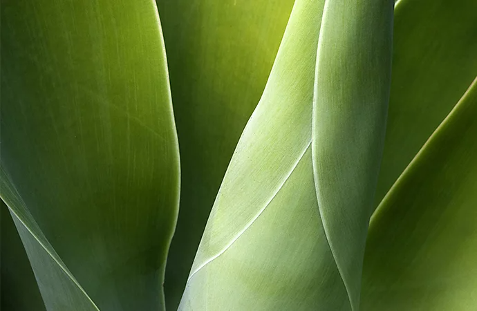
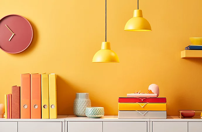
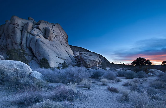
Modern digital cameras make it easier than ever to capture the world in living colour. You can shoot and edit colours differently to create unique effects. Consider the following to get the most out of your colour photography shoot.
Capture your images with your camera set to RAW mode, which records all the data your sensor captures, unlike JPEG, which compresses that data. This will give you more data to work with. “Especially with colour photography, you want to have as much information as possible to change and tweak,” says Morrison.
"People are drawn to bold colours, so use that strategically,” says photographer and author Jeff Carlson. “Try using just a bit of colour to add a pop, but don’t use so much colour that people don’t know where to look.”
"If you’re not sure where to start or don’t feel confident in your ability to judge what colours go well together, start with the colour wheel,” recommends Morrison. Explore and create different colour palettes with ease using Adobe Color.
Find colourful backgrounds for shoots right in your neighbourhood and have your subjects bring outfits to match. “I made myself a Google map that was called ‘colourful locations’ and I dropped pins for myself to come back to later,” says Morrison.
Take photos of items on contrasting coloured backgrounds or backgrounds of a similar tone. “I went to the art store and bought all these different coloured papers,” says Morrison. “Then I just started shooting different things on the papers to see what I liked.”
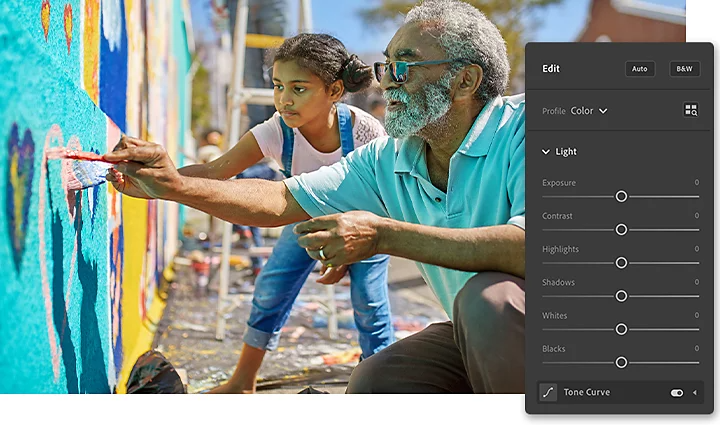
The days of painstaking colour processes to develop coloured photographic prints are over. Advanced digital photo editing tools in Lightroom provide myriad ways to adjust and perfect colours.
Eliminate unwanted casts caused by things like blue light and instantly make all the colours in your photo look more accurate by adjusting your white balance. “The auto white balance function in your camera will get things right about 90% of the time,” says Carlson. “But you can also change it in a deliberate way for a warmer or cooler mood.”
Under the Colour section on the Edit panel in Lightroom, easily adjust sliders to change the Temperature (cool to warm), Tint (green to magenta), Saturation (intensity of colour) and Vibrance (intensity of muted colours, which preserves skin tones).
Click the colour wheel icon to the right of the Colour drop-down menu in the Edit panel to open the HSL (Hue, Saturation and Luminance panel). Here you can individually tweak the Hue, Saturation (intensity) and Luminance (brightness) of the eight main colours in your image.
For example, if you photograph people sitting in the grass, there may be green reflected on their skin tones. Slightly desaturate the yellow and green in the HSL panel to correct for this. Not sure which colour to click to fix a certain area? Click the Target Adjustment icon in the HSL window and then select the area to adjust right on the photo itself.
"With colour photography, you just want to go and have fun,” says Carlson. “Get out there and find places with lots of colour and you’re going to end up with some interesting photos.” Use Pinterest to create a mood board of colourful work to inspire you. And talk to other photographers whose work you admire.
Find everything you need to make the most of your colour photography in Lightroom and Photoshop. And most importantly, don’t be afraid to experiment. “Colour photography is like photography in general. You learn the rules and then decide which ones to keep following and which ones to forget about,” says Morrison.