DESIGN
An introduction to flat logo design.
This two-dimensional design style combines simplicity, minimalism and a modern feel for a logo that stands out from the crowd. Dig into the world of flat design and learn how to craft your own flat logo.

DESIGN
This two-dimensional design style combines simplicity, minimalism and a modern feel for a logo that stands out from the crowd. Dig into the world of flat design and learn how to craft your own flat logo.
A logo that falls flat might actually be just what you need to give your brand a boost. A flat logo design is one that is two-dimensional, simple and silhouette driven, often designed without highlights, shadows or intricate details.
From Instagram to Spotify, Netflix and Apple, your favourite brands have probably switched to a flat logo at some point in their recent history. And it’s easy to get why: Flat logos are uncluttered, modern and simple to understand. Whether you need to update an established brand or just want to master the basic principles of flat design, pick up the tips you need to get started on your next flat logo.
Readable
Logos are all about communication with customers and brand recognition. “You need to communicate fast and to do this your logo needs to be simple,” says designer George Bokhua. “The more information you have in the logo, the more time it takes to process and communication becomes harder.” Enter flat logos. Take away dimensional depth, highlights, shadows, texture and intricate details and you’re left with a simpler shape that’s easy to understand in a split second and is thus ultimately more memorable.

Flexible
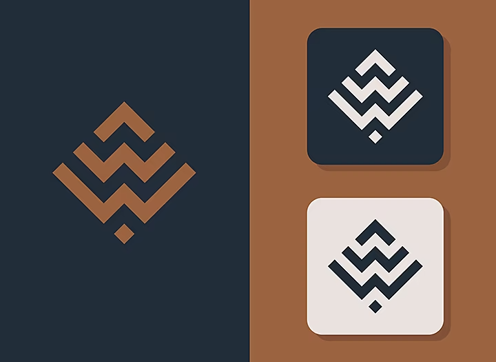
Simplicity also means that flat design logos are easy to scale up and down. A company logo has to look good on everything from a business card to letterhead to a mobile app icon. Thanks to its minimalist design elements and colours, flat logos are perfectly suited to be transferred between media of all sizes.
On trend
Not only is flat design incredibly practical, it’s also one of the most popular graphic design trends of late. Simplified, two-dimensional designs go hand in hand with minimalism, another popular design philosophy. Many companies that want to refresh their brand identity choose a minimalist, flat logo redesign to help them to get a modern feel.
Strong shapes
Basic geometric shapes are the building blocks of an effective flat logo. Similar to minimalist logos, the goal is to create a distinct silhouette without any extraneous details. “All the memorable symbols throughout history — a cross, a star, a moon symbol or even cave paintings or flags — they’re all flat,” points out Bokhua. “For a logo to have a long lifespan, it needs to work well as a flat design first.”
Simple typography
Flat logos are almost always paired with a sans serif font. Elaborate fonts won’t help you to achieve that effortlessly memorable and modern look you probably want out of a flat logo. Stick with a simple, crisp typeface and keep text to a minimum for the most impact.
Contrast and colour
Flat logo designs skip over intricate details and depth and instead emphasise contrast. Without tools like gradients or texture, you can easily render contrasts with colour so your shapes don’t bleed together.
Keep your colour palette to one or two bold hues for a clean look. Remember that any logo will also have to look good in grayscale, so think first about how you can communicate your form through contrasts in black and white, then think about colours.
Research
Great logos start not with a sketch, but with extensive research. Get to know the goods or service you want to promote inside out. If it’s client work, ask about the company’s history, mission, values, competition and target audience. The more you know about the organisation, the stronger your logo will be because you’ll be able to incorporate all the information you learnt into the design.

Gather inspiration
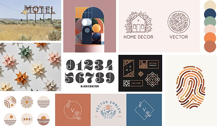
Mood Boards are a great way to conceptualise your logo, explore what’s out there and help your client visualise the art direction. Search Behance to gather logo inspiration and design examples from other artists and make a compilation of logos, colour palettes, typography and imagery that you might like to include in your own design.

Design
Make lots of fast iterations and don’t worry about perfection. “Start with a silhouette,” advises Bokhua. “You need a strong silhouette, then whatever goes inside the logo is secondary. Just like architecture, any iconic structure needs to be recognisable by its silhouette.”
Once you’ve sketched out a few concepts, pick a couple to dig into deeper. “I do most of my work in black and white,” says Bokhua. “Every first client presentation is shown in black and white. Colour is a later addition.” Remove colour from the equation until later in the process to keep you and your clients from being prematurely distracted by colour, so you can focus on the design.
If you don’t want to start from scratch, get a head start with logo templates or use a free logo maker, great for designing on the fly or kick-starting your imagination.
Now that you hold the keys to a great flat logo, you’re ready to get to work. Even if you’re not sure that’s where you want to end up, “if you’re good at making flat logos, other logos will become easier to design as well,” says Bokhua. Have fun, experiment and discover where the process takes you.