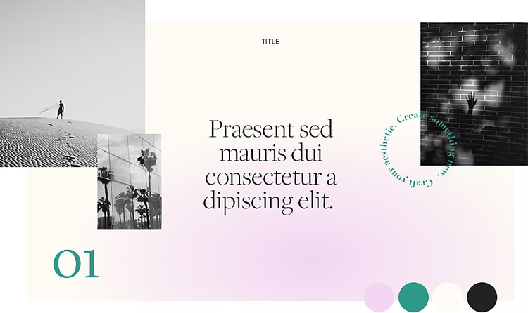
Craft presentation backgrounds that complement your work.
Learn how to create eye-catching visuals for your next sales pitch or marketing presentation with intuitive design tools, helpful tutorials and PowerPoint presentation templates.

Convey ideas with compelling slideshows.
For business presentations, a good slideshow can communicate your message and break down your proposal into smaller, more consumable pieces. By collecting all your data, photos, infographics and videos, slideshows help you to make an engaging and memorable presentation that makes a lasting impression on your audience.
Whether you use Google Slides, Microsoft PowerPoint presentations or Keynote slideshows, a well-designed presentation can help you to make a sale, land a business deal or communicate your next big idea.
Presentation backgrounds that resonate.
While the content of every slideshow will vary, the presentation background design can be the same. This gives your brand a cohesive look and enables everyone on your team or at your company to use the same slide layouts. When you craft your own slide backgrounds, you can save them as a PowerPoint theme and reuse them for future presentations.

Customise templates for your brand.
While you can always use one of the free PowerPoint background templates available in Microsoft Office, a custom, editable design template will give your brand a more professional, bespoke look. Start by adding your branded colours, fonts and the company logo to your background design. From there, you can explore gradients, shapes and patterns that work with your company style guide.

Create different layouts.
Depending on your presentation, you’ll need a variety of slide layouts to adapt and customise. Some slides may just need text boxes, while others should show images or infographics. The right visuals can help you to illustrate a point or make an argument, so make sure your background design doesn’t distract from your slide content. You may also need slides that display charts or graphics, so choose a colour theme that will help you to highlight the data without clashing with the background design.
Tips for designing your own presentation backgrounds.
Consider your audience.
As you choose colours and select imagery, keep the brand and audience in mind. Different colours and designs resonate with different viewers. For a large tech company, a minimalist, pastel blue background could help to cut out distractions and focus the presentation on the data. On the other hand, if you have an exciting lifestyle brand, a brightly coloured abstract background design might work better to help you to sell products and communicate your brand’s energy. Find some presentation inspiration and make sure your approach aligns with your company’s goals.
Make it legible.
Presentations are meant to be quickly understood. If your background distracts from the information or the colour gradient makes the text difficult to read, you’ll need to try again. Make sure the contrast between the text and the background is high and add some white space that can direct the viewer’s eye and create visual breathing room. You don’t want the slide packed with too much info, so reserve space for the photos and visuals you’ll add later.


Keep it consistent.
Whether you use a single, high-quality background image or a series of abstract shapes, make your slideshow consistent. While slides can vary from each other, make sure a single visual theme ties them all together. If you use slideshows for marketing or sales presentations, make sure they match your other marketing materials. You want to tell a unified story about your brand and a consistent aesthetic is a great place to start.
Different ways to customise your backgrounds.
There’s no one way to build or design a slideshow. Adobe has the tools to help you to create and customise stunning presentations.
Start with your graphics.
Instead of using clip art in your presentation, elevate your marketing materials by developing your own background graphics and textures in Adobe Illustrator and Photoshop. Highlight your brand colours by creating graphics and charts using the same palette or colour theme and then edit your photos to perfection in Photoshop before adding them to your final slide design.
Browse the templates.
With the Adobe Stock Add-on for Google Slides, you can easily browse presentation templates and Adobe Stock assets as you work. Instead of using placeholder images, you can preview photos and graphics in your design template before you license or purchase them. This lets you ensure that the final design will be cohesive before you make any purchases.
Rely on your Libraries.
With the Creative Cloud Libraries and PowerPoint Integration, it’s easy to access the photos and designs saved in your Libraries as you edit your PowerPoint slides. This lets you easily transfer stock images, photos, vector graphics and more directly into your PowerPoint presentations from your preferred Adobe app.

Build your slides.
You can also create a presentation in InDesign and save the slideshow as a PDF to easily share it. Just set your page dimensions in InDesign, pull in your photos, designs and videos from your Libraries and add your messaging. From there you can export your slide deck to share it with your team, clients and audience.
However you design a presentation, the right visuals can convey your important message and help your brand make critical connections with the audience.
More topics you might be interested in…
How to create effective marketing materials.
