DESIGN
How to succeed as a digital designer.
Digital designers use their skill sets and design principles to create user experiences for online platforms, but design success requires more than just aesthetic talent.

What is digital design?
Digital design is a broad term for all that goes into creating different digital products. It encompasses graphic design, user interface, user experience, and occasionally real-world products that have digital components. Every layout, array of buttons, or control panel you engage with was created by a professional designer with sophisticated digital tools in consideration of your ultimate user experience.
The choices digital designers make determine everything from how we operate electronics to how we read words on a page. Nothing is accidental. “Your TV is an interface. Your car is an interface,” says designer Aliza Ackerman. “It doesn’t just happen, somebody had to design it.”

Design with the user in mind.
Digital designers tend to be multidisciplinary. They need to know about typography, color, graphics, and photography, and combine those practices and media in a way that creates a larger experience for the user, one that anticipates what they need and how to address their needs.
Web designers make sure a web interface looks good, but web design is part of a larger field of user experience, in which designers make systems that are easy and intuitive. Those systems can also include apps, hardware with digital elements, software, or even live events. Regardless of the use case, designers bring creative skills to solve problems. Form follows function, and the look and feel of digital products, user interfaces, and print designs all have to serve a purpose.
Good designers put the user first. “Empathy is so important in digital design,” says Ackerman. “The user has a need, and you’re helping to solve the problem.” Ideally most of a design’s function and usability will be immediately apparent to the user. No one wants to spend a long time looking at your design or interface like it’s a puzzle to be solved. They need to be able to pick it up and use it instantly.
Tips for digital designers.
Digital design is a multidisciplinary practice, but there are some things to keep in mind regardless of whether you’re working with motion graphics or a web experience.

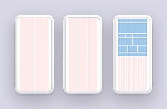
Use grids.
Nearly every digital layout is based on a grid or guide. “Every website has a grid structure,” says Ackerman. “If you look closely enough you can find the structure they’re using and learn from the best websites.”
Stay consistent.
Digital designers are, in many ways, system designers. A user needs to recognize that different parts of that system are related to each other. Fonts need to stay consistent, and different typefaces should have similar functions over different contexts. “Keep it simple,” says Ackerman of fonts. “Pick a typeface or a type family that has a wide range.”
Stay organized.
Keep your files in order. Successful designers know that web developers, writers, project managers, other designers, and clients may access their files. When those partners open design documents, they need to be able to understand what they’re looking at. Organize the layers in your editing software, and label everything clearly. Keep in mind that other people will need to use your work, so make your files easy to work with.
Be a team player.
Every project involves collaborators and stakeholders, and good graphic designers make things easier for people they work with. First, designers need to understand their client’s needs. “Getting to know the client is so important,” says designer Emma McGoldrick. “I do a lot of podcast covers, and I couldn’t imagine doing them without speaking with the client and knowing why they are doing their podcast and the inspiration behind it.”
Design for accessibility.
Think about all potential users, including those with visual impairments. A good design takes into account some of the most common accessibility issues that users might have and ensures that everyone can have a seamless user experience.
.

Some visually impaired users employ text-to-speech tools when they use the internet, and copy within your design should account for that. Also, plenty of users might see perfectly clearly, but be colorblind. Red-green colorblindness is common, and your designs shouldn’t rely on color cues that many users will not be able to tell apart. If you use red/green contrast (or blue/yellow contrast, another pair of colors difficult for colorblind people), be sure to include other visual cues like copy or icons so those users can easily navigate your design.
Likewise, keep contrast in mind. Users with visual impairments can find lack of contrast to be a major impediment, and other users might just find it annoying. Look at things in just black and white to see if your design has enough contrast. “It shows you where your darkest darks and lightest lights are,” says Ackerman. Be aware of your color choices and values, and make sure text stands out sufficiently against the background. Familiarize yourself with how people with common visual impairments are going to see and interact with your work. Make your design work for them too.

Thrive as a digital designer.
Many paths can lead to digital design. It helps to have a bachelor’s degree in a relevant field like design or video production, but potential employers are almost certainly going to pay more attention to your portfolio and experience. You can begin as a freelancer in your own community. “Start on social media,” says McGoldrick, “and stay local.” Put your work out there in a place where potential clients can see it. All the while, hone your skills with industry-standard tools like Adobe Photoshop and Illustrator.
Good designers constantly expand and cultivate new skills, and they also know what they’re capable of and where their strengths are. It’s important to make your skills clear to employers and other team members, and be clear about what you can and can’t do. “I always make sure to specify that I’m not a web developer,” says McGoldrick.
There’s always room to grow as a designer. “A big challenge is the temptation to give up,” says Ackerman. “Design is hard work. Talent can get you far, but you have to learn how to take criticism.” Develop a thick skin along with your graphic design skills, prioritize working well with others, and always keep the user in mind.
https://main--cc--adobecom.hlx.page/cc-shared/fragments/seo-articles/do-more-illustrator-color-blade
