By Caleb Kingston
Jun 9, 2021 ·
5 min read

Artwork by Bhavya Minocha
Things move very fast in the world of design today. We’re expected to deliver experiences and prototypes at breakneck speeds while maintaining a standard of quality and consistency we’re known for. In many cases this can seem an unreasonable ask but with the help of a well thought out design system, we have the power to deliver just that.
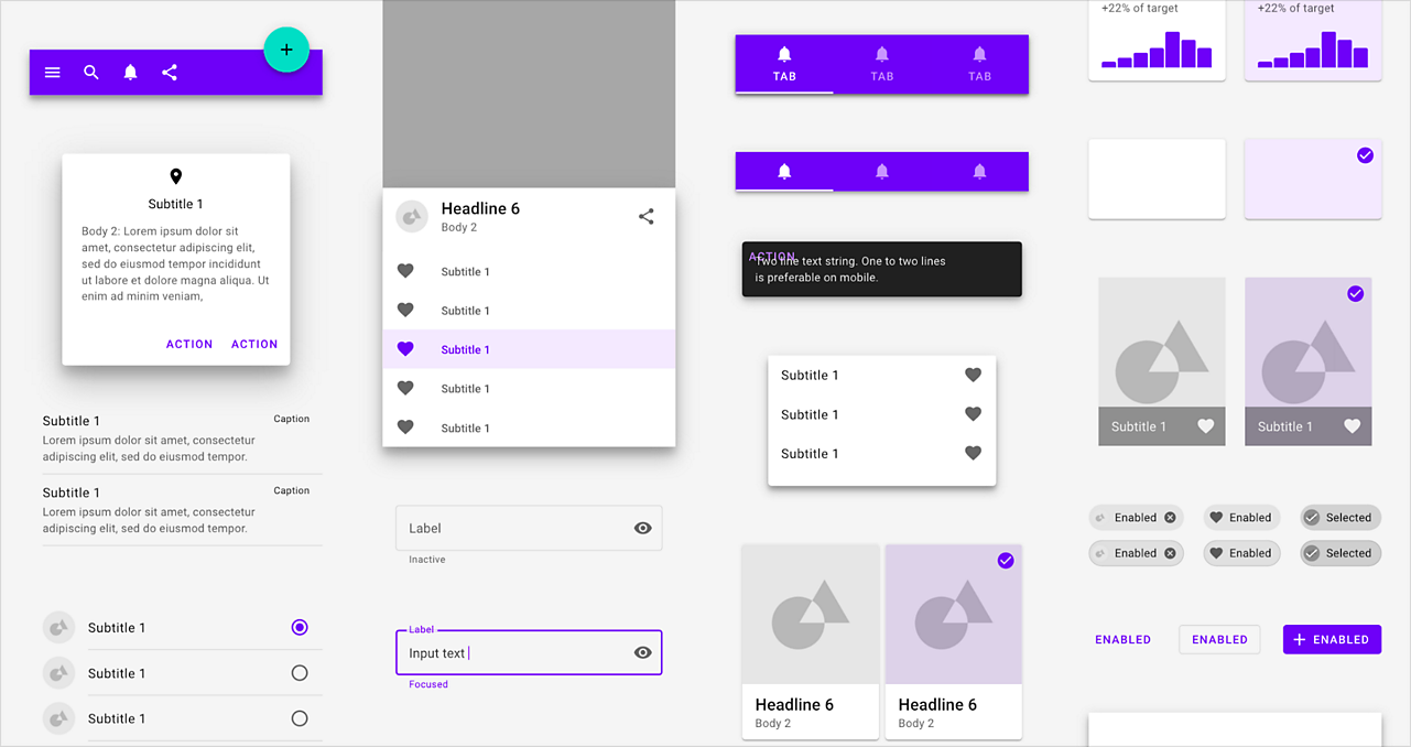
Design systems and UI kits can save you precious time when designing new experiences, giving you many preset colors, character styles, and components to start out from so you can focus on original ideas without worrying about reinventing buttons, checkboxes, and other components each time.

There are many benefits to using a design system like material design; We have many predesigned assets available to build new experiences out fast but we can also make changes to these assets at any time and those changes will ripple throughout our project everywhere that asset is used. Imagine designing an app with hundreds of artboards and being asked to change a color or character style on the fly. With a Design System in XD, this can be done with just a few clicks.
While creating a Design System from scratch can take a lot of time and setup, using an already established Design System like Material Design as a baseline can really propel your workflow forward and still give you the advantage of consistent quality and fast turnarounds.
In this article, we will walk through where you can find the Material Design Library and how you can use and customize it in just a few short minutes to match your brand colors, character styles, and personality.
Where to find the Material Design design system for XD
To get started using Material Design, you can visit the Material Design Resources page to find and download the Material Design kit for Adobe XD. This download includes a dark theme and light theme file to start from based on the theme you’re going for.
This Library not only includes all the components you need, but if you open up the Library panel in XD, you will find all the Colors, Character Styles, and Components implemented and ready to share as a Design System.
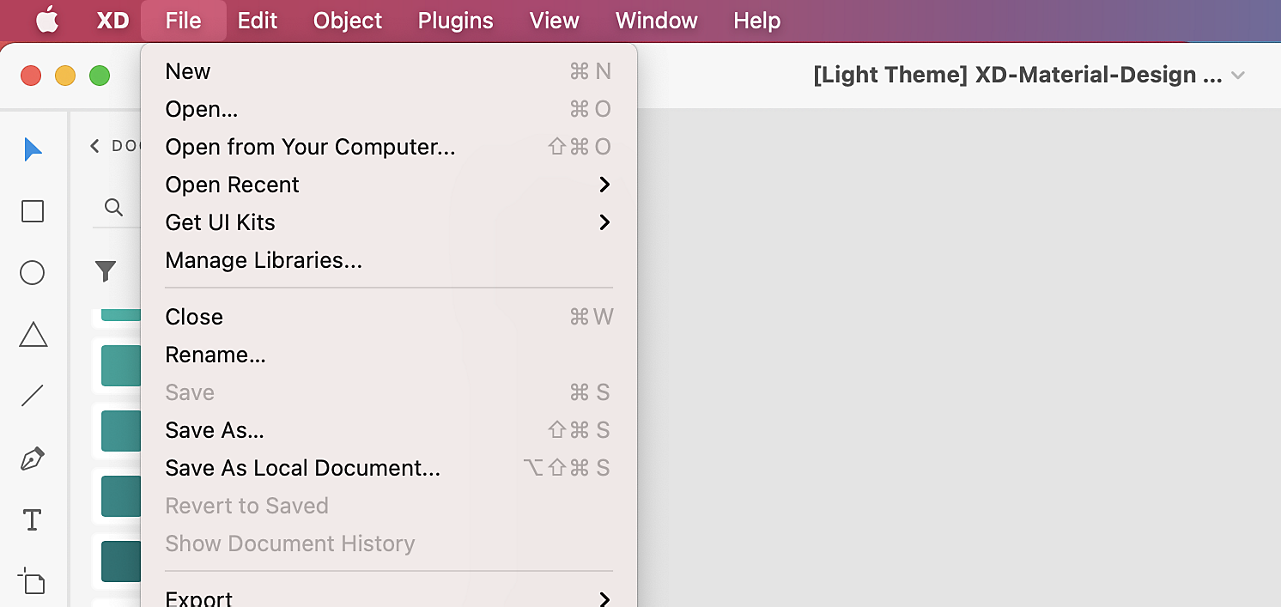
Once you have this document opened, remember to save it to the cloud to take advantage of sharing this Design System with other team members as a published Library, which we’ll cover later on in this article. To do this, you can navigate to the File menu, choose Save As… and name this Library whatever your heart desires. This document is now eligible to share and for other projects to link to in the future.

Customizing the colors and character styles used in the Library
As you scroll around the canvas, you will notice an endless buffet of elements designed for us to use. This baseline design kit can be used right away but if you want to start with updating the Library to reflect your own colors and character styles throughout the design system, we can do so by starting in the Libraries panel.
The Libraries panel can be found near the bottom left corner of the interface, once this panel is open, we can see all of our colors, character styles, and components neatly organized. If you want to expand this panel to view more assets at once, you can simply click and drag the edge of this panel out and the components will adapt to fit more content within the view.
Now let’s make a few global changes to the Colors in this Library. You can right-click on any color in the Libraries panel and then choose Edit. You have the option of using the color wheel, but you can also type in a color value if you want to match an existing color in your brand.
As you can see in this panel, there are dozens of colors and different shades of each color so finding the exact color that is used in a component can be tricky, but XD has a solution to help us find these colors very fast.
Once any element is selected, you can right-click and choose Reveal Color in Assets which will highlight that color used. You can then apply the same edit technique illustrated earlier to this specific element and all other elements using the same color.
This same approach can be applied with Character Styles as well. Although Material Design comes with Google Fonts applied (which you can download here), you can apply your own fonts to this Design System by updating the specified Character Style and again, if you don’t know the exact character style you’re supposed to be editing to change a specific font used in the canvas, simply right-click on this element and choose Reveal Character Style in Assets to find which one to edit.
As you can see with these two basic steps, we can implement our own colors and Character styles and still take advantage of all the power this design system gives us. To see where these changes are applied throughout the design system, you can zoom out to reveal all the artboards on the canvas or use Command + 0 on Mac or Control + 0 on Windows to zoom out to fit all contents.
How main components and instances work in XD
Components in XD are very powerful and dynamic. Even though you have hundreds of preset components, you can edit any instance and override any elements all while respecting the properties of the main component that have not been overridden.
This is great when you want to make fast changes to a particular instance in your design without affecting components within the Library. And if you ever want to revert this instance back to the main component, you can right-click on the instance and choose Reset to Main State. This eliminates the need to create multiple unnecessary versions of a main component just for the one or two places this new implementation is going to be used.
Editing main components in the Library panel
Although the ability to edit an instance is a great option for making changes on the fly, what if we want to make changes to these components that are reflected globally throughout our project? We can do this by editing any main component within the Library panel.
Because Material Design follows atomic design principles, you can find a solid implementation of nested components and also component states within many of the components. This gives us endless options of swapping nested components or quickly changing the states of this component on the fly.
In the example of this tab navigation component, you can easily switch states to display only text, icons, or both icons and text. You can find these states by selecting any component and then navigating to the Component section in the Properties Inspector.
In addition to states, we can also swap any components that are nested inside a main component regardless of their size or naming structure. Once you have any nested component selected, you can drag any component in your assets on top of the selected component to easily swap it out.
Combining these two features together gives us greater control over our components and enables us to keep our assets organized better by storing these different versions inside of states rather than having to create multiple component versions to reflect each state we want to use.
When you want to make global changes to components in the Library, it’s important that you’re making these changes to the main component and not any instances as any changes applied to an instance will not show up on any other instances. To understand whether you’re working with a main component or an instance, you can select any component in the canvas and discover either a green filled diamond or a hollow diamond on the top-left of that element.

If the diamond is filled green, that means you are working on the main component and any changes made will be reflected through all instances that are used in your project. If the diamond is hollow, you are working on the instance and anything you change will only be applied in that one instance.
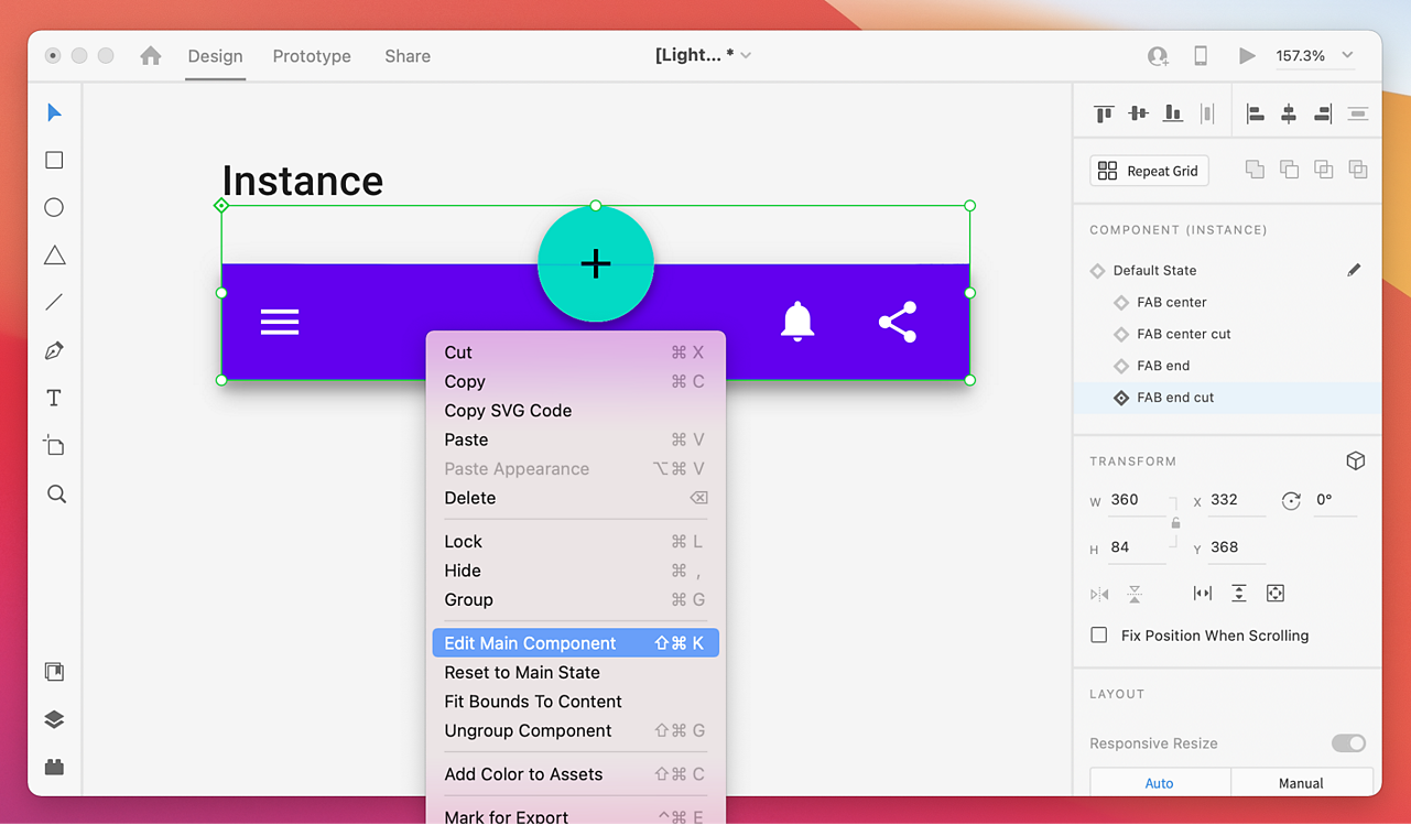
If we do find an instance in our design that we want to make global changes to, XD gives us a quick way to find that main component and begin editing. Simply right-click on the instance and select Edit Main Component. Doing this will scroll us to that main component where we can make these global changes.

Publishing the Library to share with your team
Once you are finished editing this design system based on your styleguide, you are ready to use it across your own projects or share with a team to use. Publishing Libraries is easy and very powerful. You can set permissions for who can view the Library and who can coedit the Library with you. Let’s take a look at these settings.
To publish this new Material Design Library, simply move on up to the Publish as a Library button in the Libraries panel and select Publish next to the file name.
Once your Library is published, the Invite to Library panel will appear giving you the option to add any team members via email, add a quick optional message, and choose the permission level. Within the permissions you can choose who can view and pull from the assets in this Library and who you would like to edit this Library, giving them the ability to make global changes that the rest of the team can take advantage of.
Once your team members receive this invitation, they can access this Library within any of their projects by opening the Libraries panel. By default your Document Assets will appear but you can click the back arrow next to Document Assets to reveal all the other Libraries that are shared with you. Including this new Material UI Kit Library.
Now your team can drag and drop from this Library and link any assets you have created. Additionally, any changes you publish in this Library will be accessible by the same team members that are using it and they can choose to accept these changes at any time within the same panel.
You are now set up and ready to use Material Design within XD
We have just scratched the surface of what’s possible with Libraries as we demonstrated using Material Design in XD. As you can see using the Material Design UI kit gives you a major head start to get up and running with new experiences quickly while still giving you the opportunity to make drastic changes to the style in mere minutes as your designs progress.
By publishing your Library, many others on your team can have the same advantage and any updates you make to this Library can be updated across all projects that use the Library giving you the power and consistency to deliver those high quality experiences very quickly.
You can apply these same powerful features in any Library you set up to really scale your designs and control a consistent style throughout the many projects these Libraries are implemented.
Related content