Photography
How negative space can help you use nothing to make something.
Use blank spaces and emptiness to tell a compelling story. Learn how negative space photography focuses a dramatic spotlight on the subject in their surroundings.

Photography
Use blank spaces and emptiness to tell a compelling story. Learn how negative space photography focuses a dramatic spotlight on the subject in their surroundings.
Aesthetically arrange photos to achieve this minimalist photography style. Learn to:
Negative space photography is related to minimalist photography. It emphasizes not just the subject but also the empty space around the subject. So, although the viewer’s eyes may focus on a central figure, they can’t help but notice the large section of emptiness that surrounds and defines that figure. Essentially, that emptiness (in whatever form it takes) gives definition and emphasis to the subject. “If the model or the performer is the noun,” says photographer Jimmy Marble, “the negative space is the adjective.”
“It’s minimalism in photographic form,” says photographer Will Milne. “You have your focal point and very few other elements on the page.” That focal point or main subject is the “positive space,” and the rest of the frame, be it a blank sky or the studio's white space, is the negative space.
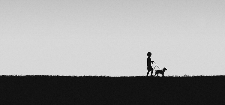
Regardless of your focal point or subject, the space around it needs to be impossible to miss. “You always want the space to steal the show,” says photographer Petecia Le Fawnhawk-Maggiori. A good rule of thumb is that the amount of negative space should take up at least 50% of the photo to achieve the right effect. A landscape photo with a single figure in the distance that gives a sense of scale and loneliness is an example of negative space photography.
Negative space photos are all about the interplay between the subject and their surroundings. “I try to view all of my photos from a design standpoint,” says Marble. “You have a box, which is your frame, and it’s about arranging it.” In that frame, the subjects generally take up less than half of the frame, with most of what’s left given over to negative space.
Negative space photographers still use rules of photographic composition like the rule of thirds, but the style lends itself to a unique approach to these guidelines. “Try to find creative ways to find your thirds,” says Marble. “I really like having things in the extreme foreground and extreme background.”

Image by Will Milne
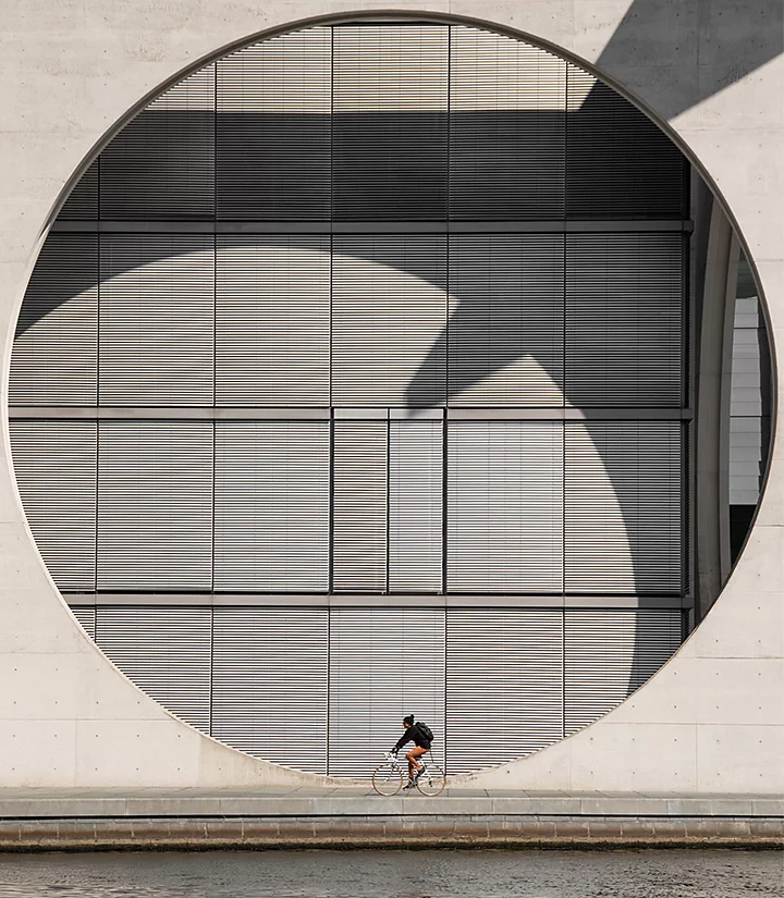
Negative spaces are often, but not always, solid backgrounds. They can be concrete walls, rolls of brightly colored paper, or black studio backgrounds. But that’s only the beginning. Emptiness takes many forms.
Negative spaces don’t have to be uniform. Grass can be a negative space, even though it has quite a bit of texture to it. Likewise, desert sands with noticeable variation or a cloudy sky can also serve as dramatic, empty spaces, even though they are not one uniform color. Negative space photography is about relationships and how the subject relates to expansive spaces, whether it’s a wide field of grass, a vast desert, or an open sky. Typically, what's most important in the image is a sense of scale and breathing room for the subject, rather than the specific type of negative space. It’s so much more than just minimalist single-color backgrounds.

Images by Will Milne

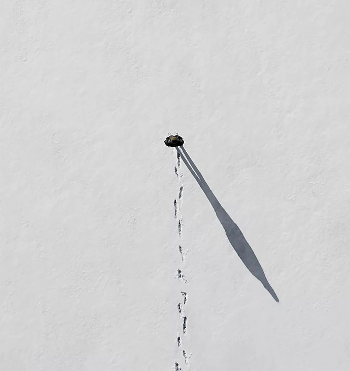
“You can use light and shadow to create negative space,” says Marble. Lighting can emphasize a subject in a stark and dramatic way, and shadows that extend into the background can further emphasize the subject’s relationship to the space. That works best with bright, direct light.
“Paying attention to a subject’s form is something you can only really do with hard light,” says Milne. Softer light can create blurrier, gentler shadows, and that effect can be at odds with the stark definitions that characterize many negative space photographs.
“Be open to what negative space can be. There are all kinds of negative spaces waiting to be discovered.” Negative space can even be something added by the manipulation of camera settings. Shallow depth of field can create a blurred background for your main focus to pop against, and the right photography composition can turn any setting into a negative space that grabs the viewer’s attention. Negative space photography is all about contrast and scale, and a skilled photographer can achieve that effect with bokeh or other effects that turn part of the frame into a blurry negative space and another part into a sharply defined subject.
Photos of emptiness can have any subject matter. Negative space photography can be food photography or fashion. It can be street photography on a busy New York corner, portraits of posed professionals, or even product photography. As long as it situates the subject within an open area and gives them sufficient emptiness to interact with it, any photographer can use negative space to create stunning images.
Ultimately, the most important part of negative space photography is how it makes you feel. A figure surrounded by emptiness always shows a relationship between them and the setting. It’s nearly always one where that setting and surrounding space is bigger and more expansive than the subject, both literally and metaphorically. The positive and negative space combine to create an intriguing effect.

A good way to understand that effect — and hone your skills with negative space photography — is to explore many spaces. Gain a feel for the emotional content of a space through experience and exploration. It will take you a long way in capturing that feeling. “Take advantage of what there is to offer in nature. Experience what it means to be small,” say Le Fawnhawk-Maggiori. “Explore more. The way you achieve space is by experiencing it.”
Be intentional when using emptiness. Because negative space images are often so minimalist, everything has to look crisp and polished — and contribute to the overall effect. Be ready to edit out any distracting elements. What often looks like a vast, empty area is the result of deliberate work on the part of the photographer—for example, diligently erasing distractions in Adobe Photoshop. Cropping, cleaning up, and meticulously crafting images all draw the viewer’s eye to a focal point and make them appreciate a lone figure in a void.
Based on your location, we think you may prefer the United States website, where you'll get regional content, offerings, and pricing.