Adobe® Illustrator® CC software provides support for individuals who want to create accessible web content. With Illustrator, users can proof images with Color Universal Design (CUD) to help ensure that graphical information is conveyed accurately to people with various types of color vision impairment, including people with color blindness. Illustrator can be configured to always add an alt attribute to image elements. Illustrator also enables users to specify alternative text descriptions for image slices.
Design guidelines
Overview
Illustrator CC is the definitive solution for professional web vector graphics and artwork creation. You can use Illustrator to create and edit graphics and optimize images in a professional environment.
Illustrator integrates with other Adobe products such as Dreamweaver®, Flash® Professional, and Fireworks®, as well as your other favorite graphics applications and HTML editors, to provide a truly integrated web solution. You can easily export Illustrator graphics to other Adobe authoring applications, such as Dreamweaver, or directly export a sliced image to HTML.
Color blindness filters
Illustrator supports CUD through its soft-proofing features, which can simulate color blindness. This feature allows the designer to see what the image will look like for people with different types of color blindness, such as protanopia and deuteranopia. Color blindness simulation makes it easier to create accessible signage and other artwork.
Soft-proofing for color blindness
CUD helps ensure that graphical information is conveyed accurately to people with various types of color vision impairment, including people with color blindness. Several countries have guidelines that require CUD-compliant graphics in public spaces.
The most common types of color blindness are protanopia (blindness to red) and deuteranopia (blindness to green). About one-third of color blind people are completely blind to red or green; most of the remainder have milder forms of color blindness.
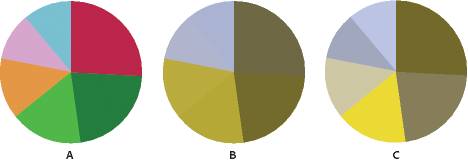
In the figure below, the color wheel labeled A is the original image. The color wheel labeled B is a proof of how an individual with protanopia sees the original. The color wheel labeled C indicates a color combination that is perceivable to the greatest number of individuals.

A. Original image. B. Color-blind proof. C. Optimized design.
To determine whether a document is CUD-compliant, do the following in Illustrator:
- Convert the document to RGB color mode, which provides the most accurate soft proofs for color blindness.
- To simultaneously view the original document and a soft proof, choose Window > New Window and arrange the windows for a side-by-side view (optional).
- Choose View > Proof Setup > Color Blindness, and then choose either Protanopia-type or Deuteranopia-type. (To comply with CUD, check your document in both views.)
If objects are difficult to distinguish in color-blind proofs, adjust the design by doing any of the following:
- Change color brightness or hue:
- Pure red tends to appear dark and muddy; orange-red is easier to recognize.
- Bluish green is less confusing than yellowish green.
- Gray may be confused with magenta, pale pink, pale green, or emerald green.
- Avoid the following combinations whenever possible: red and green; yellow and bright green; light blue and pink; dark blue and violet.
- Apply different patterns or shapes.
- Add large white, black, or dark-colored borders on color boundaries.
- Use different font families or styles.